Monday, 29 December 2014

Some research into "Blue on White" Ceramics

 Figure 1: The Blue Willow Pattern first popularized by Minton (1)  in 1780, and readily available at your local Woolworths.


This research project was initiated as a response questions from Master Crispin regarding blue on white ceramics at Fields of Gold 2014. I knew the basics such as the significant influence of Chinese (Ming)ware on the European market but I didn't know if this was a stylistic influence or something else. (turns out it's practical, higher firing temperature creates stronger ceramics and cobalt is stable at these temperatures). Given that 'Blue on White' is a wide topic I started as I usually do, hitting up my favourite museum collections for some extant samples. I've stored these on pinterest, tried to assemble a small collection of representative pieces and a timeline. I've also collected quotes from various sources that relate to the pieces above them. For some reason vases seemed to be a thing and it's interesting to see the motifs and shapes changing over time and cultures. This is a HUGE topic which I only touch on but I feel this research essay is sufficient generalist background as I conduct additional research for each project as well. Where possible I've utilized primary sources (extant objects) but have referenced a number of secondary or tertiary sources as well. Additional reference material is provided at the end and I've put this one behind a cut because it's a massive post and reasonably picture heavy.

Saturday, 27 December 2014

Greylead - totes legit!


A London delft claret bottle
dated 1645
of slight pear shape with a small plain footrim, the slender strap handle with a simple pointed lower terminal, inscribed in blue 'CLARET 1645' above a curlicue, 16.2cm., (some wear to the glaze on the rim and foot, minor glaze hairlines)

Footnotes: The label on this bottle shows two fine, parallel lines drawn in grey as a guide to the painter"

Sold by Bonhams on 1/10/2003, lot 29

Friday, 26 December 2014

Schoodie / Squoodie


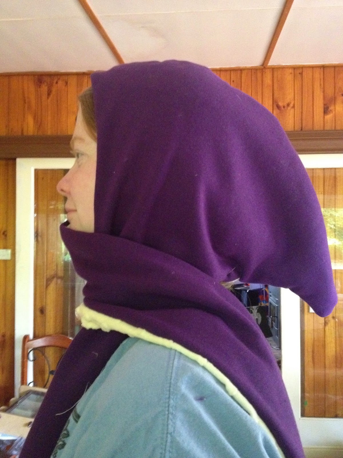
Schoodie - a combination scarf / hoodie
Squoodie - a combination scarf / hoodie with a squid theme

So, I didn't know schoodies were a thing until I went to Tobin's November Stitch and Bitch day. Apparently they are and my favorite Youtube channel, Threadbanger, has even done a short instructional video on how to make one out of an old sweatshirt (jumper) here. Tobin kindly lent me his pattern which he seems to have printed off the internets. I'm not sure where he got it but this seems like a rather simple three piece pattern which I may make next time. You can also get a ton of free patterns for knit or crochet patterns for scoodies simply by googling it.

I made the schoodies in November as a gift for my man who's currently contracted out to work in the sandbox. As it's winter over there (a cold Christmas - what a barbaric idea!), I thought I'd make him something to keep him warm. I scheduled this to auto-post after Christmas so as not to ruin the surprise!

To make - follow these helpful instructions on Indie Tutes OR:

(pattern shown here is schoodie (with ears) not Squoodie)

1. Cut out your fabric.
Make sure you have 2x outer-shell, 2x inner-shell, 2x outer pocket pieces, 2x inner-pocket pieces cut in opposite directions.
When cutting the fabric be aware of the grain. Like fur, my bumpy fabric for the liner has a grain so I had to ensure that the pattern was cut to ensure the grain went down the tentacle. This means I needed 1.2m of liner fabric but only about 0.7m of outer shell.

I elongated the outer-shell of the hoodie to create the hood shape. I left the inner-shell according to pattern to ensure the hood wouldn't slip over my mans face.


2. Pin the pockets rightside to right side and sew along top.
I decided to use the non-fluffy side of my fleece as the good or right side of the fabric so I pinned the non-fluffy side of the purple fabric to the fluffy side of the cream.


3. Turn over the pockets and pin along top to hold in place (if using cottons, you can iron the seam to hold it flat)

4. Pin pocket pieces in.
Pin in such a way that you can't see the colour difference (when you're done sewing this results in colour matching the pockets to the tentacles)


5. Start pinning squoodie together from the center front seam (right sides together)
Use ALOT of pins! I used pins ever inch or so. Fabric with nap like fur tends to slide on the fabric and will stretch and bunch if you're not careful. If you have one (which I don't) a walking foot may help


6. Sew
Sew from the center back along one tentacle.
At this point I decided I wanted to have a slight taper before the pockets to create more of a tentacle shape. I drew it in with water erasable fabric marker and sewed along the line
Keep sewing until you reach almost to the back again. Leave a hand sized gap.


7. Pull through and flatten.
DO NOT freak out if you end up with one pocket on the inside and one on the outside, simply pop the point back through and move the pocket to the side you want (your hood is actually fully reversible yay!)

8. Hand sew gap closed (or machine if you've got time restrictions and don't mind a weird seam at the back)


Adaptions:
I elongated the original hood to make a squid look. By sewing in a tight angle at the center back of the hood between the lining and the outer-shell I pinched the fabric in such a way that pulled the hood down to rest in an appropriate manner.

I considered sewing squid-eyes onto the hood but I didn't want to make it too cutesy.

If you can't find bumpy fabric like mine, consider appliqueing suckers onto the inner-shell tentacles.

If you're using fleece, you could add a quarter circle of fleece to drape out of the back of the hood. The fleece won't fray and you can slice it into tentacle shapes. Make sure this is sewn in so the stretch direction is down along the tentacles. Pull the tentacles to make them curl along the edges a little to hide the rawness.


It'd be entirely possible to elongate the hood to an extreme lire-pipe length for a pixie look.

Ears can be hand-sewn separately onto the hood, rounded ones for bears or pointy ones for a fox/dog.

Paw prints could be added to the outside of the pockets prior to sewing them in.


Monday, 22 December 2014


I found a set of wonderful sari/saree wrapping videos on youtube.
https://www.youtube.com/playlist?list=PL0B1F2FE35193AC5C

This one, showing a Kerala sari, and this one showing how to drape a sari in under two minutes are pretty much the basic drape I've taught in all of my classes. It's still my favourite drape and I find it works best with softer fabrics or a heavy brocade. The image above is me attempting this drape with a light cotton, my orange blockprint. As you can see it's not really falling right and I look a little frumpy. Still, one of the easiest drapes to look graceful in I feel.

Sunday, 21 December 2014

UFO update

The list so far:

Blue tartan bustle kilt
Red tartan bustle kilt
Blue lace tartan kilt
Brown block print sari    (21/12/2014)
Green Ikat Sari   (21/12/2014)

Apricot sari
White & gold sari
Blackwork wall hanging
Fancy Pants blue t-tunic
Snakes and Ladders Quilt
Cream 1860's dress
Goldhaube


Additional items:
Purple/Black Sari
-2x seams

Mumluk Dishtowl
-Complete embroidery

Cream woolen dress
-2x hem sleeves
-Handsew bottom hem
-Red/gold embroidered detail?

Layla's tutu
-Handsew in 13 ribbon loops for ribbon belt

Monday, 15 December 2014

Push A Laurel Song

I'm am not very good at singing, but I do enjoy the Boars Head Tavern at Rowany Festival. One song I heard at Rowany 2013 was the push a laurel song. I'm listing it here so I don't forget some of the verses that I wrote down that evening. I suggest singing the chorus ever two or three verses otherwise it just drags and drags.


Chorus
You shouldnt push a laurel off a bridge,
You shouldnt push a laurel,
For that would not be moral,
You shouldnt push a laurel off a bridge.

You can push a pelican off a bridge,
You can push a pelican,
And then push em off again,
You can push a pelican off a bridge.

Chorus

You can push a fencing don,
We wont even notice that they're gone,

Ye can push the reigning Crown,
Hear them scream on the way down,

Ye can push the King and Queen
Thought it might seem mean

Ye can push a duke or duchess
Have no fear, they won’t make a mess.
Have no fear, they won’t be missed

You can push a belted knight off
And be sure he’s a write off

Push a local reeve
But the mess might make you heave

You can push a cocky herald
Just make sure his life’s imperilled

You can push a martyr or virgin
And we’re sure ye won’t need urgin’

Ye can push St Crispins College
No one will miss their knowlesge

You can push Andronicans off
Do it right, you have their pants off

You can’t push the Rocket Herald
Or he’ll change your name to Gerald

Never push Cruz Australis
Or your lifespan will be far less

No, you can't throw Master Drakey,
He's thrown himself off by mistake-y,

Pushing Master Vandal off is fine -
Laurels please form a line!

You can't push a filk-song-writer
It'll come back hard to bite yer
Ye can push a costume nazi
If yer style’s artsy-fartsy,


Monday, 8 December 2014

Unfinished Project (UFO) list..

The following is a list of my unfinished projects. Specifically, these are ones that I've started and put to one side due to distraction, lack of interest, lack of time or lack of materials. My friend Ceara recently posted a list of things she's achieved in the last few years on her blog with some lovely Gantt charts. She is amazingly productive and has inspired me to collate this list in order to cross things off of it. This is not a full list of unfinished projects as there are some I've done the research for and/or bought the materials but haven't dived into yet (ie the silk painted sari project). Those will be addressed some other time. I've recently completed three things from this list (I'll post about the after Christmas) so I've feeling like I can probably get quite a bit of this knocked over.

The list in no particular order:

Blue tartan bustle kilt
Overlocked to length
New edge trimmed with satin ribbon
First bustle layer complete
-Second and third tulle and tartan need to be measured and attached
-Trimming or bows or something to hide the stitche

Red tartan bustle kilt
Kilt trimmed and overlocked to length
-Add edge trim
-Sew on tulle and bustle layers
-More trim

Brown block print sari
--2x edges to hem

Apricot sari
-2x edges to hem

Blackwork wall hanging
~5 hours in
-about 9/10ths left to do

White & gold sari
-2x edges to hem
-Smooth the twist out of all the gold work

Blue lace tartan kilt
Majority of damage removed
New hem replaced with cream lace
Darning of moth holes complete
50% of darning covered with silver butterfly beads
-Acquire more butterflies
-Sew on butterflies to hide darning

Fancy Pants blue t-tunic
Tunic complete
-Shorten 1x arm
-Attach silk cuffs to arm
-Handsew edge of cuff

Snakes and Ladders Quilt
(after 10 years)
Squares cut and sewn together
Majority of embroidery done
-Finish all snakes
-Finish all ladders
-Embroider random numbers where reinforcement is required
-Find / purchase batting
-Find / purchase quilt back (or double bed sheet)
-Stitch the ditch and attach pieces together
-Edge quilt

Cream 1860's dress
Majority of dress complete
-Make blue puffy sleeves
-Make cream and blue tie-sash
-Handsew down trim on bodice and reinforce pearls

Goldhaube
Gold thread and pearls completed
-Gather and sew into headband
-Gather and work out fastening method.

Wednesday, 3 December 2014

Ceramic Project 37 - Dr. Seuss completed documentation

14th century ceramic plate and bowl
by Antoinette Travaillie

Figure 1: 1400's Albarello/Apothacary/Pharmacy Jars, tin glazed earthenware, Florence, Italy. Met Museum, Accession No. 46.85.11 

I found the pharmacy jar depicted in Figure 1 while trolling through someones Italian Ceramic board on Pinterest. I fell in love with it. I quite like the dark blue on white in ceramics and this fish looked so Dr. Seuss I just had to use the design elements in a project.

Figure 2: Monochrome drug jar. late 12th - early 13th century, Iran Kashan. Stonepast, lustre-painted over opaque white glaze. Met Museum, Accession Number 2013.255

"Drug jars, or albarello, contained medicines, ointments and cosmetic preparations and would have been bought at an apothecary's shop. You could either keep the pot after the contents were finished and use it as a container, or you could return it to the shop in exchange for a small sum. It would have been sealed with a parchment lid, tied on with string just under the rim." - (Museum of London, website accessed 4/12/14)
Figure 3: Drug Jar, Beauvais, France. Early 16th Century. Decoration is scratched through top coat of white slip to reveal red slip underneath, then embellished with blue and green glaze. Museum of London, ID no A4925


Background
Albarello (or Albarelli) appear to have originated in the middle-east (Figure 2) and the tradition brought westwards over time. They have a cylindrical shape, often with a slight rim around the lip. The jars are sealed with a piece of parchment which is tied on with string. This allows the pharmicist to write the contents on the jar, and for the jar to be reused for other products later. Some jars, such as the one in Figure 3 at the Museum of London have labels written in glaze, 'VA T'EN QUITTE' (possibly meaning 'get out of here') may indicate an expensive or toxic concoction. Decorative elements seem to a simpler version of what was utilised on other ceramics at the time and display the regional style trends.

Figure 4: Dish depicting a virgin and a Unicorn. Tin-glazed earthenware. Italian.1486-1489. Met Museum of Art. Accession number 46.85.30

Around the time the apothecary jars in Figure 1 were produced, Italian ceramic plates and bowls were transitioning into the majolica design style which involves an intricate use of colours (Figure 4). There were many workshops with Italy producing ceramics which were exported throughout Europe - Deruta and Faenza for example. From the 1400's to the 1500's, many new glaze colours were introduced to the Italian ceramics market. Copper and cobalt based glazes (greens and blues) were soon paired with manganese purples and browns. Later vibrant reds and yellow (antimony) also decorated earthenwares. Though no firm date is given for the extant Albarello, I believe it was produced in the early 1400's due to it's simple colours and Hispano-Moresque motifs. Similar floral background motifs can be seen in the charger in Figure 5.

Figure 5: Dish, Tin-glazed earthenware. Tuscany, Italy. Met Museum, Accession Number 46.85.1


#Method

Shape - I use commercial bisque as I do not own a kiln and do not have the skills to fashion my own clay items. As a result, the shapes I select for my work are restricted to those that are available. In some ways this is in keeping with medieval practices where earthenware objects were sometimes produced in one workshop and glazed in another. The bisque I selected for this project were as close to the shape of extant objects (Figure 4) as I could acquire. The bowl has slightly steeper sides and a deeper base than the one depicted. This has the added benefit that it can accommodate the more liquid soups or smaller portions that are often eaten at SCA events. The shape of plates produced in Italy at this time were quite varied, from wide rim (or rims) to none at all. The bisque I selected for the plate is a common shape even now and quite similar to many extant items including that depicted in Figure 6.

Figure 6: Plate with the Visconti arms. Deruta? Italy. 1480 - 1500. Tin-glazed earthenware. Met Museum, Accession Number 46.85.16


Glaze - Tin-glazed earthenware is pottery which is coated in a glaze containing tin oxide. This leaves an opaque white base upon which metallic oxides are painted. The blue on the extant Albarello is probably derived from cobalt oxide (or Persian blue).
As I wished to create items that would be food safe I needed to avoid lead or other toxic metallic oxides. As I am using commercial bisque made out of white clay, I can skip the tin-oxide all together by using underglaze to paint the design then a clear overglaze to seal the ceramic and make the white shine as if it were tin-glaze. This has the added benefit of making my work food, microwave and dishwasher safe. The underglazes I use are purchased from Glazeit, a company in Victoria who also fires my pieces. The glazes are all designed to be fired at the same temperature which means I don't have to do multiple coats or worry about one getting burnt before the other runs.

Figure 7: Original design sketch for the plate and bowl

The Process - I started by making the bowl as close to the original design elements because it was smaller and easier to handle while glazing. Originally I was going to have the same design on both items (Figure 7) and just change up the rim decoration but the curved sides of the bowl made that too difficult. As a result the bowl is very close to true-to-reference, design wise.Once I'd finished the bowl, I decided to change the design for the plate rather than have it perfectly matching. Due to the  difference in curves and size I could make it close to my original design sketch.


Each item was glazed in a staged process-
 
the main elements were outlined then the central background fill was completed. The main elements were then covered with a 1part glaze, 3 parts water wash. This is a new process for me which I hoped would create some shading in the glaze similar to what can be seen on the original piece. As the glaze turns opaque before firing, it is really difficult to see how much coverage the final product will have. After completing the center of the piece, I worked on the back. The whole back is glazed before the rim of the front is completed. This prevents the front design (the most important part) from rubbing off while the back is being completed. It is less important if the back of the design loses colour depth due to unintentional rubbing.
 

Outline of the fish - three layers of glaze to ensure strong consistent colour.

Background fill complete - one layer of glaze as delicate swirls will thicken if more is applied.
 
The fish were then glazed with a 1 part glaze, 3 parts water wash. I wasn't 100% sure how well this'd turn out as I hadn't tried this before but I needed some shading effects here.

The back is started before the front rim to reduce rubbing and removal of glaze as I work. Flower motif has been borrowed from the background of the Albarello.
 
Back rim is completed with two lines of floral pattern taken from the rim of the apothecary jar. Inner ring is the upper rim of jar, outer ring is the almost flat ring near the top of the jar. Mistake between the first flower and leaf has been scratched off to leave the white ceramic in it's place.
 
Front rim is completed with a similar pattern to the back and to the bowl.The piece is now ready to be fired and will darken during the process.

Results

The fired plate and bowl!

Fired back of the plate and the bowl.

Things I liked:
I liked how easily the 1400's motif transitioned into a Dr. Seuss theme. That said, I think I like the front of the bowl better than the plate. The rim decoration on the plate needs to be that little bit tighter or more busy to claim the space better.
I'm also really happy with how the wash turned out. I was worried it'd be too dark and the fish scales wouldn't come through. I was also worried that the brush strokes would be too obvious 

Things I'll fix next time:
Upon close inspection the overglaze on the rim of the bowl hasn't fully run and is slightly matt in places. This is due to it not quite reaching the required temperature in the kiln which may have resulted from over crowding. While this isn't something I have control over, I can drop my items off at a different time in the week, hopefully catching a firing that's less crowded.
I'm also not entirely 100% happy with the back of the bowl. Though I deliberately made the decision to keep the sides of the bowl glaze free as I didn't think the motifs would follow the flare well, I'm not sure I like the stark nature of it. Though I won't do this design again, I think it'd probably have looked better with flowers and swirls.


I'll probably be writing up a review on blue-on-white ceramics in the near future which I'll throw up here and link to this project (and my ongoing tiles project), - stay tuned!