Showing posts with label Glaze. Show all posts

Tuesday, 9 June 2020

The final globe

This is the final globe cup from my green series. I decided I needed to further expand my use of the medieval motifs and thought maybe for the final cup I'd step away from the green over black. Instead, I used the period motifs and modified to them to align with a more heraldic colour set.

After glazing in the rim decoration and the three cats in ebony, I decided I wanted to move as far from the green as possible. I thought this would be a really good project to trial my new Firetruck Red glaze performance. I retained the motifs of the extant cup with the striped half base and the vines but used olour to emphaise the design. The red glaze is a beautiful colour and I am really happy with how this design turned out.
The dimensions of the cup are more bulb shaped rather than the tapered look of the extant jug howver when handled, the elements tie nicely in together so I am satisfied with the look.

Jug with running animals. Kashan. 12-13th century. Cleveland Museum of Art. 1947.495

Sunday, 12 April 2020

Glaze pallets

I made some glaze pallets so I could see how well the various colours worked on stoneware and the difference between the local buff clay and pb103. I’ve done this in the past, creating two test tiles with and without a titanium white base glaze.

It was important to make some new tiles because I’ve purchased some new colours and I needed to see what the impact of multiple layers was. These will be critical to making the colour choices for an upcoming collaboration.


Left- PB103, right - buff. Each divot is top third 1 layer, middle 2 and base 3 layers. The top 20 colours are the Chrysanthos glazes. The bottom glazes are five selections from the Glazeit pallet which I suspect are Duncan underglaze. Black is Cesco ebony brush on underglaze.

Sunday, 22 March 2020

Iranian globe cup II

The design:
This is the black under-glaze design. I used a single sized paint brush and a single coat for all of the items except the blackband at the top. I rather like the swirl in the foliage of this design.


The extant reference:
Extant jug from LACMA. (M.73.5.258). Kashan, Iran, early 13th century.

The reeds / kelp design and the fish are a common motif  (1, 2, 3, 4) appearing on cups, jugs and most commonly, in bowls. Given my cup is squatter than the extant piece I decided to do away with the top layer of fish. I also decided to continue the vine down the handle rather than blackening it out as it has been on the original. This was because the handle makes a greater % of the overall object and would have dominated the design. I am actually really pleased how well the fish came out. Their sinuous form is lovely, it's just a pity they are too low on the cup to be seen properly.


The glaze:
Both cups (+octopi cup previously posted) came through the kiln fine. What was most interesting about both of these cups is the difference between them and my 12th night A&S entry. Exactly the same glaze combination was used but these came out lighter with some interesting crystal patterns forming.

The result:
Front Back

Friday, 20 March 2020

Black underglaze and light blue

This is my favourite piece of bisque from the class I took in November. I’ve been hoarding it because I had no idea what I wanted to decorate it with and I really didn’t want to ruin this mug.

After the epically long time I spent with a tiny brush completing all the fine glaze detail on the mystery bisque albarello, I needed a better solution. While I was down at Potters Market I happened upon some squeeze bottles with variously sized needle bits. This is the result. The thick lines are multiple applications of the size 3 needle and the thin lines are the size 2. I think the underglaze is too runny for the size 4 needle and not runny enough for the size 1. I also suspect size 1 wouldn’t permit sufficient pigment to be applied. It may be good for fine dots though.

Generally I feel the squeeze bottle is a good idea however inconsistency in the bisque surface results in lumps and bumps in the glaze lines. I could scratch a lot back but I’m hoping a the over glaze will reduce the impact of the imperfections.

Extant jug. Sotheby’s. 

I glazed this in light blue with a clear overglaze. I twisted a finger when placing the cup on the drying rack so there are some inconsistencies along the rim where I’ve tried to repair the glaze coverage. I gotta say, I am not happy with the result.


As you can see, the fine brushwork has essentially been swamped by the glaze. Most of the detail is gone and everything has become streaky. I believe this was, in part, due to the clear cover glaze. The top rim was double dipped because of my clumsy finger damage to the original coat. This area seems to suffer most from the streaky effect.


Examination of the internal rim suggests that the light blue contributes. Note the lovely internal band where the light blue stops? It seems it already has a colour change where there is a thickness or boundary change. While I wouldn’t want to use this combination on another underglaze work, I’d love to see how this does with topographic detail. The colour somewhat reminds me of the pale Egyptian blues.

So, I don’t like this result but I’ve learned a few things. Pity I had to do my learning on a ‘good’ bisque but I guess practice will increase the number of things I consider ‘good’.


Thursday, 19 March 2020

Albarello collab

I’ve been posting this project at some of its stages already. It has now been fired so I thought it was about time I did a write up.
Fired!

Background:
Many years ago I participated in the laurel prize tourney. I don’t recall what I was displaying, I think I was in the middle of the A& S challenge so neck deep in my decorative glazing obsession. The laurel prize tourney helps participants engage with a variety of laurels to receive useful feedback and advice. It’s also open to non-laurels to review so you can inspire and engage with the rest of the Sca as well. Individual laurels will often give various participants small tokens. In this year in particular, Master Alex the Potter presented me with two handthrown bisque fired albarello. At the time I had no way of firing them myself and I wasn’t confident that I could do this limited resource justice.

Now, years later, I’m throwing my own pots. I haven’t yet created an albarello I like but I’m close enough. I can also get anything I like commercially fired to stoneware. Time and beyond to do something with the bisque I’ve had since before I moved to this state (at least 5 years ago). I’ll admit, I was really worried this mystery bisque wouldn’t hold up to the high firing temperature. Especially after the slumping seen in the Olla lid mystery bisque.


The original choice which was closer in shape to the bisque Extant arbarello from the Louve ref. OA 4091.


On inspiration:
On the right is the original choice. Unfortunately when I sketched it onto the bisque the symbols just didn’t balance right. So I switched to something else. The left is my final choice. I’ve had this image pinned to my ceramic inspiration page for a while. I’ve loved the simplicity of the component elements and the complexity of the background work for sometime. This style really has been a favourite of mine for a while and this seemed like the perfect time to execute it. Part of my decision lay in the colour fastness if black oxide and cobalt blue. Both can withstand high temperature firing with pretty good colour consistency. I couldn’t be sure how other colours, like the super fickle purple, would do so very late period Italian designs are out for now.

Of the two design choices, the second one was more balanced once sketched onto the bisque using 6B pencil.

On execution:
Glazing this took a fair while. I worked the main body in sections with the main design free handed and then double glazed to ensure colour integrity. The background super detailed swirls were a single stroke with a 5zero paint brush trimmed down to have shorter bristles and increase its stiffness. I’m pretty happy with the colour consistency achieved there. I was a little worried they’d end up streaky it grey.

The blue is ‘Cobalt Blue’ from Chrysanthos. It was painted on as a single layer as it was important to me that the black detail come through the blue. I added more blue than was on the original design because I had more foot space and thought the colour balance worked better. I’m not a huge fan of the free blue leaves at the top, I much prefer the blue outlined in black.

I designed the foot pattern myself utilising elements from the extant item. I considered a detailed swirl pattern in the background but decided that it would reduce the impact of the main panels. I really needed more light space to balance the overall look. I think it is important to understand not only the design context but the impact of the piece as a whole. I took for inspiration the bold black line features seen in many items of the time. I’m really pleased with how this came together. Using the lines also let me tie them into the shoulder pattern. Again, I could have overlooked this geometrical change and continued the extant pattern down but it wouldn’t have worked with the shape of the bisque. I did consider a vine design but decided the area would be to thin and the vines would look weird as a result. Plain black bars helps divide the d ensign
Elements without detracting from them.

On the future:
Overall, I’m very pleased with how this piece came out and I’m super relieved it didn’t deform in the kiln! I probably wouldn’t change the rim decoration even though it doesn’t overly appeal to me because it is a direct copy of the extant item. I will be using the other bisque item to trial an Italian or Spanish polychrome design next now I’m more confident in the integrity of the bisque in the high firing temperature.


Monday, 16 March 2020

Mystery bisque #1


I was given a beautiful bisque jar with lid many years ago. Without the direct means to fire it, it languished upon my desk. That is, until I read about ollas as a means to water your garden. Any bisque jar seems to work. Buried in the garden, the jar slowly seeps water into the surrounding soil. In theory, plant roots can surround the jar and increase water movement too. Once I learned of this, I promptly planted the jar next to one of my struggle plants. I’ve three in a row and two in a terracotta pot. The ones in the pot have done really well and spread everywhere. This may be better soil or better water retention. This experiment should show me what impact better access to water has!


The problem with mystery bisque is you don’t know if it’ll stand up to stoneware firing. This one didn’t. It started as a flat circle with stem and has dropped somewhat. No matter, I had a sacrificial dish under it and it’ll still work a treat as an olla lid. The colours are Chrysanthos turquoise ug153, probably ug161 electric blue and ug201 crimson and black. I’m pretty happy with the design but it has emphasised that the black does require at least two coats for good coverage.


Friday, 13 March 2020

Iranian nautical globe cups


The nautical glove cups are out of the kiln and I am so very pleased with the geeen glaze. It isn’t as smooth and transparent as the last cup but the bubble texture to the glaze is so much more fitting for the nautical theme.

I wanted to share the octopie cup while I take some time to write up a reflection for the kelp one.

Base: I wax resisted while glaze dipping. As a result of a deeper pool of wax than anticipated some of the black underglaze stripes didn’t receive any overglaze. Makes for an interesting contrast.

Tuesday, 31 December 2019

Buff white - basal white with underglaze decoration

Class results continue - 2nd firing, buff clays with a white dip.

When wet, the PB103 and the Buff clay have a noticeable colour difference. The buff clay looks like it resembles the 'earthenware' clays in the museums more. I guess, brownish clay (with some fe-oxide) content seems more natural to me. I've already posted my first experiment with the buff clay effect on glaze colour and noted the curious tendency of the buff to bloom with certain glazes. The items described in this post, were fired in the second batch but decoration commenced while batch one was still in the kiln.

If you've been following my blog, you'll know I started experimenting with underglazing in May / June 2011. I spent many years visiting Glaze It Studio and using their commercial bisque, underglaze and firing. The team there are lovely! Siegel (hope I spelled that right) still welcomes me when I drop in once or twice a year. Many years ago, she gave me glazes to take home so I could work on my items in peace and have been more than generous over the many years. I have, unfortunately, moved so attending their lovely studio is very challenging. I have tried a couple of similar studios in my new home town but the atmosphere is just not the same. The time and dedication it'd take to build a similar relationship with a new company is beyond me because I just want to be able to create my art.

Enter ClayMake Studio! This started as a way to broaden my ceramic skills as I'd been introduced to throwing at Pennsic by Master Simon. Interested in learning more I've signed up for a single session class and a longer 5 week wheel work class. As a result of these classes, I have plentiful bisque to work with and I can indulge in underglazing again. I do need to learn some new parameters as ClayMake fire to stoneware temperatures which, I believe, may be a lot higher than GlazeIt fire at. I'll still be returning to GlazeIt on occasion as I have yet to complete my tile project (ongoing since 2013). There are a few tiles I haven't posted about but I plan on firing the last one and doing a couple of posts about that project. It's been an interesting journey.

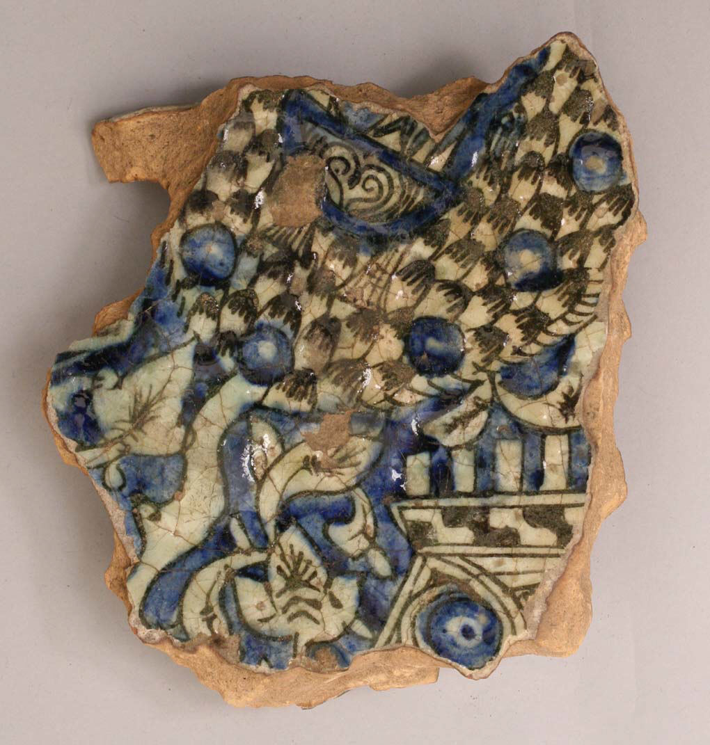
Fragment, 14th–15th century, Egypt, Kus, Stonepaste; underglaze blue and black; transparent, colorless glaze. Met Museum item number: 07.238.19

Anyway, that was an epic background introduction to this new project. I've previously only used / had access to white commercial bisque. This has made creating my designs really easy as many of my medieval references are underglaze on a white lead glaze background. The image above is an excellent example. The brownish nature of the clay can be seen on the edges of the fragment and the white basal colour fragments with curved edges suggesting a silicious nature. (Side note: I've been meaning to develop this fragment into a full design for a couple of years now. I've only just realised the main checkerboard is probably a tree with blue fruit globes and a blue bird while the angular design in the bottom right is a building or fence perhaps.)


Anyway, I've been able to do away with the background colour and concentrate on the decorative motifs in the past due to the bisque I used. Given the wet colour of the buff clay, I was concerned that if I continued to use buff, it'd change my underglaze colours too much. This experiment was proposed as a solution of the colour of the clay. Similar to some majolica pieces, these cups have been dipped in a white background glaze before the underglaze has been applied. (I don't remember which glaze I used, I may have screwed up and used Titanium white instead of satin white!).

Pre-firing, basal white glaze with Redwood, Citris / Saffron and Turquoise with three layers thick.

The cups were dipped in a white background glaze and then transported to my house for underglazing about a week later. As a result of this delay, all of the moisture has evaporated leaving a very very powdery basal glaze behind. I was able to easily smooth any drips in the basal glaze by rubbing a finger lightly over it. I am a little concerned that the underglaze brushes, if too hard, have lifted some of the basal layer and I may end up with specks in the underglaze colours. The cup on the left has a black outline and detail under the three coats of underglaze colour. I'm curious to see if that comes through or not. I will have to do a proper multi-coat tile experiment with these glazes because the reference tile I've currently got really doesn't show if the colour changes during firing are just due to the thinness of the glaze coat or not.

Test tiles for Buff clay, left = Titanium, right = plain with clear overglaze.
Colours left to right : Row 1. summer blue, electric blue, cobalt blue, turquoise, peacock, jade. Row 2. Redwood, Crimson, Saffron, Citris, Leaf, Brunswick. Row 3. 28A (glazeit colour), Black oxide, Light Jade. Row 4. 28 original (glaze it colour for my bathroom tiles).

I'm in two minds if I should cover everything with a clear overglaze or just hope the basal layer has sufficient silica to make the designs shine. I'm not sure how it'd look if I did dip it in Satin White as I planned on doing. The test tile on the left shows the titanium has sufficient silica to make a pleasing shine to the glaze. The titanium seems to react with the underglazes, modifying their colours and making them more speckled. I chose to use colours that seemed to work on both tiles in the hope they'd stay true. I have a fourth tile and will conduct a test with the clear overglaze with it and leave these as they are.

I used hummingbirds as a motif because if the underglaze does turnout to be titanium white, the speckle would still look good. If the streakiness seen on the previous underglaze experiment was an interaction between the clear overglaze and the underglaze rather than an overglaze application error, the humming bird motif won’t be badly impacted.


Saturday, 16 November 2013

Notes

Notes from Persian Ceramics from the 9th to the 14th century:

An alkaline solution obtained with potassium oxide is easily altered and ceramic objects will often take on a very characteristic iridescence if they come into contact with the earth or other chemical agents.

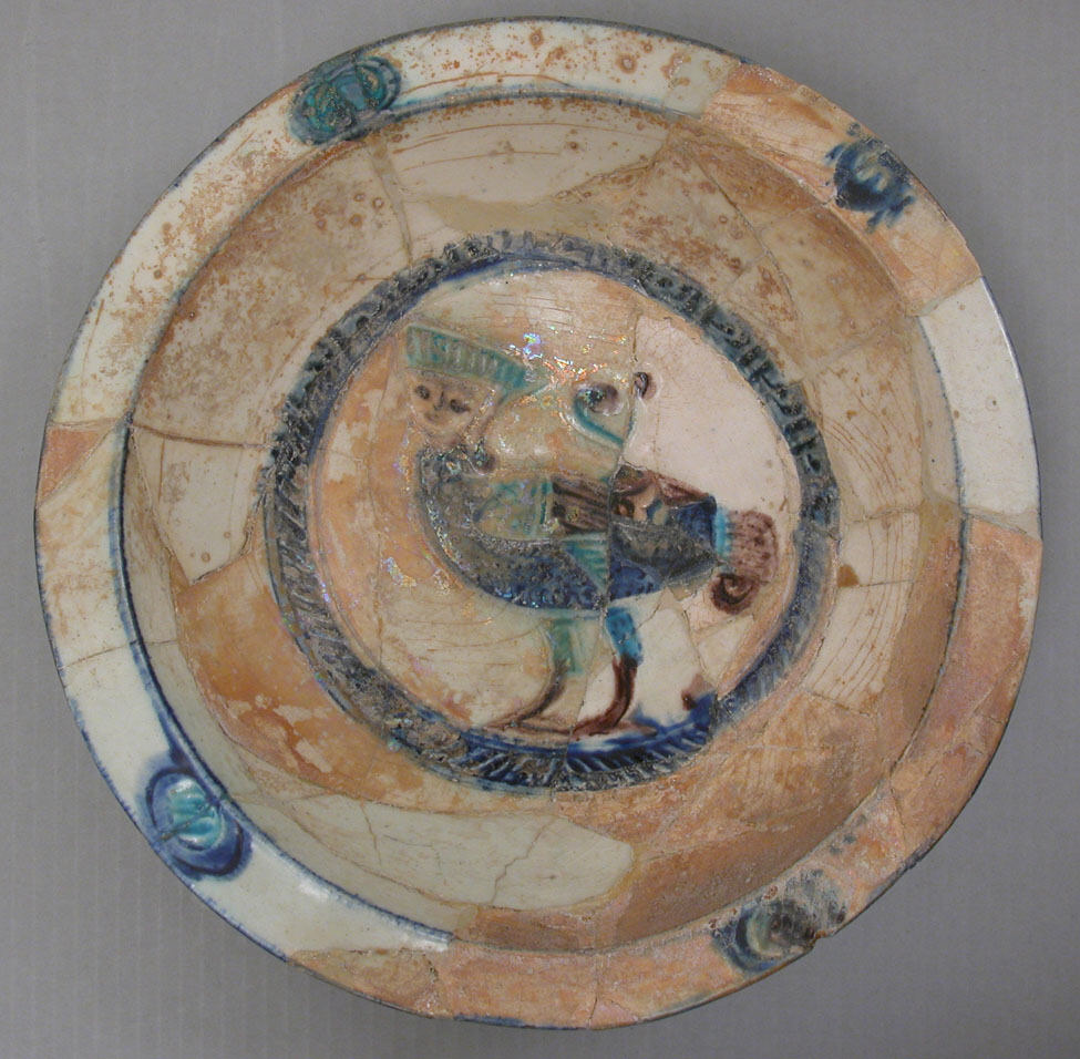
(This explains the iridescence seen in the peacock plate! I wonder if this iridescence was ever deliberately engineered by burying items or soaking them in special solutions)

Cobolt was imported from Europe via Venice. Muzarrad is a black stone used to make black, probable utilising antimony and comes from the mountains of Jajarm in Khorasan, Eastern Iran.

Turquoise is obtained from copper oxide and an alkaline glaze (well ozygenized). Copper oxide and a lead glaze (in reduction) produces green hues as well.


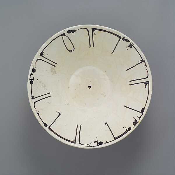
Bowl, 12th century, Iran. Met Museum of Art, Accession number: 29.160.12. Showing a slight hint of the iridescence.

Wednesday, 13 November 2013

Wisdom of the ages pt I

I present Wisdom of the Ages, part I. And by ages, I mean my grandfathers pottery diary he kindly gave me when he realized I was interested in glazes. Originally I didn't realize how valuable this little notebook was, but it contains years of experiments and notes on glazes and firing regimes so I have decided to transcribe some of it here so it won't be lost when he passes on and I eventually lose the book or die myself. This book was written by a man who can write in 7 languages and speak 10. Before coming to Australia he worked as a translator in The Netherlands. Once here, the only positions he could find to support his family were menial jobs, such as working on the production lines of a moccasin or glass factory.
He is a thin wiry man who enjoys digging holes in outback Australia and looking for opals even though he's had a triple bypass. As the only grandparent I have left he continues to impress me and each time I see him I do my best to learn more about him before he's gone forever.

In transcribing his book, please forgive the spelling mistakes or random words. Poppa writes in a beautiful flowing cursive hand which can be difficult to translate at times.

Decorating with slips or engobe

Slips or engobe is a mixture of clay, water and colouring oxides. The most refined form (Terra sigillata?) seived through 200 mesh mill burnish to a high polish without glazing.

Stir the slip regularly, otherwise it will separate. Dip the pot briefly, the shake off any drips.

Cut out paper stenciles. Sponge the newsprint carefully onto the surface. Dip. When dry, the paper stencil can be peeled carefully away.

In sgraffito ? decorating the dipped slip is scratched away in lines or areas, to reveal the contrasting colour of the clay beneath.

When using terra sigillata on a fine clay surface, leave the pot after it returns to leatherhard for some tume until it is almost starting to dry out. Then polish the surface with the back of a metal spoon..

In slip braiding, the slip is piped through a rubber bull in the manner of icing a cake. Experiment on leatherhard clay; any mistakes can be easily sponged off. Before starting, expell all air from the container - shake it to make the air rise to the surface; then gently squeeze it out

Trailing on a wet ground, horizontal surfaces can be covered with an even layer of slip - then trail a contrasting slip onto the set surface. Work quickly and when finished, tap the supporting board to flatten the slip covered surface.

Marblling is done as above with a variety of trailed slip colours in a simple design of lines or blobs. Just leave off tapping the board, agitate it with a quick circular motion until the slip colours begin to swirl into each other.

Feathering is draggin thin strands of one colour of braided slip into another using a single broom bristle on a pen.

Cut plastic foam into a variety of shapes and use these to sponge slip onto the leatherhard surface.

10th C Bowl, Iran. White Engobe / Slip has been scratched to crate a decorative border which states "Planning before work protects you from regret; prosperity and peace". Met Museum of Art, Accession No. 65.106.2.

Monday, 19 August 2013

Blue

Some things about blue to read later

The invention of blue and purple pigments in ancient times by H Berke


Page 47 in Part 5, Scientific Research in conservation of Ancient Sites on the Silk Road
Development of Ancient Synthetic Copper-Based blur and purple pigments. H Berke et al.

Page 56 in Part 5, Scientific Research in conservation of Ancient Sites on the Silk Road
Ishkor glazes of Uzbekistan. P Vandiver et al

Which has a quote that resounds with my work: The Asian view, predominant in China for the past thousand years as well as in contemporary Uzbekistan, is that replicas are not fakes and forgeries but a complement to a past tradition that is being revived, continued, and collected as an heir to that tradition.