Showing posts with label Iran. Show all posts

Sunday, 10 May 2020

Green globe attempt 6


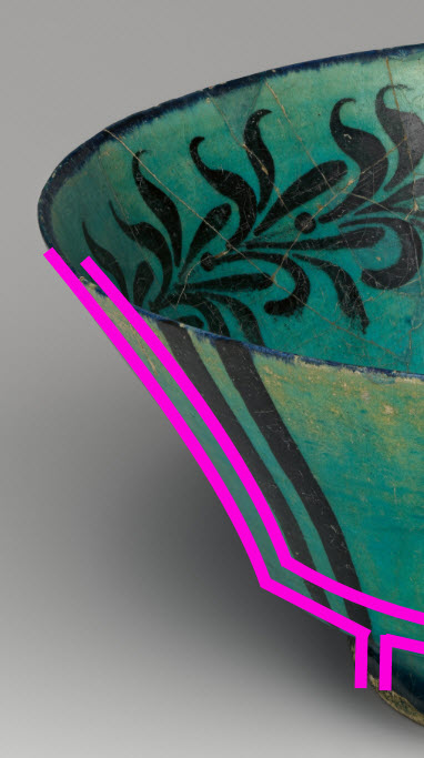
I fell in love with this pattern. I cannot find this extant bowl anywhere though. I can't even find it in any of my Pinterest collections which baffles me. I know I had this saved as a post-to-be on this blog but I can't even find that now. Even Google image search has failed me. If you know any of the details of the image to the right please comment!
On the left is my copy of the motifs. I really like the balance between the thin lines and the thick ones here.

Overglazed in sea green then transparent green and fired to stoneware. This came out lovely, I'm so happy with this cup!

Thursday, 7 May 2020

Green globe attempt 5


This was my 5th attempt at a green globe cup. I think I have figured out the difference between batch 1 & batch 2. Batch 1 was glazed at peak summer just after 12th night. Batch 2, glazed about a month later during cooler weather. As a result, a lot of the water from the first mid-green glaze didn’t evaporate before I dipped the cups in the translucent green. This meant less translucent green so a lighter frothier pale green. This time the first coat was given more time to dry so more of the translucent green glaze stuck. It provided a better green colour however the translucent glaze has a fair amount of silica in it so too much will make the glaze run and smear the under glaze.

Kashan cup with stylised vegetal decoration and inscriptions under a transparent turquoise glaze, Persian, early 13th century. Sotheby’s. Arts of the Harvey B Plotnik collection, item 177. There is also a slightly fancier version with slightly different proportions in the Victorian and Albert museum here.


Pictured above is the extant ewer whose pattern I have utilised. Per standard, I haven’t even bothered replicating the text as I do not know what it says nor do I know what effect an imprecise replication could have. I just loved how well balanced this design was and wondered if I could manage something similar. The original is 12cm high while mine is only 8cm, two thirds of the height. Skipping the basal section seemed like the right approach to maintain the shapes and ratios. I think it has worked out quite well.

The design in black under glaze. This was quite fun to do as the pattern wraps around the bulb of the cup quite nicely.

Fired. A small amount of running has obscured parts of the design. An interesting lesson from this cup - do not underglaze the rim. On previously posted green glaze cups it is possible to see the rim of the cup has very thin glaze. This section is usually pulled out of the glaze dip last and while thin, has the most time to accumulate glaze. As it is at the top of the cup during firing, it also is the first to have the glaze run. The sort of metallic shades to the rim on this cup is due to the glaze running and collecting the black underglaze. This has given it an interesting sheen. Though this is an easy way of treating the rim and makes a good visual border, I won't be using thick bands of underglaze like this again.

Friday, 1 May 2020

Not-a-globe but still green

Finished - green glaze conical cup with black underglaze in the style of 12-13th century Iran.

I've been focusing on achieving balance in my underglaze pieces recently. It is an interesting challenge to even out the light and dark space as well as the thick and thin lines. I was intrigued by this extant cup (below) as it has so much black yet still achieves a balanced finished look. I wondered if I could replicate it and if the lighter green I've been using will still do it justice.


Left: black underglaze. Sketched in 8B pencil then hand painted. Right: Extant cup, 12-13th century, Iran. Harvard Art Museum. Item 1936.48.

Even though the green ran a little, I'm pretty happy with how close to the extant item the colour is. The cup probably needs to be a tighter cone shape with slightly thicker walls. This unfortunately deformed a little in the kiln losing it's pleasing circular shape. It's still viable just not as perfect. A solid 7/10 in my opinion.


Sunday, 26 April 2020

2 level hydro-abrasion

I got impatient while waiting for the previous attempt at hydro-abrasion to be fired. So I started on the next project. The aim of this one is to create some depth in the design by applying the shellac, removing the clay, then repeating.

Step 1: design. I used a medallion motif from a broken plate. I don’t like the central design on the plate but I thought the medallions were charming. The leaves are a common motif of the time.


1200s, Seljuk. Iran or Syria. Cleveland Art Museum 1915.590.

This is the design after the first layer of shellac. I love the golden tone!

I used a scalpel to trim away unwanted shellac before abraiding. It is really important to angle the blade away from the shellac so it isn’t under cut. I found some of the thicker areas tore if I wasn’t careful. This is probably because this isn’t a new knife blade and may be a little dull.

This is the cup after the second layer has been applied and a raised. As you can see, I shadowed the outer loop with a second layer and added a small arrow leaf in the middle / top. For comparison the two medallions on the bottom haven’t been a raised yet.

With 8 design elements to raise, I found was really important to stop and let the cup dry after every 2-3 items. Otherwise the rim was absorbing a lot of the water and getting squishy.

This dark blue glaze was very thick and it took forever to dry. As you can see it's reasonably runny so it pools nicely in little pockets. I do need to be aware of it along the foot though as it threatens to spill over and cement my piece to the kiln shelf. I'm really happy with how this came out even though I wanted the second, lower level to hold more glaze.

Monday, 23 March 2020

Bowl shapes black underglaze - Iran

I've been working on cups for a couple of months now but many of my favourite references are bowls or dishes. Before trying to make some bisque to decorate I thought I should review some shapes before I get throwing. To narrow it down a little, I'll focus on Iranian objects preferentially black underglaze.
Bowl - 1180-1220 Kashan Iran. V&A, CIRC 53-1938
Small flare above foot then reasonably conicle. Likely incised foot / foot ring but no images of the base is available. Similar shape at The Met.

Bowl. 13th century. Kashan, Iran. The Met. Accession No. 20.120.32.
Incised foot with a flared edge.

Bowl, early 13th century. Iran. Brooklyn Museum. Accession no. 37.147.
Conicle with bulb 2/3rd of the way up. Slight lip.

Bowl. 1038-1194. Iran. Saint Louis Art Museum. Object 281:1951.
Conicle with an inclised foot ring. A slight bulb  4/5th of the way up with an overhanging lip. Similar bowl in Sotheby's. 


Sunday, 22 March 2020

Iranian globe cup II

The design:
This is the black under-glaze design. I used a single sized paint brush and a single coat for all of the items except the blackband at the top. I rather like the swirl in the foliage of this design.


The extant reference:
Extant jug from LACMA. (M.73.5.258). Kashan, Iran, early 13th century.

The reeds / kelp design and the fish are a common motif  (1, 2, 3, 4) appearing on cups, jugs and most commonly, in bowls. Given my cup is squatter than the extant piece I decided to do away with the top layer of fish. I also decided to continue the vine down the handle rather than blackening it out as it has been on the original. This was because the handle makes a greater % of the overall object and would have dominated the design. I am actually really pleased how well the fish came out. Their sinuous form is lovely, it's just a pity they are too low on the cup to be seen properly.


The glaze:
Both cups (+octopi cup previously posted) came through the kiln fine. What was most interesting about both of these cups is the difference between them and my 12th night A&S entry. Exactly the same glaze combination was used but these came out lighter with some interesting crystal patterns forming.

The result:
Front Back

Friday, 20 March 2020

Black underglaze and light blue

This is my favourite piece of bisque from the class I took in November. I’ve been hoarding it because I had no idea what I wanted to decorate it with and I really didn’t want to ruin this mug.

After the epically long time I spent with a tiny brush completing all the fine glaze detail on the mystery bisque albarello, I needed a better solution. While I was down at Potters Market I happened upon some squeeze bottles with variously sized needle bits. This is the result. The thick lines are multiple applications of the size 3 needle and the thin lines are the size 2. I think the underglaze is too runny for the size 4 needle and not runny enough for the size 1. I also suspect size 1 wouldn’t permit sufficient pigment to be applied. It may be good for fine dots though.

Generally I feel the squeeze bottle is a good idea however inconsistency in the bisque surface results in lumps and bumps in the glaze lines. I could scratch a lot back but I’m hoping a the over glaze will reduce the impact of the imperfections.

Extant jug. Sotheby’s. 

I glazed this in light blue with a clear overglaze. I twisted a finger when placing the cup on the drying rack so there are some inconsistencies along the rim where I’ve tried to repair the glaze coverage. I gotta say, I am not happy with the result.


As you can see, the fine brushwork has essentially been swamped by the glaze. Most of the detail is gone and everything has become streaky. I believe this was, in part, due to the clear cover glaze. The top rim was double dipped because of my clumsy finger damage to the original coat. This area seems to suffer most from the streaky effect.


Examination of the internal rim suggests that the light blue contributes. Note the lovely internal band where the light blue stops? It seems it already has a colour change where there is a thickness or boundary change. While I wouldn’t want to use this combination on another underglaze work, I’d love to see how this does with topographic detail. The colour somewhat reminds me of the pale Egyptian blues.

So, I don’t like this result but I’ve learned a few things. Pity I had to do my learning on a ‘good’ bisque but I guess practice will increase the number of things I consider ‘good’.


Thursday, 19 March 2020

Albarello collab

I’ve been posting this project at some of its stages already. It has now been fired so I thought it was about time I did a write up.
Fired!

Background:
Many years ago I participated in the laurel prize tourney. I don’t recall what I was displaying, I think I was in the middle of the A& S challenge so neck deep in my decorative glazing obsession. The laurel prize tourney helps participants engage with a variety of laurels to receive useful feedback and advice. It’s also open to non-laurels to review so you can inspire and engage with the rest of the Sca as well. Individual laurels will often give various participants small tokens. In this year in particular, Master Alex the Potter presented me with two handthrown bisque fired albarello. At the time I had no way of firing them myself and I wasn’t confident that I could do this limited resource justice.

Now, years later, I’m throwing my own pots. I haven’t yet created an albarello I like but I’m close enough. I can also get anything I like commercially fired to stoneware. Time and beyond to do something with the bisque I’ve had since before I moved to this state (at least 5 years ago). I’ll admit, I was really worried this mystery bisque wouldn’t hold up to the high firing temperature. Especially after the slumping seen in the Olla lid mystery bisque.


The original choice which was closer in shape to the bisque Extant arbarello from the Louve ref. OA 4091.


On inspiration:
On the right is the original choice. Unfortunately when I sketched it onto the bisque the symbols just didn’t balance right. So I switched to something else. The left is my final choice. I’ve had this image pinned to my ceramic inspiration page for a while. I’ve loved the simplicity of the component elements and the complexity of the background work for sometime. This style really has been a favourite of mine for a while and this seemed like the perfect time to execute it. Part of my decision lay in the colour fastness if black oxide and cobalt blue. Both can withstand high temperature firing with pretty good colour consistency. I couldn’t be sure how other colours, like the super fickle purple, would do so very late period Italian designs are out for now.

Of the two design choices, the second one was more balanced once sketched onto the bisque using 6B pencil.

On execution:
Glazing this took a fair while. I worked the main body in sections with the main design free handed and then double glazed to ensure colour integrity. The background super detailed swirls were a single stroke with a 5zero paint brush trimmed down to have shorter bristles and increase its stiffness. I’m pretty happy with the colour consistency achieved there. I was a little worried they’d end up streaky it grey.

The blue is ‘Cobalt Blue’ from Chrysanthos. It was painted on as a single layer as it was important to me that the black detail come through the blue. I added more blue than was on the original design because I had more foot space and thought the colour balance worked better. I’m not a huge fan of the free blue leaves at the top, I much prefer the blue outlined in black.

I designed the foot pattern myself utilising elements from the extant item. I considered a detailed swirl pattern in the background but decided that it would reduce the impact of the main panels. I really needed more light space to balance the overall look. I think it is important to understand not only the design context but the impact of the piece as a whole. I took for inspiration the bold black line features seen in many items of the time. I’m really pleased with how this came together. Using the lines also let me tie them into the shoulder pattern. Again, I could have overlooked this geometrical change and continued the extant pattern down but it wouldn’t have worked with the shape of the bisque. I did consider a vine design but decided the area would be to thin and the vines would look weird as a result. Plain black bars helps divide the d ensign
Elements without detracting from them.

On the future:
Overall, I’m very pleased with how this piece came out and I’m super relieved it didn’t deform in the kiln! I probably wouldn’t change the rim decoration even though it doesn’t overly appeal to me because it is a direct copy of the extant item. I will be using the other bisque item to trial an Italian or Spanish polychrome design next now I’m more confident in the integrity of the bisque in the high firing temperature.


Friday, 13 March 2020

Iranian nautical globe cups


The nautical glove cups are out of the kiln and I am so very pleased with the geeen glaze. It isn’t as smooth and transparent as the last cup but the bubble texture to the glaze is so much more fitting for the nautical theme.

I wanted to share the octopie cup while I take some time to write up a reflection for the kelp one.

Base: I wax resisted while glaze dipping. As a result of a deeper pool of wax than anticipated some of the black underglaze stripes didn’t receive any overglaze. Makes for an interesting contrast.

Monday, 9 March 2020

Iranian globe cup decoration


Full discussion and analysis once they have been fired. For now, an under-glaze update. I’m in love with the fish and kelp? I thought I’d also create my own motif with the octopie for a proper nautical theme.

Sunday, 8 March 2020

Islamic illumination reference helper

If you do not know about this you should!

Are you trying to find miniatures?
Are you getting frustrated by the need to troll though an entire manuscript just in case there's an image you can use?

I found the Islamic Printed Page. http://www.islamicpaintedpage.com/

Its a meta-reference which will tell you where in each illuminated folio the images you are and what they are of. It really speeds up the search times and makes visual research so much easier!

Saturday, 11 January 2020

Buff green Pt 1 - 12th night entry

12th Night Lochac A&S competition Entry

My entry for the Kingdom of Lochac 12th night Arts and Sciences competition in the category of "A container" is a cup based on an extant example from 12th century Iran (Persia). This cup has been hand thrown and hand glazed by myself over the last two months. It is currently unfinished, sitting at stage 6 of 7. This accompanying documentation will discuss the extant item, the creation of the object and my development in the following sections:
  • The extant object - what I've learned about how it was originally made & glazed.
    • construction - stonepaste
    • construction - shape
    • glaze - slip
    • glaze - underglaze
    • reference cup summary
  • Constructing the replica - stages and learning
  • Glazing the replica - stages and learning
  • Reflection
  • References (alphabetical)
  • Table - additional extant items referenced - shape


This project has taught me a lot about ceramics cups, having grown from previously only throwing one moderately successful cup under complete guidance prior to November 2019 to being able to independently form and shape the objects quite close to what I am after. I am rather pleased with the results and plan on exploring period shapes and glazes more going forward. I believe I have achieved the targeted outcome of this project and there is very little I’d change for future implementation.

Monday, 17 July 2017

Qasam and the Kashani cobalt

As outlined in previously, Kashan, Iran seems to be the initial production site of Blue on White ceramics. This is due to Kashan's proximity to a source of cobalt and other minerals useful in creating glazes. The Kashani cobalt originates from Qamsar aka Ghamsar which is located in the hills south of Kashan. Ghamsar is located proximal the the boundary between the Sanandaj-Sirjan Zone (1) (associated with the subduction of the Neo-Tethys Ocean) and the Urumieh-Dokhtar Arc. The U-D Arc hosts porphyry copper-gold deposits (2) as well as epithermal lead-zinc deposit (3).

Figure1: Geology of Iran - adapted from Geology of the Sari Gunay Epithermal Gold Deposit (4). The blue star marks the location of Kashan and to the south, Ghamsar (aka Qamsar).

The cobalt in Ghamsar is formed as part of a skarn deposit (5) resulting from the intrusion of a microdiorite into the Qom Formation. For non-geologists, the limestone in the Qom Formation is dissolved by the hot hydro-thermal fluids originating from intrusion of diorite, a volcanic rock. The contact between these two rock types metamorphises and recrystalises becoming the skarn deposit. The mineralology of a skarn is determined by the composition of the hydrothermal fluids and the limestone. The Ghamsar deposit appears to be structurally controlled, with the mineralising fluids travelling through faults. The cobalt is spatially associated with magnetite veins in the faults however the cobalt may precede the magnetite ore. The cobalt (smaltite) likely took the form of a silvery metal and would have been locally processed and washed before transport. Cobalt glaze requires less than 5% cobalt to achieve a rich blue colour. Thus it is a valuable and highly transportable product. Given the comparative weights, the washed cobalt, and other metals, would have been transported to markets in nearby cities.

Summary: Due to the unique geological processes and structures involved, precitipation of cobalt ore is rare and unlikely to be accessible at surface in a form useful for glaze production.

As a side note, the presence of copper-gold in the area would have provided minerals for glaze and lustre while the nearby lead-zinc deposits allowed for the transparent lead glaze that resulted the beautiful underglaze ceramics (6).

Why Kashan rather than Ghamsar?

We can see why ceramics are produced at Kashan instead of Ghamsar, the source of the ore, by consulting a soils map. Figure 2 indicates that the soils around Ghamsar are calcareous lithosols which are calcium rich, and often contain chunks of partly or fully unweathered rock. They are calcareous (calcium rich) as their parent rock is likely the limestones of the Qom Formation. Kashan, on the other hand, has a source of salt marsh soils. Salt marshes are a low energy environment which accumulate sediment over long periods of time. Marsh soils are typically fine grain and well sorted, these appear to be grey and low in organic matter. Small grain clays require less work for the potter to purify and create into fine earthenware. The clay would likely have been dried, ground and sifted before being utilised.

When creating blue glaze, cobalt commonly composes <5% of the overall blend (8). The low concentrations required make transporting the washed cobalt the short distance to the source of clay highly viable.


Figure 2: A map of the soils of Iran indicates which medieval towns would have superior clay. (7)


1: A new tectonic scenario for the Sanandaj–Sirjan Zone (Iran) 2005 A. Ghasemia, C.J. Talbotb Journal of Asian Earth Sciences.

2: Porphyry Copper Deposits of the Urumieh-Dokhtar Magmatic Arc, Iran. 2005. A. Zarasvandi, M. Zentilli, S. Liaghat. PGS Publishing, Linden Park, 2005. pg 441-452

3: The Ay Qalasi deposit: An epithermal Pb-Zn (Ag) mineralisation in the Urumineh-Dokhtar Volcanic Belt of northwestern Iran. DOI: 10.1127/njma/2015/0284

4: Geology of the Sari Gunay Epithermal Gold Deposit 2006 Northwest Iran. by J.P Richards, D. Wilkinson and T. Ulrich. Economic Geology. DOI:. 

5: Ore Mineralization at Qamsar Cobalt Deposit:Skarn and Metasomatism Evidences .  Hadi Mohammaddoost, Majid Ghaderi, Nematollah Rashidnejad-Omran  The 1st International Applied Geological Congress

6: Islamic pottery, a brief history. Metropolitan Museum of Art.

7: Soils of Iran 1961. M.L Dewan, J. Famouri. Food and Agriculture Organisation of the United Nations. 

8: Ceramic Arts Network, accessed 31/12/2018.

Tuesday, 13 June 2017

Squwark plate

I made a plate for my friend Phillipa. She's pretty awesome and loves her chickens so when I found the following image I couldn't help but modify it. I believe the original is supposed to be peacocks, but their little bug eyes and beaks made me think of chickens. So they became chickens.

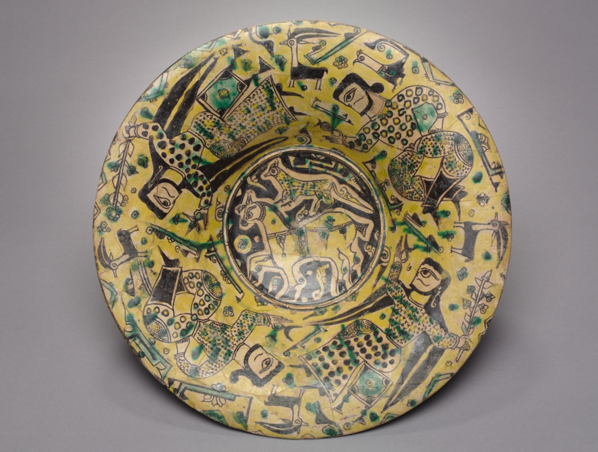
Bowl. Iran, Nishapur 10th century. Earthenware, buff slip, underglaze slip-painted,. LACMA M.73.5.289. (No direct link is possible, check out items 30 and 52 of 99)

The LACMA have two bowls in this style. The other one (M.73.5.266) has a lot more intricate detail but a similar peacock shape. The buffware with this figerative style is specific to Nishapur, Iran. The Meteropolitian Museum of Art conducted a number of digs in the city in the early 20th century and recovered numerous artifacts (1). The style is closely linked to sgraffito but lacks the incised decorations (2). A good example of sgraffito ware can be found here for those curious as to it's styling.


The finished plate complete with a variety of personalized chickens.
I've been doing a number of yellow and green items recently. I quite like the colour combination, but I'm also aware there a much more experienced artist who produces sgraffito in my Kingdom, Alex the Potter. Since I don't make my own bisque yet, I'll be steering clear of sgraffito and limiting my emulation of buff ware.

I'm really happy with how this turned out. The green/yellow/white/black contrast looks great and is appealing to modern tastes as well. I only hope Phillipa likes it as much as I do.

1) The Met at Nishapur. http://www.metmuseum.org/toah/hd/nish/hd_nish.htm
2) Sgraffito from Nishapur. http://www.metmuseum.org/blogs/ruminations/2015/production-history-of-sgraffito-ware-from-nishapur

3) The extant plate - http://islamic-arts.org/2011/ceramic-vessel-collection-at-lacma/

Sunday, 14 May 2017

Why Iran? Why Kashan?

So, I have resolved my first research question:

How did Blue and White ceramics transition from China to Europe?
Turns out they didn't. Blue and white ceramics originated in Iran and spread across the middle east and eventually made it to China. China developed a new style as they were able to fire their glazes at a higher temperature for porcelain. This changed the colour slightly as they were able to burn out arsenic and some of the manganese. China eventually discovered their own deposits of cobalt, but were dependent on imports from Iran for many years. The lighter, stronger porcelain transitioned out of China into Europe along the silk road. It resulted in the revival of Blue on White popularity and the many duplication of patterns onto heavier earthenware. This Asian-appropriation was adopted by the Dutch in their manufactories and given a more European theme (Delft) while the Italians went down the multi-colour path of majolica. Turkey meanwhile, developed their classic red, blue, turquoise of the Iznik style.

The next research question to be answered (it's a two parter):
Why Iran and Why Kashan?
What was it about Kashan that permitted the production of such a large number of tiles? Was it geology, geography or political?
Where did the cobalt actually originate from? There are a number of geological settings that could produce cobalt ores. How was it refined?


Saturday, 13 May 2017

Festival cups

In theory, the cups have all gone to their new owners so I can post the posse of my latest experiments. Three different eras, three different styles and three different colour sets! I'm very please with how these turned out. I was a little unsure if the new glazes would have the right tones and if the shading would work well but I seemed to have nailed the contrast I needed.

Cup 1 reference:
I've been sitting on this reference image for a while. If you've visited my Pinterest collections you'll know I mostly have blue and white ceramics however I am fascinated by other extant artifacts as well. This plate features a black horse with a cheetah on it's back. The original is reportedly in the Asian Art Museum of San Francisco however I haven't been able to find a formal online reference for it. At the moment the only two bits of information come from flicker and trip advisor. Not the best resources. That said, I have managed to find a piece in a similar style, depicting the same subject matter in the Cleveland Museum of Art (here, and info here). The Cleveland one apparently dates to the 900's so it's fair to assume the my one is from around the same time and place.
Horse with Cheetah, 800-1200.Nishapur, Iran. Asian Art Museum, San Francisco. 
Cup 2 reference:
This one turned up when I was trolling The Met for references for a different research project. I stored it away on my Pinterest and when I wanted to make a prize for the Fighter Auction Tourney I thought this would be perfect. I really liked the style of the griffin but wasn't too keen on the rest of the bowl. It didn't translate into a cup as well as the horse did because the griffin is too long compared to it's height. I should have shrunk it down more and put two on the cup with a vine border at the top but i didn't know what the vines would look like until I was done. Ah well, I can always do a reprise if the mood strikes me.
Bowl with Griffin. 11th Century, Egypt. The Met Museum. Item no. 1970.23
Cup 3 reference:
I didn't find this reference. It was passed onto me as a suggestion for a different project. I modified the design at the request of it's new owner to suit her heraldry. This cup is based on a typical Albrello (Drug Jar) which features three sets of wings. When I find the original (I suspect The Met due to the background), I'll post it here.
Albrello (drug jar), Italy. Museum and date unknown.

Pre firing:

Finding myself not so sure about the layout and I modified the nose into a beak
.
Blue and gold, light yellow and green, gold and red.


Sunday, 17 January 2016

Plate - 14th century Sultanabad

I've been rather quiet these last three months as I've been moving across the country and am still finding my feet in this new city. I have now found a place to rent and my furniture gets delivered in three days! I am enjoying finding all sorts of new things but last weekend I thought I'd try something new and old at the same time. I had passed through a homewares and overpriced duct collectors shop and found the sales lady painting white plates with some sort of commercial poly-paint. I've seen this stuff before, you paint it on, put the item in the oven and ta da - customized item. Unfortunately, the paint doesn't really stand up to wear and tear, the Stormhold Baronial plates haven't really withstood knives, forks and hand washing by people not told about their special needs. This is why I prefer to glaze my plates rather than buy the ceramic paint from spotlight. True, this restricts me in size, shape and I need people to fire it for me but the end product is much more durable. I've decided that finishing the A&S 50 challenge was enjolyable but I'm not done with the ceramic painting yet. So, I need to find someone in my new city who can supply the bisque and fire the finished products for me. Or make arrangements to get the my bisque to Melbourne for firing and collection by a friend.

So last weekend, off I went to All Fired Up in Joondalup. I've mentioned this place on my 'where to make your own ceramics' list for a while now so I thought it was the perfect first candidate for a replacement ceramics facilitator (i only have two candidates). So I saved a number of reference images from the Met Museum on my iPhone and off I rode (image 1). I arrived at noon, spent half an hour browsing their limited stock of bisque before settling down to another project. When I went I had no real plan in mind as I wasn't sure what sort of bisque range they'd have (small). I was there until closing (5pm) and finished the front of a plate and made an attempt at the back.

The blackwork outlines complete. I was tempted to finish here because the grey and white looked so lovely and balanced just by themselves but I knew it'd fire to black and throw the look off.

The blue is complete. Note the solid look of the blue over the black. The original used transparent glazes in blue and turquoise of the Saltanabad style. This is really hard to replicate using opaque glazes so I aimed for a wash and hoped the fired results would be satisfactory.
Finished! Well balanced and really happy with the front.

 The center of the design - surprisingly balanced for a free hand experiment.


Replicate or create original designs?
This is always a question I ask myself when creating something new. Should I replicate an original extant item I'm really taken with, or should I use design elements from a specific time/place and design my own items? I think every SCA artisan asks themselves this same question and I believe the answer comes down to, will the item be fit for purpose? SCA items seem to fit into two categories, 1) cheap make do items for a single or short term use or 2) expensive or hand made items design to hopefully last an SCA lifetime. The items in the second group are not used on a daily basis and are often expected to last for years beyond their more often used modern counterparts. For many people in the SCA, a ceramic item that is fit for use must look medieval. For some people this means old, worn or clearly handmade (see previous rants), others want ceramic items that fit their game, either referencing their personas storyline or featuring their heraldry. The final group of SCA users want items that completely replicate medieval items.

I feel that I make items that generally fit into five categories.
a) appropriation, the grotesques are an example of this. I copied images from manuscripts into a new medium. They are the least medieval ceramic thing I've made (let's not count the escher plate).
b) adaption, I count my early household plates in this category. The elements came from a number of related sources but the combination was created to meet a specific need.
c) insertion, Into this category I fit the Gabs & Stanzi plates. The design and a majority of the plate were period replicas with small elements of heraldric symbols to craft something appropriate for the leaders of my other household.
d) replication, I have replicated the designs on many of my A&S items straight from the originals adapting them only slightly so they'd fit on the bisque available. This Sultanabad item is one such item.
e) creation, the items I'm often most proud of, the Dr Suess bowl and plate fit into this category. These items are inspired by their medieval counterpart but the design is very much original.

Extant reference - Bowl, Il-Khanid, Iran, Sultanabad. 14th century. Freer Slacker, S1997.129.