Saturday, 27 May 2017

Star tile lineup from the A&S 50 challenge


 No.
 Star Tile
 Original tile
 Time / Place
 1


Kashan 1262
 2


 3


 4
 5
Kashan 12th/13th C
 6

 7

13th century, Iran.
 8


 9


 10


 11


 12


 13


 14


 15


 16


 17


 18


 19


 20


 21


 22


 23


 24


 25


Future tiles are hiding here.

Saturday, 20 May 2017

Belated ceramic 48 & 49 - Tiles 12, 13, 14, 15 & 16

The tile project is ongoing! I collected four new tiles this April and I'm so happy with how the design is going. I'm going to start posting my reference chart as well as boast about my project. Forgive the not so amazing picture but it's the best I have.

One of the small 1/4 cross tiles isn't show here as it doesn't have it's matching stars yet. The key (belated) tiles are the three in the bottom left of the image.


Two of the tiles are from one reference panel, the third on the panel is already featured on the right of the middle row.

Lustre tiles. 14th Century. Kashan, Iran. The British Museum. 1888.0109.4

Sunday, 14 May 2017

Why Iran? Why Kashan?

So, I have resolved my first research question:

How did Blue and White ceramics transition from China to Europe?
Turns out they didn't. Blue and white ceramics originated in Iran and spread across the middle east and eventually made it to China. China developed a new style as they were able to fire their glazes at a higher temperature for porcelain. This changed the colour slightly as they were able to burn out arsenic and some of the manganese. China eventually discovered their own deposits of cobalt, but were dependent on imports from Iran for many years. The lighter, stronger porcelain transitioned out of China into Europe along the silk road. It resulted in the revival of Blue on White popularity and the many duplication of patterns onto heavier earthenware. This Asian-appropriation was adopted by the Dutch in their manufactories and given a more European theme (Delft) while the Italians went down the multi-colour path of majolica. Turkey meanwhile, developed their classic red, blue, turquoise of the Iznik style.

The next research question to be answered (it's a two parter):
Why Iran and Why Kashan?
What was it about Kashan that permitted the production of such a large number of tiles? Was it geology, geography or political?
Where did the cobalt actually originate from? There are a number of geological settings that could produce cobalt ores. How was it refined?


Saturday, 13 May 2017

Festival cups

In theory, the cups have all gone to their new owners so I can post the posse of my latest experiments. Three different eras, three different styles and three different colour sets! I'm very please with how these turned out. I was a little unsure if the new glazes would have the right tones and if the shading would work well but I seemed to have nailed the contrast I needed.

Cup 1 reference:
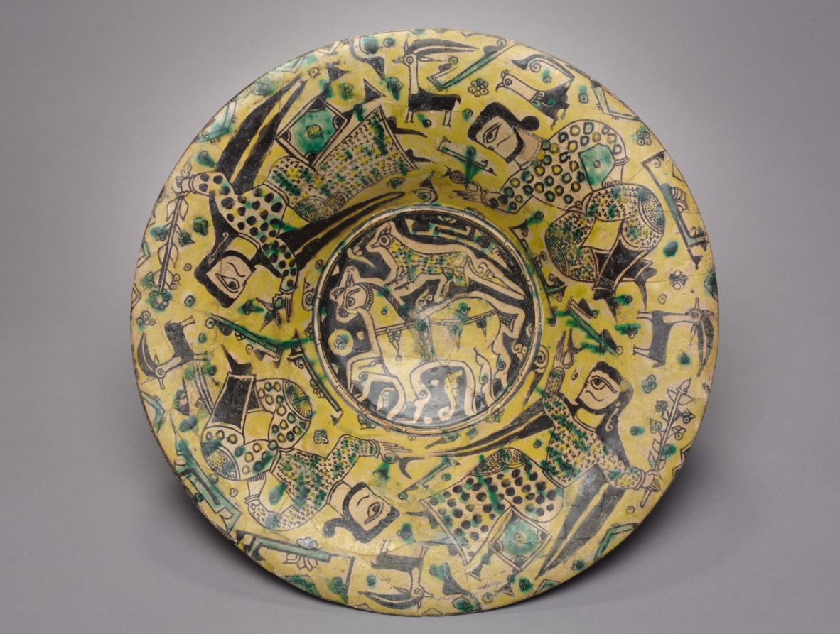
I've been sitting on this reference image for a while. If you've visited my Pinterest collections you'll know I mostly have blue and white ceramics however I am fascinated by other extant artifacts as well. This plate features a black horse with a cheetah on it's back. The original is reportedly in the Asian Art Museum of San Francisco however I haven't been able to find a formal online reference for it. At the moment the only two bits of information come from flicker and trip advisor. Not the best resources. That said, I have managed to find a piece in a similar style, depicting the same subject matter in the Cleveland Museum of Art (here, and info here). The Cleveland one apparently dates to the 900's so it's fair to assume the my one is from around the same time and place.
Horse with Cheetah, 800-1200.Nishapur, Iran. Asian Art Museum, San Francisco. 
Cup 2 reference:
This one turned up when I was trolling The Met for references for a different research project. I stored it away on my Pinterest and when I wanted to make a prize for the Fighter Auction Tourney I thought this would be perfect. I really liked the style of the griffin but wasn't too keen on the rest of the bowl. It didn't translate into a cup as well as the horse did because the griffin is too long compared to it's height. I should have shrunk it down more and put two on the cup with a vine border at the top but i didn't know what the vines would look like until I was done. Ah well, I can always do a reprise if the mood strikes me.
Bowl with Griffin. 11th Century, Egypt. The Met Museum. Item no. 1970.23
Cup 3 reference:
I didn't find this reference. It was passed onto me as a suggestion for a different project. I modified the design at the request of it's new owner to suit her heraldry. This cup is based on a typical Albrello (Drug Jar) which features three sets of wings. When I find the original (I suspect The Met due to the background), I'll post it here.
Albrello (drug jar), Italy. Museum and date unknown.

Pre firing:

Finding myself not so sure about the layout and I modified the nose into a beak
.
Blue and gold, light yellow and green, gold and red.


Monday, 23 January 2017

Ceramic 53 - Montjoye jug

I acquired a bisque jug a while back and have been stuck for an appropriate design to place upon it. I trolled the internet for reference images of extant items that had the right shape. Originally I was thinking of converting the central image on the jug (Figure 1) into a household of fighting badgers but in every trial sketch they ended up looking like teddy bears.

Figure 1: Jug, Montelupo, 1480, Tin glazed earthenware painted with metal based colours. V&A, no. 1568-1855

Inspiration:
So I decided to go looking for more inspiration. I found it. A friend of mine, Montjoye, who I admire quite a bit, posted a flurry of things on her blog. One post caught my eye because it was regarding the recent acquisition of some blue and white ceramic item for her kitchen. Given my enjoyment of blue and white, I decided to make her a blue and white jug because she brews some very tasty stuff.

So, many museum collections later I amassed a number of pinterest images I found inspiring, nothing was a 100% match for the jug shape that I had, but there were quite a few jugs, drug jars and miscellaneous items that were in the ball park. I also had a time frame restriction as Montjoye camps with a group that try to be mid-medieval in every way.

There are a number of drug bottles, jugs and vases that do feature blue and white, but the designs just didn't appeal to me. The key inspiration (figure 2) was chosen due to it's simple 2 colour motif which would convert well to blue, black and white.
Figure 2: Drug bottle, Italy, Tin glazed earthenware, date unknown. V&A no. 629-1902

Timeframe:
The inspiration jug has no date, but appears to date between late 14th century and early 16th century. That is a rather large time frame but I believe it's closer to the 14th century for the following reasons: The late 14th century examples have a similar pallet of colours and a similar consistancy for application (layers can be seen in the green leaves above). The early 16th century example, is much more ornate in it's design with multiple shades of blue, yellows and oranges (i really like the wyvyrn in this one). It also features a neat little twisted spout holder which gives it a cute flare. One final reason I believe it's closer to the 14th century than the 16th is shown in Figure 3. This jug has the right shape however it seems to be one of the earlier examples of the high firing colour pallet. The yellow, blue, green and manganese brown/purple suggest  this jug is the mid point between the early 16th century highly crafted majolica and the reference jug. So I give the jug in Figure 2 a date range of 1400-1450 ish.
Figure 3: Drug jar, Italy. Tin glazed earthenware with high-firing oxides. 1450. V&A no. 1222-1901

Motif:
Many of jugs I examined feature writing around them. The text usually designates what the contents of the drug jar is, for example - SYo DI PAPAVARI = syrup of poppies, SYo DE FARFARE = syrup of coltsfoot (tussilago). I considered translating alcoholic beverage, or spirit of grain or some such into Italian but that would sort of lock down the use of the jar. This was the intention of the original jars as a measure to prevent residue of one drug mixed with another but not required for this project. I could have removed the text, but that would have done away with the key feature of the jar. Instead, I decided upon labeling the jug with her name, Montjoye, as she does with her alcohol bottles..

The next challenge was getting the characters in the text right. I downloaded image after image and copied all the writing forms as Master Piers taught me years ago. I wasn't able to amass an entire alphabet and there was a huge variation in character forms between the jugs I was able to find. So I could either use a mishmash alphabet which spanned about 100 years (badbad), pick one and try and fit the missing letters in, find an extant alphabet from the right time and use that, or come up with something else.
I decided to copy the text form that Montjoye uses on her bottles (and had on her website at the time). I was able to download a copy of a picture of one of her successful brews and figure out the lettering from the computer screen. I'm pretty happy with how the kerning turned out.

I also placed three trefoils on the jug, as they are a key feature of her device. I think the motif came out less crowded than the Italian-ware and strikes me as more of a spanish take on an Italian jug.

All in all, I'm happy with this project and I hope Montjoye gets much use out of it as a jug or a vase or whatever. The best thing about gifting ceramics is if the recipient doesn't like it, they can accidentally smash it and I'd be none the wiser. My general dislike of repetition means they're unlikely to get an exact replacement anyway and I'm always open to suggestions!

Wednesday, 5 October 2016

Ceramic 47 - Tile 11

This one collected dust for a while. That is to say, the plastic I wrapped it in after it was glazed and dry collected dust as I didn't have an opportunity to drop it off to get glazed for months. This is the start of the top corner. I'm not sure if I'm going to finish the entire square but I do hope to finish at least the top half.


Ceramic 52 - Nyssa's household plate


 Sketches of wolf anatomy by J.C. Amberlyn

This plate has been on the go since I completed Vandels plate in 2013!. I started the two at the same time but Nyssa hadn't registered her device yet so I didn't want to make the plate until she had. After registration, I'd sort of lost interest in this project because it was at the time consuming central blue bits stage and I'd already done two of these. I have a very short attention span. This plate, in it's half finished form, moved house with me three times before finally ending up in Perth. I decided Nyssa's birthday was the perfect reason to finally complete this thing so I could stop worrying about scratching the underglaze and give my friend something she'll hopefully use at every future event. I like the fact she and Ro have a matching set now.

 Nyssa's banner by Lasy Elizabet Hunter.

Nyssa  device is, quarterly purpure and sable, a wolf statant and a bordure argent. I had a bit of trouble with the device as heraldic wolves tend to be a little too dog like. I was tempted to copy the wolf that Lady Elizabet had used for Nyssa's heraldic banner but I didn't think the outlines would work as well in the size I was working on. I was also worried that the underglaze wouldn't allow me to make the fine shapes I needed to do. After much googling and a number of sketches, I decided to go with a smidge of viking knot work to tie in where her Norse name.


I also received some great advice at the Laurel Prize Tourney this year which was to investigate the skeleton of any animal I plan on drawing to work out the most realistic body shapes. This was specifically for jaw lines so my badgers would stop looking like racoons but the same concept apples to any animal. I purchased Drawing Wildlife by J.C. Amberlyn. It's a great book which shows skulls and skeletons of many creatures as well as fur patterns and postures. It takes you through how to draw particular animals step by step. I found it amazingly useful!


I wanted to honour Nyssa's viking persona and have a wolf that looks more wolfy than the typical heraldic wolf so I did some sketches and practiced and practiced.

Finally, I was able to paint the plate and drop it off at the team at Glaze It for firing. Of the three plates in this series so far, I am most happy with this one! I'm also pleased that Nyssa and Rohan have matching couples plates. I don't often make sets but when I do the satisfaction is -almost- work the tedium.


Saturday, 30 April 2016

Pelican Outfil #4 - Cloud collar design research

As mentioned in a previous post Miriam of the Alawim of Stormhold has given me a number of PDF's of Persian Cloud Collar images. I believe she collected the images for a Laurel Prize Tourney entry. This week I've been analyzing the images in my typical science before art process. (This is going to be an image heavy post). My conclusions are as follows:


The first set of images Miriam sent me come from one manuscript. Firdawsī, Shāhnāmah, Book of Kings. which is Turkman/Timurid style. Dated 23 Jumadi II 891 (26 June 1486). This manuscript features to main styles of cloud collar, a floral style, and what I've been privately referring to as the geese style. Cloud collars of either design don't seem to be restricted to a certain class or sex and can be seen on a variety of coat styles. I've drawn up the designs from a couple of the images in black and white to make it easier to see the particular elements.


In both of the images above, the same goose like shape can be seen as a major symbol surrounded by blobs and tick marks. The goose is always pointing towards the left and is rarely inverted to balance out the pattern on the opposite shoulder. Given the frequent occurrence of this decorative element I began to wonder what it symbolised so I spent some time squinting at the screen and trying to determine what it actually was. One figure has a single goose on the upper thighs so I worked out the shape as best I could.

After looking at many examples of the goose, I've some to the conclusion that it's possibly a word or phrase written in islamic calligraphy. Islamic calligraphy is a beautiful art form but difficult to read for a Persian newbie. I've waxed lyrical about my reluctance to copy something I don't understand so that leaves the floral designs. Two of these come from military figures which wear a chain mail or scale coifs. Given the regular pattern and symbols, and the fact the pattern isn't adjusted to the lobes of the collar just the center neck, I'd suggest this fabric would have been a brocade rather than embroidered. Brocades are harder wearing and can be cut from second hand garments. The threads of the embroidery are more likely to be caught and damaged by the rings used in construction of either coif. The third floral design appears to be a leaf pattern and I copied it because it seems to blend seamlessly with the coat along the arm. Perhaps this one is embroidered directly onto the coat rather than onto a separate piece of applique attached to the shoulders?


Second manuscript set of images Miriam sent me were from The Khamsah' of Niẓāmī which dates from 1539-1543. This manuscript features cloud collars which were counter-coloured against the coat. The designs are stylistic and floral reminiscent of the Iznik tiles produced in the area. There's one I particularly like which has a tiny bee or month amongst the flowers. Once again, all sorts of figures wear these sorts of collars. The manuscript also has a number of indivisuals with the gold on base style collars seen in the previous manuscript. I've drawn up two of these designs.


The first is a seated man with a repetitive design on his collar. This may be done in multiple colours of silk. I've drawn the central medallion with a Star Wars twist as it's hard to tell what it is given the size of the image. The other collar is gold and features floral designs which are repeated in each lobe. This figure also has a slightly different floral design around the sleeve cuffs. I like both of these designs as repetition creates balance but I'm also away it may not be possible with my pattern given the different shapes and sizes of the lobes. This is something I'm going to have to research further and maybe draw up a bunch of mini images to see what I like the most.


One question you might be asking, if you've been following these posts, why am I researching Timurid / Turkish cloud collars when I've already stated I wanted to make an Indo-Mughal outfit?
The reason being is the image I'm most drawn to is Babar seeks his Grandmothers advice. It's a Mughal manuscript which depicts the Turkish born (1483) Babar who established the Mughal empire. At first I thought this image, painted around 1590, was a 16th century impression of garb worn by Persians in the 15th century. I then did some more research and found that cloud collars were a thing well past the 16th century so it was possible this scene was depicted with the figures wearing 'modern' clothing to assist the audience in relating to the tale. The Mughals did wear cloud collars and Persian inspired outfits. I've found a few other images that document this and will continue looking for more.

Detail - Court of Ravana, folio from a Ramayana. India, 1605. Met Museum, Accession no. 2002.505