Wednesday, 29 February 2012

Plate 07 - Drollery II

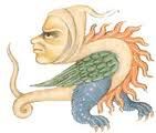
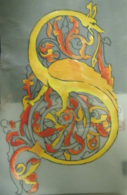
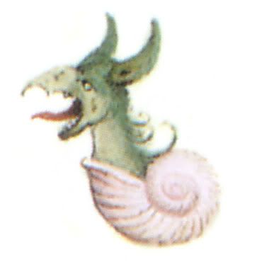
Plate 7 is another experiment in shading using a drollery image. This one is from Les Heures de Croy (the Croy Hours) currently in the collection of the Österreichische Nationalbibliothek in Vienna. I found a wonderful art blog which had posted a number of drollery images from the Croy hours (http://www.spamula.net/blog/2004/08/drolleries.html). The blog author had scanned the drollery’s from a book, Codices Illustres. As I have been having trouble to properly trace the previous drollery back to its manuscript I thought I’d try one of these instead (Figure 2). I picked this one for two simple reasons: I wanted to use blue (needing to take home the glaze for a different project) and I wanted to use some of the remaining yellow/brown from the previous drollery. This little guy seemed perfect.


Figure 1: The vines used as inspiration. (San Marino, Huntington Library, HM 1100, f. 13, John on Patmos)

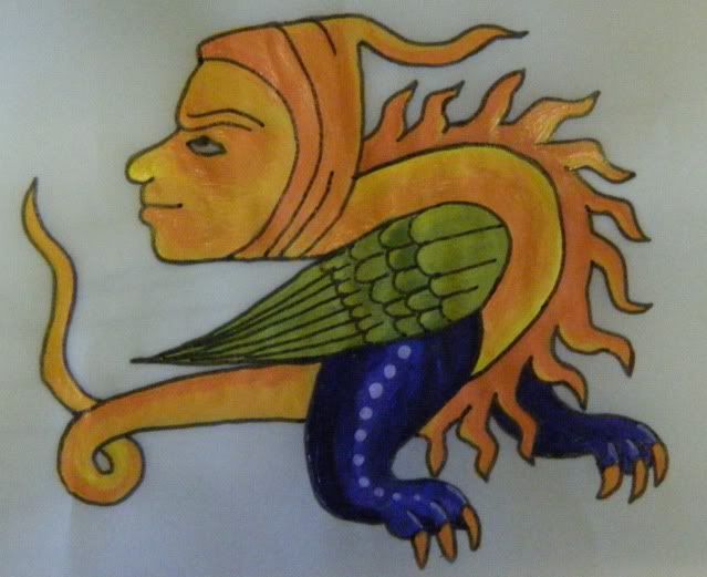
As the intent of this piece is to practice shading in different colours with the glazes I coloured in the back of the image with a 6B greylead and then traced the image onto the plate. Happily, the greylead burns off in the kiln. This meant I could maintain the proportions of the original image rather than having to freehand it like the last drollery. Having completed the drollery I decided the plate needed spiffing up a little. Though I sort of consider plate 6 and 7 to be a set, I didn’t want to do the same vines as I’d get board very quickly. So I cruised some images of illumination and found the perfect thing (Figure 1) and freehanded in onto the plate. In the before firing shot you can see the mess of greylead I left behind trying to get it right. At a loss for how to complete it, I took an idea from one of the Deruta plates and repeated the face of the drollery at the top of the page.
Figure 2: The Croy drollery
Figure 3: My attempt
Figure 4: The plate – pre firing. The greylead is visible
Figure 5: After firing. The colours become stronger and shading more evident.

Saturday, 18 February 2012

Plate 06 - Drollery I


I’ve been ogling plates made in Deruta for sometime now (above - Deruta 1520-1525). There are some very pretty ones in the Victoria and Albert Museum however the ones I like the most require an artistic talent I’m not sure I possess, namely the ability to shade things well. As I’ve previously posted, I’ve tried some simple illumination experiments. I know mixing light is completely different from mixing pigment and I suspect mixing glaze is different again as the chemical compounds may interact unexpectedly in the kiln.

So, having attempted shading with pigment, I have used the same image from Drollery (22nd Jan) on a medium sized plate. I completely forgot to take a ‘before firing’ shot. The shading looked good when I handed it over. A nice yellow/brown skin colour, and brown/orange spikes. I’m not entirely sure the legs will work with the blue shading but I guess that remains to be seen. I added a simple vine work around the edges of the plate in the same green used on the wings because the plate looked a little empty without it. As a final experiment I added a lighter green shading layer over the dark green.

...

 It seems to have worked, mostly.

Figure 1: The completed plate. Light green on the dark vines doesn’t appear to have been successful

Figure 2: Zoom in of the drollery. Light blue legs overshaded to darkblue – success!

Thursday, 16 February 2012

Cranach gown brustflect construction - an analysis

I'm still trying to work out how to construct a Cranach gown 'properly'. I've found some higher resolution images of some of the Cranach women which is helping in my task.


The Brustflect

1 - Jesus with Mary & saints Catherine & Barbara & 2 cherubs – Detail

Highlighted here in green, the brustflect seems to join the right of the bodice snugly (A) while on the left the shading may suggest that the bodice overlaps the brustflect (B). The embroidery also seems to stop at the right but continue under the bodice at the left.
At the bottom of the brustflect (C), shading indicates the guards on the dress overlie the opaque white fabric.

2 - The suicide of Lucretia.
In this image the brustflect has been folded down however the folding at A suggests the opaque fabric continues around her body but it seems to run under the guard. At B we can see the decorative part of the brustflect is attached directly to the opaque white fabric and would continue down to meet the skirt (C). The Brustflect and opaque white marterial seem to be a single unit and run under the guards of the dress.

3 - Lucretia (1512).
In this image we can see the Brustflect (A) has been folded down to bare her breasts. This brustflect is golden on the back rather than white (maybe because Cranach wanted to highlight then opened dress rather than have the panel blend into the excessive levels of white). There are strong black ties which would be the waist chinching ties seen on many Cranach gowns. I first thought these were tying the brustflect on and the pearled trim was the brustflects decorative trim. Closer examination shows the pearled trim is part of the dress guard as it runs straight from her shoulder. It is also possible to see lighter ties (C) that appear to come from the brustflect. These ties are too thick to be part of the fur and run against the grain in some locations.
These images somewhat contradict each other, it may be that one side of the brustflect is pinned or sewn in place while the other is pinned or tied.

Chemise / underdress

1- Jesus with Mary & saints Catherine & Barbara & 2 cherubs – Detail

Here we clearly see two different fabrics, the translucent chemise (D) and the opaque white fabric below the brustflect.
The skirt seems to join the bodice at C and shadows at A suggests the bodice overlies the opaque white (chemise?). It is not clear at B if the white is separate to the skirt, an underdress, or joined as a stomacher.


2- The suicide of Lucretia (1529).
In this image the brustflect has been folded down however the folding at A suggests the opaque fabric continues around her body but it seems to run under the guard. At B we can see the decorative part of the brustflect is attached directly to the opaque white fabric and would continue down to meet the skirt (C).

3 - Judith with the Head of Holofernes (1537 – 1540)

Here we see the white opaque material has been trimmed with tiny pearls and pleated in a ruffle on the top of the brustflect.

On the basis of these images, I would propose the brustflect is most likely attached to the opaque fabric and the combination is used as a supporting garment under the main gown. I would suggest that it is attached on either side with pins much like the tudor gown outlined in Patterns of Fashion by Janet Arnold.


Chemise Neckline?

1- Mary Magdalene, 1525.
A number of the Cranach women have been painted with sloping black lines over their breast. It has been suggested that this is the neckline of a translucent chemise however in many of the images (like the one opposite) there is no discernable change in skin tone nor is the

2 - Jesus with Mary & saints Catherine & Barbara & 2 cherubs – Detail
The Chamise:
In this image two parallel lines curve over Catherine’s chest (A). Her skin tone between these lines (B) is pink suggesting this is the collar of a translucent chemise (there are also wrinkles near her armpits where it tucks into the brustflect).
It’s unlikely that the fabric would change at the bust line from translucent to opaque as the translucent fabric doesn’t seem structural enough to support the opaque fabric.

3 - Saint Dorothea, 1530.
Here Dorothea has a simple black ribbon looped around her neck. This is clearly not the edge of a chemise as it loops around itself multiple times. John Thrupp in “The Anglo-Saxon Home: A History of the Domestic Institutions and Customs of England” proposes that ribbons embroidered with prayers would be worn around the neck. While his book covers a period earlier than the Cranach dresses and of a different culture, it strikes me that a majority of the women wearing the ribbons wear simpler dresses. I’ve also noticed that when I wear a longer chain it does tend to get wedged in the top of my breasts and the chain forms an arc similar to that seen in the top image. Some of the Cranach women, i.e. Duchess Katharina von Mecklenburg are painted wearing a chain that drapes over their breasts a lot like the ribbon seen in 1.

Sunday, 22 January 2012

Drollery

Original drollery image (Google researched). Chosen as shading practice before I commit to a whole plate.
I think it turned out reasonably well. The eye isn't as nice as I wanted but the colours on the legs and feet I'm happy with.

Thursday, 19 January 2012

Illumination experiments continued

Continuing the theme of my last post I have increased my attempts at learning medieval style shading and illumination.

Below is an as-yet unfinished attempted at an illuminated S. I have completed all of the reds and much of the yellows and just need to finish up the greens and blues. I rather like how this one is looking (apart from the smudge fingerprint on the left). Maybe I should find someone willing to do all the calligraphy so I can make an attempt at a scroll. Maybe I should have a chat to Stanzi or Katherine Alicia of Sarum as I've seen them produce some lovely work.

Monday, 16 January 2012

Illumination experiments

I have been pondering my next plate (after the two household ones currently in the works). There's alot of very nice 15thc plates from Deruta however many of them require shading rather than solid lines and textures. I'm not confident enough in my abilities yet to commit to a large plate so I've been trying to find ideas in which I can practice on before doing a full plate.

One idea is practicing with some drolleries on smaller plates. Something like the one above which came from the Croy Hours (date unknown because I google image searched rather than re-searched).

During my wanderings around Spotlight a couple of months ago I found some sheets of vellum which are about A6 in size. So I've tried my hand at illumination as a shading experiment. Once I'm happy with an illumination project I'll go back to the plates and the added complication of blending (or not) glazes.

Experiments so far:


Attempt 1: No guts, no glory.
I was thinking of my man when chosing this motto. I'll admit the calligraphy isn't mine (as this is a skill I've attempted in the past and don't have enough time/interest in perfecting). I actually found a collection of medieval fonts on line developed from period resources by Pia Frauss (http://www.pia-frauss.de) and I fell in lust with some of them. This one,  EtBoemieRex is based on a charter issued in 1359 by the German/Roman emperor Charles IV, granting a market privilege to the city of Hambourg. I printed then traced the words I wanted as the calligraphy is just bulk for the illumination to surround.
Attempt 2: Knowledge is power.
Same deal with the font here as in attempt 1 however where I traced the font with a ink pen for attempt 1, here i traced it with paint, it's thicker and uglier I think. I created the little Dolphin scrollie things inspired by a 'medieval designs' book I own and the fact that Krae Glas' animal seems to be a dolphin,
The white work within the S was done using a whiteout pen as I thought that using a brush would be too difficult as I'd have to go over it multiple times. Since taking this image I have painted over the white and redone it much finer and neater with white paint and a paintbrush. Sometimes short cuts aren't short cuts at all.
I really like how the fish things turned out.

Saturday, 31 December 2011

Video success

I have taught myself the basics of Adobe Premiere Pro and have edited and uploaded my first video to YouTube.

Twilight Tourney 7.1

I aim to upload a selection of videos shot by Casper and Kitty at Twilight Tourney 7.1 as well as a series of videos that display the new training drills.

Friday, 16 December 2011

Haube

So I need to make appropriate headwear to go with my Cranach gown. I've made the snood but it really needs a gold-haube inside it or as part of it. While  I have the perfect gold silk, I'm really really not willing to cut it up unless I know what I'm doing... which I don't. So I decided to make an experimental haube.

 Figure 1: Goldhaube detail from Ill matched Lovers (unequal couple) by Lucas Cranach the Elder 1528.

Step 1: Pattern
I spent an age online trying to find a pattern for a goldhaube, or really any haube. Nothing. There are many descriptions of what I call the sausage hats depicted in many german portraits (and some Cranach portraits too) but nothing of the Cranach snood-esk headwear. The best two references I could find were a blog written in german which suggests using a half oval who's diameter (long side) is the circumference of your head, and who's radius is the distance from forehead to nape of neck. Another blog (in english) discusses something similar but she used this as a pattern for St Bridgets headwear so had ties that looped around the head.
So I made a pattern as suggested and tried to see if it would fit.


 The pattern with allowance for the embroidered forehead band.
Attempt at fitting paper pattern side.
 Fitting paper pattern back.

Step 2: Cut out of fabric, overlock/surge, iron and pin hems
I used the same fabric my dress was made out of so it'd match.


Step 3: Realise that if haube experiments are created out of pink fabric there needs to be a net or snood over the top. This would require tacking a net of gold cord onto the snood. Too much work for an experimental haube. New plan!

Figure 2: White-haube detail from Amorous old woman and young man by Lucas Cranach the Elder 1522.

Step 4: Repeat step two with white cotton fabric (ex-bedsheet). Cheat on wide forehead band by utilising pre-sewn edge of sheet. Machine sew folded edges.

Step 5: Measure and mark points along flat side (back) of haube every centimeter and gather.

Step 6: Check fit


Front: good fit and feels snug, but shows more fringe than most goldhaube images
Side: Doesn't drip down the back of the neck like many snoods. If I had more hair, bundled higher on my head I suspect it wouldn't project as far either.
Back: Sits higher on the neck but doesn't expand out the side of the head much. This may be because I don't have much hair to cover and I haven't made buns to the side of my head, rather looped up two braids.

Over assessment: rather happy with the fit. I'm not sure how I'll fasten this, I can add a tie to the gathered section so the haube can change size as I grow more hair or I can add a clip which would ensure that it doesn't loosen during wear.

EDIT: Over christmas, unhappy with the simple gathering, I replaced it with my first ever attempt at smocking. Smocking stretches quite a bit and doesn't gather as tightly as I'd like. Future attempts will gather the back at points greater than 1cm to ensure more gather in a smaller space and I might avoid smocking for haubes.