Friday, 9 August 2013

Pennsic teasurers pt 1 - Byzantine stuff

I just got back from my Pennsic pilgrimage and I managed to collect all sorts of treasures this year (yes, I went a little over budget). I got some delightful sari's from pennsic from Flori of Northshield. Some nice, possibly not very period, Persian garb and some random trinkets. The sari's have inspired me to find out more and attempt to document my newest acquisitions.

 First up: a birthday necklace that Dash bought for me (not pennsic treasure, but very close). It's been many years since I've received jewellery for my birthday. Dash commissioned the necklace from an Etsy seller as a replica of one in the Walters Museum. It's been created from recovered pieces from other necklaces. She's done a pretty good job and it's even in my heraldic colours!

 My new necklace: pearls, blue cats eye beads, red glass beads and silver doohickies.


The original Byzantine necklace from the Walters Art Museum. gold, malachite, sapphire and semiprecious stone. Item number: 57.54. From Egypt. 


On the long trip home, I happened to traispe past the Met Museum of Art retail shop and I couldn't help being drawn in. It was hard not to buy most of the store. I ended up going home with some Byzantine paisley pendant earrings. They are lovely!


Tuesday, 6 August 2013

Iznik Pottery and tiles - a review

Iznik pottery and tiles in the Calouste Gulbenkian Collection, ISBN: 9789728847583

This book includes a brief history of the Calouste Gulbenkian collection and discusses different types of decoration in chronological order. Mention is made of the extent of Chineese influence on the Iznik styles as well as the positive outcomes of increased local demand and export. The second half of this book is dedicated to tiles looking at large panels, freizes and border tiles. The book discusses stylistic evolution and follows the use of 'traditional' forms and the inclusion of new symbols. Also highlighted is the evolution of the color pallet for which Iznik tiles are prized. Some lovely examples of experimental forms are included in this book such as a lovely tankard featuring salmon pink flowers (below).
The images in this book are beatifully presented with a good range of extant pieces so the reader can follow the evolution of the style. Information is provided t a level a non-expert would be comfortable with but enough additional references are included so that this becomes a good reference book rather than a pretty coffee table book.
9.5/10

Tankard, Turkey ca 1550. Item 17 in Iznik Pottery and Tiles. Inv. no. 834 in the Gulbenkian Museum collection.


Additional personal notes:

1520 - Turquoise was introduced into the Iznik pallet in the second decade of the 16th century (page 33). Previously, blue and white dominated the colour scheme, a trend adpoted from China
1530-1540 - Sage green (the third stage of evolution) came in
1540 onward  - violet was introduced (page 35)
1550-1570 - 'experimental stage'  uses dark and pale blue, violet, aubergine, light grey and olive green as well as lavender blue.(page 44)

Saturday, 29 June 2013

Toys for the tot

My sharehouse has had a recent addition. The couple upstairs have given birth to a little girl named Layla. It seemed like a lot of work (and no doubt will be, going forward) but she's quite a cute baby at the moment. Sometimes it's nice to live vicariously through others and not have to do these things myself.


As I've had a couple of friends spawn in the last year I thought I'd try my hand at making toys. I started by making a giraffe for Olfus' boy but I found the mane a little time consuming. I was tempted to make an elephant for Layla but got a little frustrated. Luckily, one of my friends had Pinned a number of interesting toy ideas. I ended up making a couple of Stegosaurus - who doesn't like a good dinosaur? It's called a 'taggie' which I assume refers to the loops of ribbon used as the defensive plates. The pattern is one sided so doesn't standup but would make a good chewtoy I suspect. Someone with more time than I could probably work out a 3d four legged pattern.
As I had excess fabric, I made four. One for Layla, one for Bennie, one for the next infant I happen upon and one for the first person to register interest.

Two days before Layla was born I decided to try something a little more difficult. My awesome sister works with felt alot. She makes things like screaming avocados and other quirky items. So I thought I'd make something with felt that Layla's SCAdian parents would find appropriate.

 A dragon for Layla the Dragon Slayer!  Pattern from here with many thanks. I also found this  pattern for a rampant dragon but I don't think he is as cute.

Monday, 24 June 2013

Plate 11 - Hare and Artichoke Bowl

Figure 1: The Hare and Artichoke Bowl, completed May 2013.

I am feeling super proud of this bowl. The colours are wonderfully balanced and the shading on the hare turned out better than anticipated. I really enjoyed painting this bowl due entirely to it's shape. I admit, the internal rim was a little challenging, but the bowl was handsized allowing me to hold and spin it as I painted. This also freed me up to paint this on the couch in front of the heater. A prefered position during winter! Typically I paint in the kitchen as the lighting is best, but my toes tend to freeze and go numb. Also, now that Dash is home most days, I can't paint when he's walking around as he tends to galoomph and move the floorboards which jiggle the table. So, yay for heater and loungeroom!

Under-under-glaze
I laid down yellow leaves under the green and brown to ensure that I got the fine vein details right as I knew painting them would be thicker and possibly wouldn't show up. Pre-firing (figure 2) you can't tell the bottom layers are there but they've come out during firing. Not too big an issue and actually really effective. This under-underglaze has added a beautiful colour range to the thistle.

Figure 2: The hare bowl pre-firing. The pastel colours really grew on me and I was a little reluctant to fire this piece.


"The basin is covered with a tin-opacified glaze which gives a bright white covering on which the design is painted. This type of decorative glazing is known as 'maiolica' in Italy. The image on the basin is a hare standing in front of what apears to be an artichoke. Artichokes may have been cultivated in Italy as early as the 9th century."

The white and brown leaves on my replica don't pop as well as those on the original. I think this is due to the fact the green increases intensity towards the leaves on the original. On mine, as such shading is a challenge, I made the green solid. They stand out more than I wanted as a result.

Under-glaze pencil
The big experiment for this bowl was on the back (figure 4). Glazeit use a black underglaze pencil to number their items so they know who they belong to. They've stopped doing it to my plates as I'm such a frequent customer and have such unique items. The back of the original had an angel clutching a stem (on an artichoke?) in purple manganese on the back. It's quite hard to make out but the lines are very fine. I wanted to replicate this without glaze blotchyness strong lines so I borrowed Sigal's underglaze pen and went over the sketch I'd made on the back. Alas, the pen and greylead look the same before firing so I forgot to complete the stem.
As the original is so hard to make out, I couldn't decide if the angel has his back to the audience, clutching the stem and laying the side of his head against it OR if he is side on and laying his forehead against it. I opted for the back view. The result is not as spectactular as the front but true to the original.
I like the idea of sketchin though I'm not so good at it. I might do some research and then talk to Sigal and invest in some under-glaze pencils. They're probably expensive but it'll be nice to experiment further.


Figure 4a) The back of the original dish with hanging loops so dish can be displayed and an angel in manganese. Figure 4b) Underglaze pencil interpretation of the angel/cherub.

Saturday, 22 June 2013

Plate 10 - Vandels plate fired!

Figure 1: The center of Vandal's plate with his device, Quarterly sable and purpure, a mascle and a bordure argent. So simple, so effective, so hard to ensure it's symmetrical.


This plate has only been at Glazeit for three weeks waiting for me to collect it but I present plate no. 10, Vandal's household plate in all it's baked glory.

Figure 2: The complete, fired plate - finally!

You can see the limbs of the rising sun are not evenly coloured, again. I had thought this problem with my household plate was due to the fact it was my first. I was extra diligent with ensuring this plate had the requisite three even coats but it appears that I didn't succeed. I don't want to put more than three layers on as I suspect that underglaze that is too thick might flake off. I think I'll avoid large single colour areas for now until I have a solution.

Squeezie bottles
Even though I was working with a known design I got the chance to try something new for this plate. Sigel (sp?) of Glazeit introduced me to squeezie bottles of glaze. Like silk paints they have a thin nozzle and allow you to make thin-ish lines and dots. I used them for all the blue background fill sections (Fig 3). You can see the spirals aren't as smooth as they were on my plate as I can only do a single run and my hand isn't that steady in movement and strength of squeeze. I also used the squeeze bottles to do the squids (for want of a better term). The smoothness of the pigment isn't that good when you look at the head of the squid. This method clearly only works for lines and dots.
It is ALOT less time consuming than outlining each spiral three times. Oh, how I wish I knew of thise technique when I did Gab's and Stanzi's plates.Though, I'm happy with the neatness on them, and probably wouldn't have been as happy with the squeeze bottle results. I probably wouldn't have the wrist strength back then either to complete a whole plate.

Figure 3: Close up (slightly blurry, sorry) of the blue background fill.


For the first in this set (and my first ceramic experiment) go here.

Saturday, 8 June 2013

1/5 of A&S 50

As I've just hit 1/5th of my A&S 50 goal I thought I'd make a few summary tables because I'm a scientist and I like tables. It's also helped solidify my ideas of what I've looked at and where I want to investigate in the future. Spoilers for plates currently in the works!


Plate ID Experimental component
0.1 Undocumenting the Spanish Tazza Investigation into the Spanish colour choices and symbolism
1 Antoinettes Plate 1st ever plate - adapting motif's for household use
2 Gabriel De Beaumont Plate Conversion of style and symbols for HRM
3 Constanzia Moralez's Plate Conversion of style and symbols for HRM
4 Relief Plate Creation of relief post-bisque
5 Ibis Plate Single layer of colour (watercolour effect)
6 Drollery 1 Light on dark shading
7 Drollery 2 Dark on light shading
8 Peacock Plate Rainbow lustre and copper based pigment
9 Dove Plate White line solution investigation
9.1 Iranianplates Lobed edges and saltanabad-ware
10 Vandals Plate Squeezie bottle for lines and dots
11 Hare Bowl Line work shading and bowl shape
12 Mirriams Plate Medieval font


Even though I'm in an Iranian designs zone at the moment, I also want to expand my array of cultures and times.


Plate Style Culture Age
0.1 - Spanish -
1 Lusterware Spanish 15th C
2 Tin Glazed earthenware Spanish, Seville or Valencia 1525-1550
3 Tin Glazed earthenware Spanish, Seville or Valencia 1550-1600
4 Lusterware Spanish, Reus 1575-1600
5 Luserware Spanish, Manises 1525-1575
6 Illumination
7 Illumination
8 Stonepaste with under-glaze decoration Syrian 12th C
9 Earthenware Iran 14th C
9.1 - Iranian
10 Lusterware Spanish 15th C
11 Tin Glazed earthenware Italy, Florence 1450
12 Tin Glazed earthenware with luster Spanish, Manises 1400-1450


So, that's 1/5th done in 1.5 years and I have two years to go. Wish my luck. Also, I'm open to requests, who knows, you might inspire me to try something completely different!

Wednesday, 29 May 2013

Plate 10 - Vandal's plate

Vandal's household plate - prefiring. Colours = 1, 10, 18, 28, 30

This plate has been kicking around for about 9 months. First it was on pause until someone else in my household bothered to register their device. Then it was held up because I had other things to do and repeating a design is somewhat boring. The elements of this plate are exactly the same as Plate 1 however I've changed the device in the middle to Vandel Lynchea's device. I also didn't do a pale brown wash on this one as it came out streaky on mine. It also isn't period and I've realized that I shouldn't be trying to replicate plates as they look now (all aged and scratched) but as they looked for their original owners. This means a crispy white base underneath the glaze. Thankfully Vandal's device is a white diamond on quarterly black and purple with a border of white. Simple, effective and easy to draw. Everything a good device should be. This plate gave me the opportunity to use a white underglaze for the first time. Sort of pointless you might think given that the plate is already white however areas that have under glaze are raised above the plate and I didn't want Vandal to have divets in his device. Hopefully it'll look as nice once it's baked as it does in my head.

I also got to use purple for the first time.

On purple:
Manganese purple was in use during the middle ages. Here is a link to a 16th century tile that's simply beautiful and utilises manganese purple. I've found references to manganese purple on ceramics as early as the 12th century but I haven't been looking all that hard. I do know manganese oxides have been found in french cave paintings. Most of the references I've found that use manganese don't really have a vibrant purple. It's more of a brownie purple. I'm not sure if this is due to oxidisation and age or if this was the intended colour. I will have to experiment with manganese pigments at some point.

Having found a manganese deposit (here <- they named it after me!), I can safely say this is one chemical that would have been easy to spot and acquire in the Middle Ages. Manganese tends to be concentrated due to weathering of overlying sediments. It is often associated with iron and on our 45% outcrops it showed as a beautiful black (iron) and purple (manganese) rock. I'm just kicking myself that I seem to have lost the sample I got from this site. I would have been nice to have made a pigment from scratch from a deposit I discovered.

On colour choice:
In some cases, the period pigment isn't viable. This may be due to toxins such as lead being utilised in the blend. In other cases I simply can't do it. For example, lustre items involve placing thin sheets of metals under a glaze and baking at a low temperature. As I want my plates to be food safe, microwave and dishwasher safe I can't do this. I also can't do this because I can't afford gold leaf at the moment, and I'm not firing my own pieces so I don't control the temperature. When I get around to running the small plate kiln and trying to make my own glazes, THEN I'll look into lustre, in the mean time I'm substituting visually appropriate colours.

 
The colour palette I work with.
 I've acquired, 5, 10, 13, 19, 22, 25 and 28. Next on the list is 18 because I love that rich yellow colour.

Friday, 24 May 2013

A&S heraldry entry - St Monica's bottle bag.

The fieldtrip to Mt Gambier with the John Monash kids involved alot of travel and alot of sitting around in Uni car. As a result, I actually started, AND finished, a SCA project and my final item for the Twilight Tourney Series 7 heraldry competition. This 1.5L bottle bag was inspired by one completed by Bethany Gaitskell earlier in the competition. Made out of drill, I did the main part of the sewing (joined the blue and white fabric) before I left. During the ride I embroidered the St Mons device, completed some beading, sewed the thing shut and then finger-loop braided a cord. For the white section of the device I copied an early period embroidery stitch I saw Constanzia and the flying monkeys using on HRM Beatrices step up garb. I then attempted some chain stitch to outline the top of the device. While it was nice (for a first attempt) it wasn't blue enough. I ended up sewing the laurel wreath using the hand made blue beads Lucas and I had won in previous TT competitions. Once I was sure I had enough remaining I used them to outline the top of the device. Unfortunately, as they're hand made, they're not an even size nor are they square ended. Also, this is my first attempt at beading. As a result, when trying to outline straight lines, the beads tend to roll to either side when touched. As I completed this around sundown I decided not to take the beads off as I didn't have time.

I also didn't have time to enter it in the competition as I got back to Uni just as the event was wrapping up. Instead, I donated it as one of the prizes for the tourney series. Happily Lucas won it for being so awesome at fighting so I can still adapt it until I'm happy.


Tuesday, 21 May 2013

Plate 9 - follow up and round up

Since completing Plate 9 I've found a small number of similar dishes and bowls at various museums. Importantly, some of them have more information about the style so here's a round up of images found so far:

Bunny Bowl, Iran, 1260-1350. V&A Museum. Item number: C.414-1918


This bowl is an example of a type of ceramic that became very popular under the Ilkhanids. It is known as 'Sultanabad ware' after the place it was first found. However, these wares were probably made at Kashan - the main centre of pottery production in Iran before the Mongol invasions of the early 13th century, which continued to operate during the Ilkhanid period (1256-1353).

The Mongol invasions created a close link between the Middle East and China as both regions came to be ruled by the Mongol viceroys. In China this was known as the Yuan dynasty. These dynasties maintained close cultural links with each other through trade, by sea and land, along the silk route. This created a flow of many new artistic motifs from China into the Middle East such as the dragon, the phoenix and the lotus blossom.

The bowl represents some of the characteristics of Ilkhanid wares that are attributed to Sultanabad. Such is the decoration in slip painting that covers interior and exterior except for the low foot. Black is used for the outlines of the decoration. The lobed shape of the bowl copies Chinese bowls which were imported in large numbers at this time. Single animals in a densely foliated background, like the present bowl, were a popular subject during the Ilkhanid period.

A very similar bunny dish from the Met Museum next to the original inspiration for Plate 9. Iran, 14th C, accession Number 91.1.184.


Bowl, Iran. 1260 - 1350. Met Museum. Accession Number C.10-1960. I want to put this bowl in the Ilkhanid category too due to it's shape and motifs used in the center roundel and decoration on the sides of the bowl.

The decoration of this bowl reflects the influence of Mongol rule on Iranian ceramics. Production of ceramics with decoration painted under the glaze, as here, resumed about 1260. 

The sides of this bowl are divided into panels, a design copied from Chinese bowls imported at this time. In the centre are two seated men. They can be identified as Mongols from their headgear, which is topped by large owl feathers, a sign of status.

The invasions of Iran by pagan Mongols under Genghis Khan (ruled 1206–1227) brought devastation and disruption, especially in the east. But they were followed by a period of increasing prosperity, as the unification of much of Asia under Mongol rule caused a boom in international trade.

Other items of visual interest:

Deer and Phoenix dish. 14th C, Iran. Met Museum of Art, accession number 17.120.99. Background is very similar to that of Plate 9 in both colour and foliage design.


Upside down bunny dish. 14th C. Iran. Sontepaste painted under transparent glaze. Met Museum. Accession Number 32.60. Though a simple circle this plate appears to be alot more complex and has a Middle Eastern feel with foliage blocks resembling tiling. The style of the bunny itself is also very similar to the V&A bowl (C.414-1918).

Bowl, Iran. 13th C to 14th C. V&A. Mus Number C. 184-1928. Bowl features similar hare design as the first bowl as well as the alternatively painted foliage as in Plate 9.

Bowl, Iran. 1260-1350. V&A. Item C.53-1955. Fritware decorated in white slip oin a grey englobe outlined in black under a clear glaze. Convex sides, curving in at the lip. The base of the interior decorated with a flying phoenix within a densely populated ground of foliage. The exterior with radiating petals in white outlined in black.This type of ware is known as 'Sultanabad' ware after where it was first found, but was probably made at Kashan. Foliage similar to Plate 9 as is bird motif.

Bowl with Deer Motif. 14th C. Iran, probably Kashan. Stonepaste, underglaze painted. Met Museum. item no. 41.165.43. Foliage and alternate painting is similar to Plate 9 as is the sort of lobby quartering borders.

And finally, a rare one showing humans:
Bowl (sultanabad ware) 14th century, Iran. Composite body. 13in diameter. Met Museum no 1975.1.1646


Conclusions: The alternatively painted / blank blue green foliage appear to be attributed to the Kushan, Iran around 1260-1350 CE. Bird and animal images were popular as was division / segmentation of the ceramic item by simple foliate designs. These items are fritware (or Islamic stonepaste or quartz paste or faience). Sadly the Ceramic Dictionary doesn't have a definition for these as its focus is on modern work. According to V&A, "It was developed by Middle Eastern potters as a response to the challenge posed by Chinese porcelain. Unlike high-fired Chinese porcelain, low-fired fritware was soft and porous, but like porcelain it was white all the way through and could be used to make convincing substitutes.". In this light, Ifeel that the modern bisque that I'm using is a suitable substitute for a) making my own plates and b) using stonepaste or porcelain.

 The fact the V&A has a bunny bowl while the Met Museum has a bunny plate makes me want to paint both as a set. Though I suspect I'll bored half way through the second item as I like to make new things every time. I do, however, really like working with the blues and greens. They're somehow peaceful.

Tuesday, 16 April 2013

Plate 9 - Iranian dove plate

I do believe I'm at plate nine now. I'm a bit late in posting this one, It's been out of the kiln for two weeks but in my excuse, your honour, is that I've been away on a field trip with the JMSS students to look at Volcanoes in Western Victoria. What could beat volcanos, scoria cones, the 12 apostles and all sorts of funky wildlife? No, not much, especially when you're being paid to examine these things!

So anyway...

This plate is a little bit different from previous plates. Since experimenting with shading and dark-on-light and light-on-dark colour mixing I've been wanting to use the wavy bisque plates again. So I spent alot of time searching the Ashmolean and the Victoria and Albert and the Met Museums. They all have rather good search engines and very varied and beautiful collections. It is sometimes a bit frustraiting trying to find that perfect reference you remember seeing though, so I also suggest getting a Pinterest account.

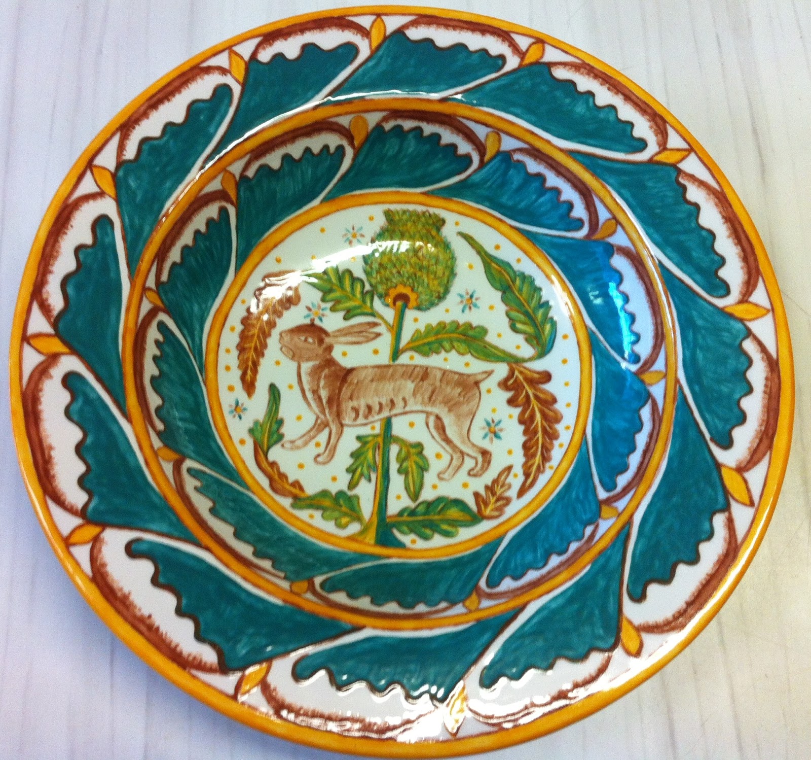
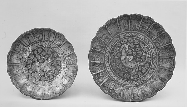
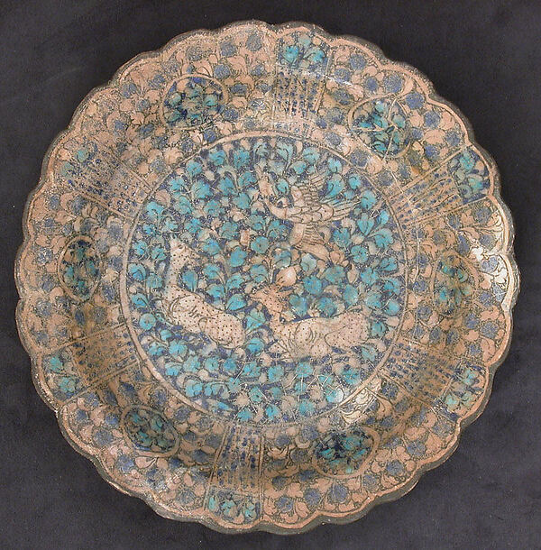
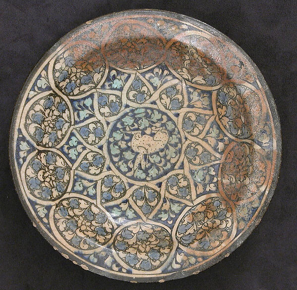
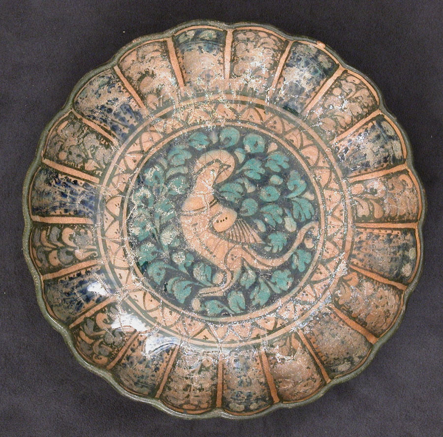
I found the perfect extant piece for my experiment, no only does it have wavy edges, it also uses alot of green, a colour I've been meaning to experiment with for a while. This dish (figure 1) is from Iran, 14th century. The dish appears to be molded into a wavy, flat bowl shape. Though not a plate, I thought the imagery would convert nicely.


Figure 1: Extant dish from Iran, 14th Century. Beautiful greens and blues. Met Museum, accession number 91.1.185. It was acquired by the museum in 1891.

There are a couple of tricky things on this plate. The first being the solid background of vegetation behind the dove. On past plates I've had trouble with small white gaps appearing when I join two colours. There are three possible causes for this; I don't paint to the edge (pre-school mistake), I overlap the glaze, making it too thick and it pops off in the firing process, or the greylead underneath some shapes causes the glaze not to stick making it shed during firing. The easy solution to two of these uses the information from the drollery plates. I know that to make shading one must place dark on light. So I painted the light leaves first and then filled in the background with dark pigment hoping it would bake over the light pigment and fix cause number one. If cause number two was the case, all my leaves would now have a pretty white outline and I'd learn something new. For cause number three, I decided to risk using an eraser to ensure the greylead was as light as possible and I used pencil sparingly.
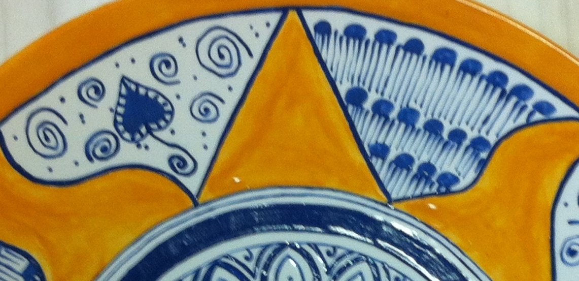
Problem number two is the pale blue shading in the border. At times it looks like water colour. This has to result from a single application of glaze which can be hard to apply to large areas. The original also has floral stems in every second edge panel. To ensure the appropriate painting of blue, I painted the stems, then covered the panel with the single layer 
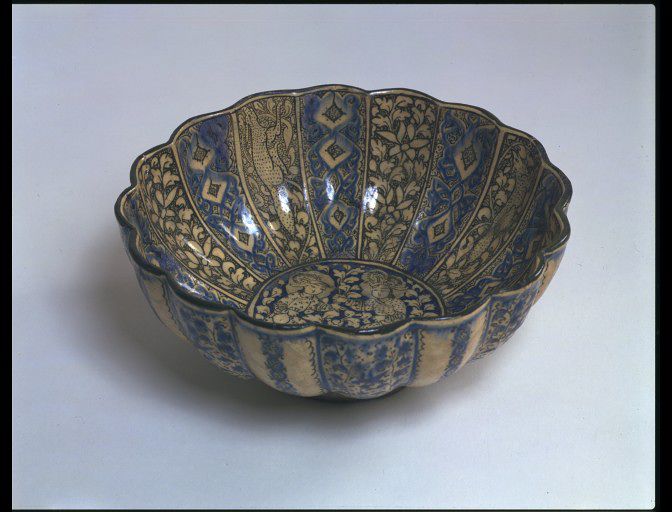
of blue shading. Pre-firing (figure 2)  it didn't look to good but I was hopefully the drollery experiement result will win though again.


Figure 2: The dove plate pre-firing. The blue decorations on the sides look quite blobby and really detract from the clean lines of the center of the plate.


The firing was a success and I am very pleased with how this plate came out.


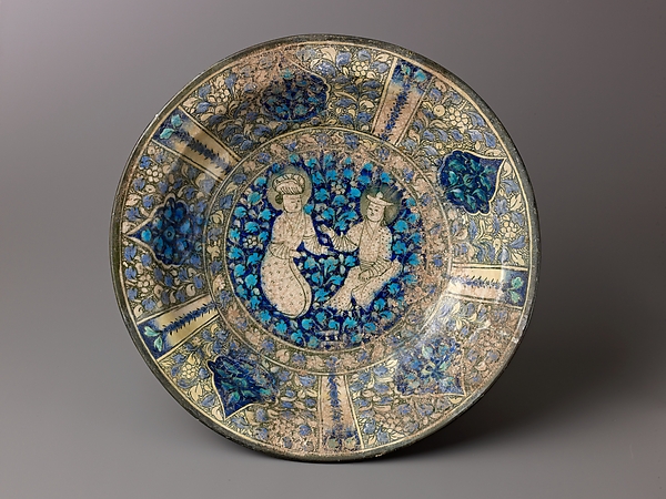
 Figure 3: Front of extant plate
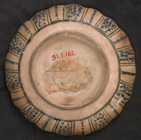
Figure 4: Back of extant plate, a simplier floral plattern has been used to decorate the edge of the plate.


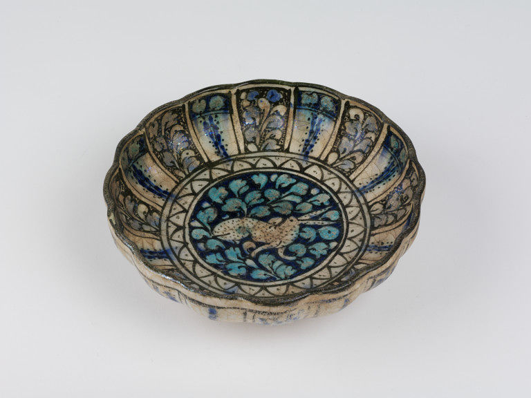
 Figure 5: Front of my copy. As this is a plate not a dish, the edge plaques aren't as long and elegant but I still thing the overall design is balanced.
 Figure 6: The back of my copy. I've replicated the edge decorations using black rather than dark green.


Summary: Success - no mystery white lines. Drollery experiments have showed their worth. I love the green colour.

Sunday, 7 April 2013

Plate 8 - part II


So I finished the plate, sent it off for baking and then promptly left for Rowany Festival. Ah, such a delightful event. This year we had fire, flood and tears. I left the boy with instructions to collect the completed plate and fly up with it. This he achieved (eventually) and the plate arrived intact and in all it's blue/green glory. I took it to the Laurels Prize Tourney (which is not a tourney, has no prize and the laurels don't compete) and showed off all my different pottery type experiments. I got some excellent feedback and ideas from laurels and non-laurels alike which I will post about at a future time.

Without further ado.. the plate.

Plate 8: The peacock, replica of a 12th c Syrian dish.

The plate turned out to be rather simple once the option for iridescence had been undocumented. I quite like the chevrons and wibbles that outline the body banding. The main difference between the original and my copy is the lack of a rim as the copy is a plate not a dish. The second difference is that the original has been repaired while my plate is currently in two pieces (it broke on the way home from Rowany somehow). The bits have been placed in Dash's mosaic pile and will hopefully see a new life at some point. I'm not to heartbroken over the breakage as the peacock hasn't made the top five favourite projects.

Monday, 18 March 2013

Plate 8 - part I


After a long break, mostly due to guilt at not finishing the two plates that languish in my kitchen cupboard, I have started decorating plates again. This resurgence of interested was prompted by a post by Aliette of Stormhold quite a few months ago. She posted a rather nice plate (13th Century I think) that sported a simple cat motif. While looking for the details of the original I stumbled upon something much more interesting, a 12th century peacock dish from Syria (Figure 1).

Fig 1: Peacock plate from Syria. 12th Century. Accession number: 29.160.17. Metropolitan Museum of Art


The back of the dish is plain and shows minor green staining. Interestingly, when stood 'flat', the plate appears to slant towards the left of the peacock. The rainbow luster around the edge of the plate and around the breast of the peacock bothered me initially. In my limited knowledge of ceramics, I associate that effect with modern day fairies or ballerina ceramics, not 12th century dishes. Looking at the unstained head of the peacock where the plate is the whitest there is no iridescent coloration. So, the two most likely causes are 1. a pigment used to outline the peacock and add decoration to the edge of the dish as been changed to create the irridescence, 2. groundwater or whatever stained the dish orange transported chemicals onto the plate to create the irridescence.

Cause 1 - pigment conversion
I have sifted through the Met's Syrian 12th century ceramic collection and found a fragment of a bowl (Figure 2) featuring a bird which has a similar white outline of the wings and features to the peacock. Given there is no trace of a decorative motif on the rim of the peacock plate this suggests that the void around the wing was intentional not the result of alteration of pigment causing the iridescence.

Fig 2: Fragment of a bowl. late 12th - first half 13th century. Composite body, underglaze painted. Syria. Accession number: 1978.546.9 The swan (?) depicted has voids outlining it's primary leg and wing.


Cause 2 - pigment discoloration
I have examined the images of most of the Met's Syrian ceramic collection and have found others with the iridescent staining (Figure 3 and 4). Both plates feature blue and green images similar to the peacock in colour. The Faun? (Figure 4) has the best example of irridescence as it only appears on areas that also exhibit orange staining. The likely cause of the iridescence is groundwater interacting with the underglaze chemicals (copper?) and causing the staining.

Fig 3: Syrian (Raqqa) plate featuring a Sphinx. late 12th- first half 13th century. Made out of stonepaste, under-glaze painted under a transparent, greenish colorless glaze. Accession number: 13.219.1. Metropolitan Museum of Art.

Fig 4: Syrian (Raqqa) plate featuring a faun? Stonepaste, under-glaze painted. Accession number: 56.185.5. Metropolitan Museum of Art.


So. Having made the conclusion I can ignore the iridescence, I can now happily paint a white plate with a beautiful blue and green peacock.

Wednesday, 13 March 2013

Islamic Dragons

Document delivery via Monash University is a wonderful thing. You simply click on the book you want and they eventually deliver it to a library near you. Unfortunately it isn't always as quick as one would like. Take for example, todays book: The Dragon in Medieval East Christian and Islamic Art by Sara Kuehn (ISBN: 0929-2403 / 9789004186637). It arrived recently and I can't for the life of me remember why I had it. I suspect I ordered it because I was planning on entering an A&S competition that featured images of Wyvyrns and I wanted to find one that suited my persona.

Anyway, I've flipped through the collection of articles in this book and here are some of the best images for your consumption:

A winged dragon with forelegs. Buckle of a belt, Mongl Empire, Astrakhan region. Probably 13th century, Silver, gilding, inlay in a black substance (niello?) Length 6.3 cmm width 3.1 cm. St Petersburg Hermatiage, inv. no. SO-762 . (I really really like this one!)

Confronted pairs of winged dragon tailed dragons with forelegs. Detail from a candlestick base, the Jazira. Thirteenth century. Copper alloy, silver inlay. Metropolitian Museum of Art. Inv. no. 91.1.561.


 A musician with a dragon-headed stringed instrument. Wall painting. Panjikent (Tajikistan). 8th century. Dushanbe National Museum.

Confronted dragon-headed birds with interlaced necks. Missal, Armenia. 9th or 10th century. Ejmiatsin, State Library. MS 958 fol 10.