Wednesday, 20 November 2019

Pot throwing results

On the 20th of September, I took a casual class in pot throwing at Claymake. This was my third ever time using a wheel, and my first exposure to an electric wheel. Thanks to the expert tuition of Master Simon at Pennsic, I understood the basics of what I was trying to achieve even if I couldn’t quite get my hands to do it properly. In that three hour class, i made many objects, scrapping most of the asymmetrical ones. I retained 5 olive bowls which were bisque fired.

I then signed up for their monthly guided glazing class so I could glaze my treasures.


I am rather proud of my creations even through one of the rims snapped. I tried a different glaze technique on each one. From left to right: green and yellow englobe with a translucent green dip; Matt blue interior with blue englobe rim /painted on for the scales in a transparent outer glaze; blue englobe belt with blue interior and aubergene exterior glaze; translucent green glaze throughout with aubergene angle dip and finally englobe interior scratched back to create design with transparent clear over.

Notes: the englobe is a coloured clay tweaked to ensure no shrinking occurs during firing. The glazes and englobe are very powdery when dry and make further decorative work challenging. I’d probably add more gum or something to reduce the powder effect if I were to make my own for the painting or scratching applications.

Notes II: it’s likely the underglaze I used for all previous work won’t stand up to the firing temps at Claymake. Well, the blue might because that’s generally a sturdy colour. The others might not. It’s worth an experiment though.

Tuesday, 5 November 2019

Mughal flat hat

The Mughal flat hat!

Late 15th Century. Shapur with the daughter of Mihrak, by Qāsim.  British Library MS 5600 - f.399v: Look at the detail on her hat! I love the beaded (pearl?) trim on the edge and the suggestion of gems all over.


Tuesday, 29 October 2019

Lets talk about pants

So, in my usual method of garb creation, I've started with a half remembered reference and jumped into my project. I've begun practicing block printing on bigger items and thought I should start with a ~2m bit of fabric because then I could make it into pants. Because, you know, you can never have enough pants.


Anyway, I've now block-printed half the fabric and I couldn't remember if the original reference looked like the diagonal strips both trended the same way or opposite ways. i.e. do I need to change orientation half way through the print to make a V shape or can I get away with //// all over?

Cue many many hours of trolling through manuscripts trying to find diagonal prints!

Here are some findings and comments thus far:

Some Safavid pants to start...
Folio 155r, British Library. MS 6613. Pants appear to have a dark stripe over blue, red and black diamond pattern. The diamond pattern is offset in the right leg which suggests an alternate construction method where the pale fabric is sewn together out of isosceles triangles, allowing the pants to gently increase in size with every rotation. Given I'm not very good at sewing, I think this would only happen if you were short on fabric, otherwise just gather / pattern to taper to the ankles.

Folio 184v, British Library. MS 6613. Pants worn by the Greek Princess. Same manuscript so artistic style is unlikely to change however these appear to have aligned triangles and alternating gold and grey bands. I wondering if the white dots are dyed, pearls, embroidery or spangles?

  
Woman holding a daisy. Herat (Afghanistan) Safavid. 1570-1578m. The Met Museum,   55.121.42. Diagonals again but such detail on the closeup! The fabric is fantastic and does suggest the entire piece is either diagonal stripes or vertical and the pants are cut on the bias. Cutting them on the bias would provide some stretch.

Christian Maiden dies. 1600 Iran. The Met Museum. Folio 22v. Accession no. 63.210.22. Look at that splendid acanthus print!

 Woman nursing a child. Bibliotheque Nationale Paris. folio 23r. Arabe 5847. Glorious colour combination and multiple foliages. It looks like these would fall into horizontal strips should she stand up.

Skipping to the Mughul culture now because when it comes to pants, I'm not picky.
 These are the pants of Princess Jahanara, painted in 1632. British Library, Add Or 3129. Folio 13v. I am really taken with these pants, the strips are fantastic! Unfortunately, the geometry doesn't work well. We see three red stripes at the ankle, which becomes 6-8 at the waist. We see no narrowing of stripes up the leg suggesting all stripes must either be cut off or gather/taper. To achieve this look, the fabric must be cut to ensure excess stripes on the front and back are cut to terminate on the inner thigh. Even then, superior tailoring is required to taper the cut from the hips up to the waist.


Lady with a narcissus. 1631-1633.  British Library, Add Or 3129 folio 34r. Take a moment and admire this spectacular pair of pants. Yellow with blue mangos? outlined in red, with a blue framing pattern. Splendid!


I'll leave this collection there as there are many many pants down this particular rabbit hole. For now, I believe i have sufficient justification for horizontal, vertical and diagonal stripes. There is no supporting evidence, yet, of stripes that originate on the inside ankle with one leg clockwise and the other counter-clockwise so for now, I shall make the stripes all go one direction.

Monday, 21 October 2019

Princesses MS6613


I had hoped the Princesses mentioned in this manuscript would all be wearing clothes reminiscent of their culture or at least Safavid interpretations of their garb. Unfortunately, a majority of them appear to be wearing the fashion of the times, that is, Safavid fashions.


The Moorish Princess, F165v The Tartar Princess, F168v
The Russian Princess, F171v The Khvarazm Princess, F178v
The Chineese Princess F180r The Greek Princess F184v

Happily, the Indian Princess and her attendants wear something slightly different.


The Indian Princess. F159v Indian Princess' attendant / dancer


Sunday, 13 October 2019

Safavid pants - MS6613


Detail: Folio 155r: Fitnah carrying the ox on her shoulders up steps to Bahrām Gūr. 
Khamsah by Niẓāmī Ganjavī (1665-7) which contains 41 minitures in the Safavid style. This manuscript was written for Tājā Mīrzā Abu al-Ḥasanā. Colophons dated Jumadi II 1075 to 5 Rabi‘ II 1076 (AD 1665). British Library. MS 6613


Pants appear to have a diagonal blue/grey pattern which overprints blue triangles / diamonds outlined in red and black.

Sunday, 1 September 2019

Pennsic pottery achievements

I attend Pennsic again this year. I spent a lot of time hanging out at the Tudor House in the market place with Master Simon and all the amazing pottery people. I didn't help make the kiln this year as I was sleeping off a watch shift, but I was there for both firings. The first one didn't hit temperature. Master Simons thinks it might be because the woodbox tunnel roof sort of collapsed so it wasn't drawing properly. The collapsed part was dug out and the second firing went much better. The kiln was very crowded but everything seemed to come out generally fine.

I tried a new experiment this year. I was trying to make a quatrefoil cup because they have a very graceful form. I don't think I got the shape quite right though. It should cinch in under the foils slightly more. Then, not bad for my third ever item!

I did also try something a bit different with the glaze. I asked the blacksmith to crush up some malachite (copper carbonate ore) and some chrysocolla (copper oxide ore). I then mixed this with a clear glaze and applied it to the sides of my cup.


I now have a non-slip cup. It seems the chrysocolla had more gangue material (silica?) so left lumps on the side of the cup. The malachite, being a larger chunk of purer ore, turned into a finer powder so provided colour without texture. Very little copper is needed to achieve a good glaze.

I'm very happy with the outcome of this Pennsic and I'm looking forward to next time!
Left - malachite glaze; right - chrysocolla glaze.

Wednesday, 14 August 2019

German embroidery design 1535


Embroidery chart by Christian Egenolff. 1535. Germany. The Met Museum accession number: 33.69(4r)

I really like the zig-zag and sort of trefoils of this pattern. The chart really strongly reminds me of a Mamluk pattern currently residing in the Ashmolean. I'm not sure what I'd use this on though as the best effect would come from repeating the pattern which would create quite a wide band.

Linen embroidered with blue flax. 10th-15th century. Fustat, Egypt. Ashmolean Museum. EA1984.560


Wednesday, 15 May 2019

German embroidery pattern 1535

Embroidery chart by Christian Egenolff. 1535. Germany. The Met Museum accession number: 33.69(4r)

I'm not sure where I'd use this design. The width may work for both collar and cuffs for a landsknecht shirt. I'm not overly taken with the design but it does remind me of some of the beautiful mumluk patterns.

Wednesday, 13 February 2019

German embroidery chart 1535

Embroidery chart by Christian Egenolff. 1535. Germany. The Met Museum accession number: 33.69(4r)

I love this embroidery chart. It looks like carnations and an iris. It'd be quite simple to loop this around and around a Landsknecht collar or cuffs. The design on the left, I can't decide if it's bells or acorns or some sort of pod on a vine.

Thursday, 3 January 2019

Hood idea II

Yesterday I published a picture of a hood I'd like to make as I'm quite taken with the ears. I've now found something equally great! Below is an image of a 1535 German design book by Christian Egenolff. The designs seem to cover a great many applications. Some are clearly embroidery charts, others appear to be engraving or carving where rounded lines are utilised. I found the image below on a page of embroidery designs. Though this image has a few rounded lines, I believe the cubic format is intended for embroidery.

The chart features two fools conversing in a garden surrounded by sun flowers. In front of them a wattle fence keeps them penned in. The alignment of the left most flower and fence post and right most flower and fence post suggests this pattern could be repeated with ease. Now I'm torn, should I embroider this along the base of my hood or as shirt cuffs?

Modelbuch aller Art Nehens vn Stickens by Christian Egenolff. 1535. Germany. The Met Museum. Accession number: 33.69(4v)

Wednesday, 2 January 2019

Hood idea

Lets all take a minute to admire this hat:

I do like a hood with ears and this has some beautiful detail around the seams. I also love the slightly floppy ears - like a x-breed kelpy. This hat is a small feature in the Fable of the Mouth of Truth by Lucas Cranach the Elder (1534). The original is in the Germanisches Nationalmuseum but to make it easier on us, they have released a lovely high resolution image to Wikimedia here. The figure himself a an disguised as a 'Fool'. I'd happily be considered foolish and wear this amazing hood around at cold events if I could figure out how to make the ears stay up.

Tuesday, 1 January 2019

How to make tables in Blogger


1 - An example of images inserted into a table so Blogger will display them side by side.

If you've been following my blog, you'll notice I like to present some of my data in tables. Blogger doesn't have an 'insert table' function so you have to use a work around. Typically my tables are the form of one or two images side by side with a caption followed by a caption (1). To force Blogger to display two images side by side I do the following:

  • Open Microsoft Excel (Word or anything that you can use to create a table should work)
  • Work out your column and row numbers
  • Insert dummy text
  • Copy entire table and 'CTRL-V' it into the Compose tab of blogger.
  • Replace the dummy text with images using the arrow keys to pan through the boxes in the table.
  • Add a caption as standard text below the table or individual captions using 'Left click -> Add Caption'

This simple system works really well and beats having to play with HTML code. Unfortunately, this won't always work. Blogger will automatically resize your text filled columns to conform with it's presentation style. This can result in endless pages of single spaced letters creating an unreadable blogpost.

There are two ways to address this problem. This first is my new favourite brute force hack method which I use when the second method becomes too fiddly. The hack involves exploiting bloggers auto-resizing system. This can cause problems for people viewing your blog on different screen ratios so utilise carefully. To exploit bloggers auto-resizing system:
  • Arrange your columns as you'd like to see them in the compose view
  • Screen capture the headings of your columns as individual tiles
  • Replace the titles of your columns with the new images
  • Blogger will maintain the columns at the size of the image rather than shrinking to fit the rest of the text.
2 - An example of image column headers. Blogger auto-formats them with a shadow so factor this into your chosen style. Note the faint line near Date - that's the end of the standard Blogger page.

The final alternative is to play with the html tab. Some help blogs will recommend that you create your table in Word, save it as a .html file, open it in Notepad and copy the code across. This is a great quick and dirty method for creating a table however it'll often come with a load of code that relates to formatting that you simply don't need as Blogger ignores it. A note of caution: Blogger will also correct your html, changing some of the designations at times. You can manually correct this if you know where the issue occurs. Flicking between the Compose and HTML tabs helps a lot. You'll also need to know the following:

3 - image of basic HTML required to create and modify your table
Good luck and happy blogging!

Sunday, 30 December 2018

Blue and White ceramics - China

Blue on White ceramics: the reciprocal influence of Chinese porcelain on European and Middle Eastern ceramics - China

Other essays on the history of BoW in IraqEgyptearly Iranlate Iran, Japan, Turkey, Spain, The Netherlands, Italy and England.

China

Tang Dynasty (7th - 10th century)
Like many countries, some of the earliest examples of cobalt glaze in China are dipped earthenware items (1). This later developed into earthenware covered in white slip and painted with blue designs (2). These items were produced during the Tang Dynasty and may have been inspired by simple figurative bowls imported from Iraq.  From the 9th century China started to develop "Porcelaneous ware" the precursor and bridge between earthenware and porcelain. Similar to earthenware, these items utilise a fine white clay, kaolin, which is an alumina-silicate (3). Fired at higher temperatures, the quartz (silica) fuzes creating the product often known as Mingware. Many glazes aren't stable at the higher temperatures required to create Mingware thus the decoration on the porcelaneous items remained simpler while earthenware items produced at the same time could be coated in a riot of colours like this yellow and blue phoenix headed jug (4) or this blue, green and brown box (5). These green, yellow/brown and blues items are often referred to as sancai-ware and would occasionally feature cobalt glaze (6, 7, 8, 9, 10). The sancai-ware became highly developed, with potters incising their designs to prevent the glazes from running together (11). Alongside the sancai-ware, the potters of the Tang Dynasty start to produced painted items such as this bird bowl (12) setting the stage for the development of the finely painted BoW items associated with China.
(As a side note, the Tang Dynasty also produced lovely earthenware of marbled clay, which I'm quite enamored of (13) )
Item 11 - An incised sancai-ware tray. China, 8th century. The Met Museum item 1994.605.47

Song Dynasty (10th - 13th century)
The Song Dynasty further developed the Sancai style producing complicated green and yellow motifs on incised earthenware such as Ganwa-ware from Mongolia (14) and Cizhou-ware from northern China (15, 16). These items however, do not seem to feature cobalt as the earlier style did. This was likely due to the difficulty of sourcing the cobalt for the glaze at the time.

In addition to lovely plain white porcelaneous objects, the Song Dynasty also produced distinctive items dipped in a light green / celadon glaze (17). Following the seemingly standard path of pottery development, the Chinese potters also experimented with under-glazing such as this light blue example with purple splashes dated to the 13th century (18).

Ming Dynasty (13th - 17th century)

It is generally accepted that the methods of creating porcelain had been well established by the 14th century in China. Porcelain had been endorsed by the Emperor who theoretically controlled all production and the export of porcelain items. The kilns of Jingdezhen produced all the imperial porcelain however there were private kilns creating imitations concurrently. For a good rundown with comparison images check out the Imperial Palace Museum's website here.

The kilns at Jingdezhen produced items both for export and domestic use. To appeal to the export market, the Chinese artists imitated design motifs from a variety of sources. A 1520's jug (20) is the earliest item identified as being deliberately created for export. It features the classic key design around it's rim seen on earlier porcelain items (21) as well as an upside down copy of the Portaguese arms. This plate from 1580-1600 featuring a Portuguese coat of arms for Captain Don Joao de Almeida (22) exemplifies the early attempts at leveraging the export market. The tiny coat of arms featured is framed by plumes and crested by a very awkward attempt at a helmet suggesting the artists had a weak grasp of the subject matter.


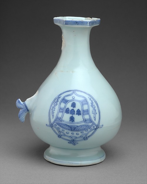
Item 21 - Ming-ware made for export featuring an upside down Portuguese coat of arms.

As trade along the silk road flourished and the European market increased, the export designs become significantly more refined and targeted. For example, this bottle made between 1662-1722 is very Persian with it's use of void space and stylised floral geometric patterns (24). The shape is also reminiscent of Iranian bottles popular at the time.. The imitation wasn't one sided, with the European and Middle Eastern ceramic centers creating their own imitations of Ming-ware. For example, these porcelain bowls created in 1600-1620 (25) spawned Iranian fritware copies (26). in the 16th-17th century, Chinese artists appear to have started adopting the Middle Eastern and European penchant for inscriptions in their work (27)


European countries weren't the only market or stylistic influence on the Chinese export trade. number of Ming-ware items also feature Mongolian style cloud designs which are a dominant feature in Turkey's Iznik design style (15th - 17th century) 28293031. It seems that the Mongolian / Persian influence was quite extensive. This jar features archers wearing Persian style garments and is decorated with various vegetable motifs as well as images of European houses (32). This 17th century asymmetric dish shows the Chinese artists were also incorporating Japanese styles into their work (33).

Identifiable Chinese Design elements
The number 8 is considered lucky and linked to prosperity and wealth. This may be the reason why there is a distinct subset of Mingware incorporating 8 lobes of panels around the main decorative element (34353637). The lobes very often feature auspicious symbols like a double gourd, a fan, a drum or a scroll. This subset of Chinese porcelain is occasionally referred to as Kraak after the carrak's of the Portguese traders who brought the goods to Europe. Porcelain is light and significantly stronger than the earthernware available that was available in Europe. This, in addition to it's link to the Chinese emperor, increased it's appeal as a status symbol. A number of renaissance paintings contain a blue and white porcelain bowl or ewer as a background feature. Rarer are those that celebrate the porcelain itself. The bowl featured in Treck Jan Jansz's (38) painting can be identified as Chinese in manufacture due to a combination of it's thinness, the sheen captured by the artist and the decorative lobes in the glazing.

The production and export of porcelain by the Chinese was the most significant factor in perpetuating the blue on white colour scheme as ceramic art became more sophisticated through the Renaissance and the range of colours available increased. Cultures which had well developed ceramic industries either renewed or built thriving local markets for the BoW goods. Chinese Kraak items were imitated by the Dutch (39), the Japanese (40), the Portuguese (41) and the Japanese (42). BY the 17th century, even the Spanish, who had several manufacturing hubs and a number of celebrated artistic trends were producing blue on white items for local consumption.


Item 38 - Detail, Still life with pewter flagon and two ming bowls. Treck Jan Jansz, 1651, National Gallery, NG4562


Additional references:

Valenstein, S.G, 1989. A handbook of Chinese ceramics. Metropolitan Museum of Art.


Friday, 28 December 2018

The hats of the landsknecht

This is a simple image reference collection of the various hats featured in Landsknecht woodcuts. No construction methods are proposed but styles types are grouped to align with my 1520's German hat research. I'm not a fan of Pinterest links within links so this is a more direct way of referencing.  The aim is to reduce the trolling through Pinterest and museum archives next time I need a specific fancy hat reference. Each image will only feature the hat detail and a link has been provided to the entire original image. Reference details are provided in the event the hyperlinks break. 

I started this post with an assortment of 30 images but as I was tidying up the references I realised that they fell into three sets. The British Museum has a collection of 50 odd images of Landsknechts block cut by Jost de Negker. There is a goodly number of Daniel Hopfer and then assorted random images. Unfortunately, some of the images aren't high resolution so end up a little pixelated.

This is by no means a complete collection and if you know of a hat I've missed please link to the museum reference in a comment!

1520's German hat Research part 4

Allegory of Virtues and Vices at the Court of Charles V by Hans Daucher 1522 (The Met Museum accession no. 17.190.745)

The previous parts of this research have discussed Tallerbarret's and Split Brim hats, Star fish and upright brim hats, and multiple ideas on constructing the hat crowns. The fourth, and final part, will examine the decorations on the hats featured in The Virtues. This discussion will also examine the art work within the cultural context to ensure this artwork is reflective of wider society and the information can be extrapolated beyond this context. This part of the analysis is important as many allegorical hats (and clothes) are not representative of what was worn at the time, being either a fantasy creation of the artist or an artists impression of 'ancient' clothing. I'm of the opinion in the SCA, that if you can find it and make it, you should wear it.  You should also be aware of its history and context so when asked why you're wearing a beautifully absurd hat, you can explain it's origins and inspire others.

Again, a lengthy and picture heavy post which can be found under the jump cut.

Saturday, 24 November 2018

1520's German hats research part 3

Allegory of Virtues and Vices at the Court of Charles V by Hans Daucher 1522 (The Met Museum accession no. 17.190.745)

In the previous two posts I reviewed the hats of The Virtues with regards to the varied brim construction (split brim and floppy hats). There is significantly less material to work with on this topic as displaying the full crown of a wide brimmed hat often means obscuring the face of the wearer. Working within the limited confines of the The Virtues, I've attempted to propose some constructions methods to achieve the look on display. These are aimed to direct future experiments with cloth to determine how construction and use requirements (function) might dictate form.

The rest of the post is below the cut as it's picture heavy, again.

Tuesday, 20 November 2018

1520's German hats research part 2


Allegory of Virtues and Vices at the Court of Charles V by Hans Daucher 1522 (The Met Museum accession no. 17.190.745)


The Allegory of Virtues and Vices at the Court of Charles V features a lovely spectrum of hats from the early 16th century. Tallerbarret and Split Brim hats were discussed in the previous post so this post will look at floppy hats, upright brim and combination hats. I consider floppy, or "Star fish hats" to be distinct from split brim as cuts do not overlap and more slashed than cut and pieced. For this analysis "Split brim star fish hats" will be a combination of both where the splits clearly extend to the crown and overlap in places and are additionally slashed. There are a variety of floppy hat patterns to be found here (beware the poor livejounal formatting) and a good tutorial by Geoneva von Lubeck can be found here

Further analysis is under the jump cut.

Sunday, 18 November 2018

1520's German hats research part 1

Allegory of Virtues and Vices at the Court of Charles V by Hans Daucher 1522 (The Met Museum accession no. 17.190.745)

When delving into a new area it's important to have a few prime images to fixate on otherwise you'll get lost down the rabbit hole. Often people use an image of something they've seen someone else wear and they try to find references to reference it, make it fit a costume or make it more period. In this case, I started by collecting a Pinterest board of Landsknecht, Cranach and general German-ish hats. This gave me a good reference base for the variety of hat types available within my scope. I then narrowed the field by focusing on one item and using it as the basis for my research. If you want to do the same, there's a large collection of hat references collated by Jeanne de Pompadore here. It'd be nice if they're hyperlinked to a primary source but they typically contain sufficient information in the caption to help you find the original without needing to use Google image search.

Personally I found my focus image deep in a Pinterest linked-linked-link. The sculpture by Hans Daucher contains a good number of hat types. As it's a crowd scene, it also has a few back of hats so we can see the crown detail. I've numbered the hats to assist as I discuss the various types and my construction conclusions.

Details are below the jump cut as this the first of three long research posts

Saturday, 17 November 2018

Tyrant productions part 2

So, since I've been making hats recently, I decided Tyr needed one to complete his outfit. As many before me have discovered, accessories like hats take a costume from 'I rolled out of bed' to 'I am Dressed'

Let it never be said that Tyr doesn't like hats (don't believe me? I've got so much photographic proof).

This hat was made in a similar way to the St florian square hat however I used white silk for the lining and didn't cut any shapes out of the wool. He doesn't have a device that'd translate well into cutouts and I was hesitant to ruin a perfectly good hat. We did add a button to the middle because it seemed the right thing to do. Proportionally the button should be bigger (or the hat smaller) but it is what it is.

The hat has had two formats so far. Originally the hat was edged with a galvanized steel embroidery loop size extra extra large. The sort you can buy at Spotlight. This turned out to be a mistake as the edge was too heavy and while it didn't deform while worn, it did try to edge down the wearers head. At festival someone showed Tyr how to tuck under and sew down the edges of the square to make it more of a puff to stop the runaway brim. Very similar to how the St Florian 1 hat ended up. It seemed to work but it still wasn't ideal.


After festival I cut out the embroidery loop and threaded the edge of a witches hat through instead. I had to trim the witches hat wire slightly and crimp it together with some metal tubing. It has significantly reduced the weight of hat however the brim will now pringle if jammed onto a head oddly. Given pringling or maybe drooping appears in some of the documentation, I'm not too worried about that. I've also unpicked the puffing and tacked the corners of the square to the edges of the hat. I think it's a little plain but it looks lovely with the feathers on it. Maybe someday it'll get some slashing, who knows?

Turns out, it's almost impossible to take a selfie of the crown of a hat if its brim has a diameter of 50cm. Though, if you stuff a bike helmet in it, and place it on the floor, the dimensions are about right.