For my final AS50 project I decided I'd finally finish a project that I thought about 4 years ago when I met Dangerboy for the first time. DB is the son of Lucas' knight. He seemed to be a rather shy boy but came out of his shell when Lucas was around. He was really into Star Wars at the time and I felt bad about taking his friend away from Atlantia. (His parents and whole campsite were also pretty wonderful to me). At the time I really didn't have the skills to make the item I wanted to but I kept the idea in the back of my head for ages. Though I was hesitant, I thought it was the perfect project to push my skills that little bit harder and decided to make it my 50th project. (Feel like you've missed a few? That's okay, I haven't posted them yet because they are gifts and still pending delivery!).
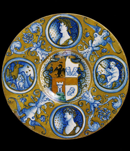
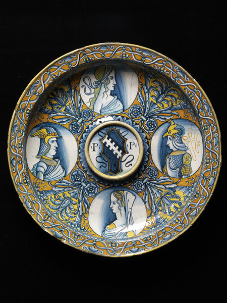
Inspiration plates:
Dish 1 was the main inspiration for this piece. I found it's simplistic colour pallet quite appealing and I quite like the grotesques between the medallions. The shape is also closer to the bisque I had available. Dish 2 requires a thin rim and the proportions of the items I have aren't quite right. I like the dark shading around the portraits in Dish 2 as it highlights the faces better. I also liked the central roundel as it looked a bit like Sir Cuan's heraldry.
I started by roughtly sketching my ideas to get an idea of how everything would sit. I then realised that it'd be impossible for me to freehand characters that I know nothing about so I had to do a lot of Star Wars research. Dangerboy is part of the new generation so a plate featuring Leia probably wouldn't be appropriate. I tried to pick strong characters one of which might be his favourite (there was no way I'd put Jar Jar Binks on this plate!). I ended up settling on R2D2 (as the character in every film), Yoda (because), Vadar and the Bounty Hunter. I then trolled the internet to find appropriate images of each of them. I collected a folder worth then resized them so they'd all be the same height. I opened them in photoshop, turned them greyscale and reduced the number of tones. Adjusting them from 3 tones to 15 helped emphasise the areas which needed shading and the direction it should fade. The final images I chose are below.
|
|
|
| Bounty Hunter |
Darth Vader |
|
|
|
|
|
| R2D2 |
Yoda |
Once I'd selected the images and worked out the best way of shading them, I 100% cheated and traced them off the screen of my computer. I ended up drawing them each three or four times before making an attempt at transfering the outline to the plate using the old-fashioned pencil rubbed back of paper method. I mastered this trick making cups (which I'll post about later) Once I had the outlines, I painted the majority of the plate in the background colour, yellow. I also drew in Yabba the Hut's head as the grotesque and added sort of dolphins and a thistle (Dangerboy's mothers device) because all the Star Wars worm type characters didn't look right or sit well. I then outlined the four medallions and painted in the strong solid lines on each of the characters.

I thought long and hard about the thistle things. I felt they were rather plain compared to the detail in the medallions. I decided to be a little tricky and put Star Wars symbols in each one. Fans will know what they are but off the top of my head, the rebel alliance and the sith are in there. Finally I finished the outlines, the thistles and dolphin things (they should have been Atlantian seahorses now I'm thinking about it a month later, ah well). It was time to do the shading!
To shade the figures, I diluted the blue glaze with water in a 1 to 4 ratio as shown to be most effective in my Krae Glas Baronial Platter experiments last year. I then used a sponge to dab water onto the target area to dampen it without smudging the existing glaze. The Angel and Matt plate showed that damp surfaces allow the brush and glaze to spread further and smoother leaving a better shadow.

It seems to have mostly worked out that the light source of the characters is the top right side (ish). This wasn't something that I considered until after the fact, it just turned out that way from the photos I selected. If I do this again I'll have to think about these small details to ensure cohesiveness of the design.
The next step was the small details, I shaded the back of the medallions in with yellow to replicate the shading I liked in Dish 2. I know cartoonists often use the angle of background colour to emphasise a message or symbol. I just shaded in the left side. I should have tied the yellow shading to the angle of the light (next time). I also added a minute amount of red to the design. Yoda and Darth Vadar are nicely mono-chromatic however R2D2 needed a red light (?) and the bounty hunter has a red patch on his armour. I thought this would tie in nicely to the red I'd need to use to make Cuan and Padreign's devices.
I outlined the central roundel and the shield. I sketched in half of each device and added a chief that symbolises 'Oldest Son'. I had to make a call on Padreign's device. It's supposed to be half black with gold thistles. As I wasn't and wouldn't be using black anywhere else I went with a pastel blue instead of having a big black blob in the middle of the plate. This is when I made my big mistake on this one. I forgot to fill in the crown around the dogs next on Cuan's device. As a result, this ended up being white instead of red. I was kicking myself when I noticed after it'd been fired!

I learned many things to make this project happen; how to evenly paint three layers without leaving thin or thick patches, how to clean up lumpy lines, how to vary the thickness of lines to balance out design elements, how to transfer images, how to find the right medieval inspiration for a project, how to shade with glaze, how to use Photoshop to emphasize shaded areas and how to apply glaze without having thin white lines between colours. While I am not a master of this art yet, I am happy to say that for my 50th project I have produced something I will always be proud of and it has inspired me to continue making things like this.


.jpg)
.jpg)
