
Showing posts with label Experimental. Show all posts
Showing posts with label Experimental. Show all posts
Monday, 1 June 2020
Making an impression
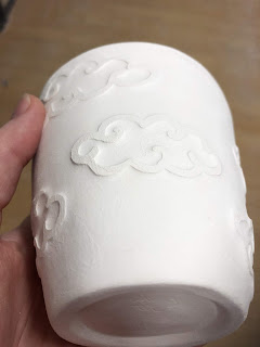
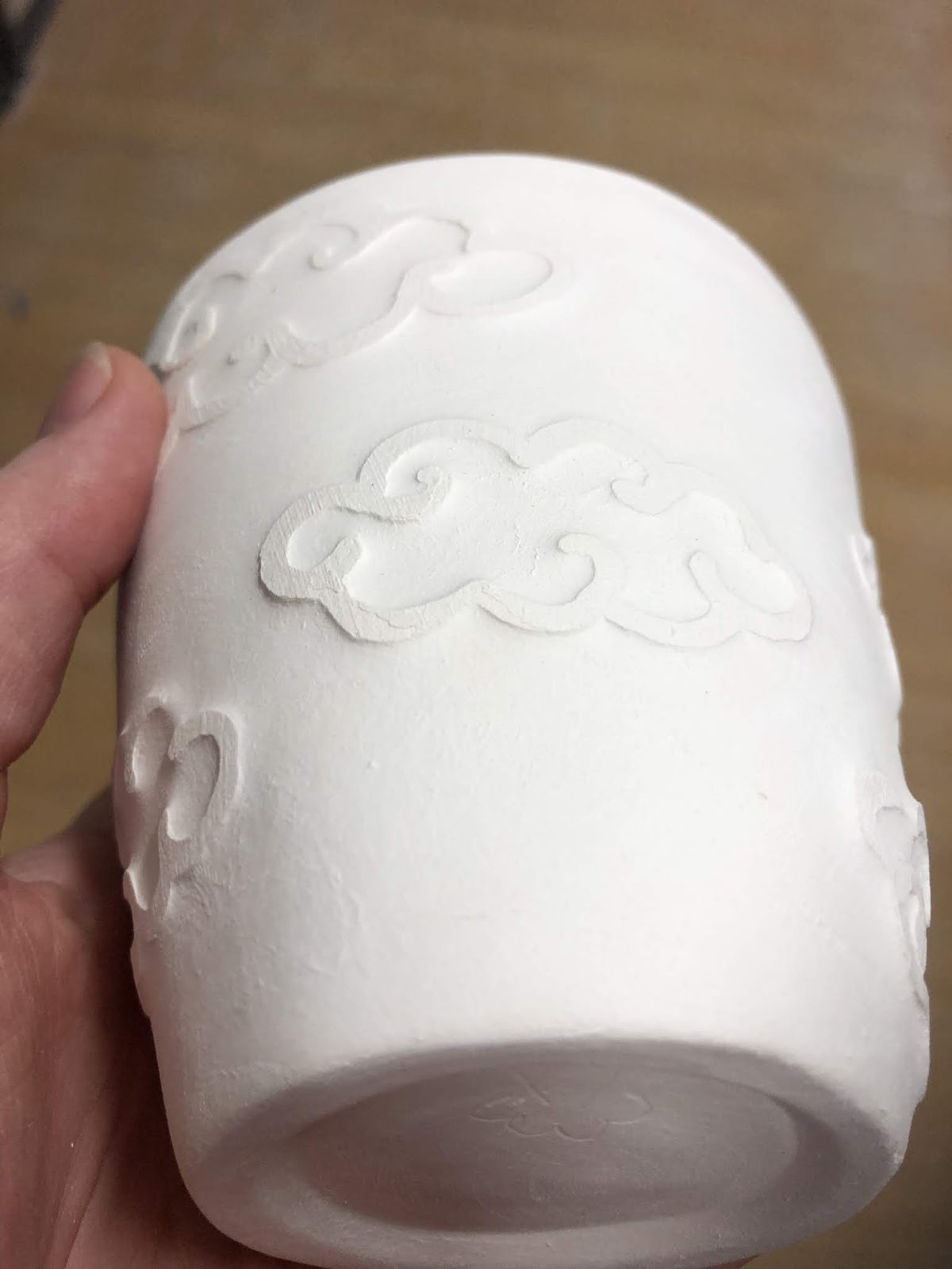
While rummaging around in my tool drawer trying to ring the right screwdriver I happened upon a leather stamp I’d bought years ago and never used. I wondered if it’d work well on clay and since I had a slightly less than leather hard cup just sitting there I tried it out. This cup will have sea green base with translucent green rim which will hopefully run and fill the leaves nicely. If this works it’ll open up a whole range of stamping options for me since these would also look good impressed into little clay buttons attached to a cup.

Friday, 29 May 2020
Stages of slip
As I blended up an ice cream container of slip for my Mishima experiment I thought perhaps I could use some of it for slip painting. I used a humble paint brush to apply this slip to a damp leather hard greenware cup. The design is quite course but I’m hoping to add some finer details after the bisque firing. The benefit of adding my design at this stage is it will be stable during the glazing stage. I can put as much runny glaze on this as I’d like and these blue leaves will go nowhere.

As this is tinted slip, the design is slightly raised. I’m going to rub these down once it is perfectly dry to ensure it has a good hand feel once fired.
.....
This cup sat on the shelf as I continued my stained slip experiments. I ended up filling a tiny squeeze bottle full of this slip and trailing on some stems. The finer detail really helps. I quite like the added dimension to the texture too. Now I’m looking at the photo, I really should have used a sharp tool to sgraffito some lines into the leaves. Ah well.
I’m hoping this stain won’t move after the bisque firing. It’d be a great way to avoid running of the detail. Then I could use the blue over glazes with abandon!

Thursday, 21 May 2020
Mishima
I’ve been following a YouTube channel called Karen’s Pots and Glass. Karen’s is a ceramics teaching and during the covid restrictions she has been creating daily videos for her students. She demonstrates a lot of different techniques and introduces new concepts rather well. I thought I’d give a recent technique a try - Mishima.
Mishima involves cutting a design into a leather hard item and then back filling the design with coloured slip. The slip is then scraped away to create a flat surface for bisque firing.
 I haven’t fired this yet as it’s been a bit wet and I’m not 100% sure it is dry enough.
Initial thoughts:
Mishima involves cutting a design into a leather hard item and then back filling the design with coloured slip. The slip is then scraped away to create a flat surface for bisque firing.

Initial thoughts:
I probably should have learned to carve clay first. I need some better tools as a twisted bit of misc wire really isn’t the best cutting tool. I’ll be investing in a tiny little diamond shaped tool next time I visit Potters Market!
I made the slip by blending in some stain (not mason stain) with my stick blender. It hasn’t blended perfectly and there are still occasional dry clumps of stain. Consistency is good so I might try some slip trailing as well.
The slip was too shallow in some of the grooves as it shrunk slightly as it dried or slumped into the lines. I’ve gone over some of them a second time to address this issue. I think using a paint brush instead of a rubber bulb might be the solution for this.
I had trouble maintaining a smooth surface during scraping. I’m going to have to go back and ‘sand’ the outside of the cup with my fingers to remove evidence of the scraping. I doubt there is an easier way to do this apart from reducing the amount of excess slip and thus lessen the scraping.
I think this will make a great layered glaze. I’m curious how it’s go with runny over glaze. Perhaps I could preserve my beautiful delicate black outlines in the bisque firing then runny over glaze will not deform my design. If I didn’t mind the dints, I could arguably achieve something similar by brushing the under glaze onto the leather hard green ware then wipe it off again. Something to follow up!
Monday, 18 May 2020
Let there be Light?


A bamboo torch wick and citronella oil for firing, both purchased from Bunnings. Due to the kink in the neck the wick was a little tricky to insert but this does prevent the oil from sloshing out the front.

The lamp was pretty easy to fill and the wick adsorbed the oil very quickly. I cannot completely fill the reservoir as the wick lip is around the same height as the rest of the bowl so oil will seep into the open and pool under the wick.

This lamp produces a rather large flame when lit. This could be related to the loose wide weave of the wick (too large), the protrusion of the wick (too long) and partly, the strong wind. I'm going to modify what I can when it's less windy and see if I can get this to be sufficiently manageable that I'd risk having it inside.
I may have to carve a dragon into one of these.
Friday, 15 May 2020
Not medieval shading experiments

I really wasn't sure how this would turn out. This is a rather short cup and I wasn't sure how to decorate it. I was cruising around Pinterest waiting for some inspiration to hit and stumbled across some beautiful mendalas. Eager to try some of the shapes I'd seen, I used multiple shades of blue and blended them into each other. I then went over with some dots and lines to provide an additional design element. Most of the blue came out darker than I thought it would and the light blue dots are a little thick as they were applied with a paint brush. Still, I'm rather happy with the outcome.
One of my friends said this looked like snow so next time I'll trial some snowflake designs in the blue instead.


Sunday, 26 April 2020
2 level hydro-abrasion
I got impatient while waiting for the previous attempt at hydro-abrasion to be fired. So I started on the next project. The aim of this one is to create some depth in the design by applying the shellac, removing the clay, then repeating.


Step 1: design. I used a medallion motif from a broken plate. I don’t like the central design on the plate but I thought the medallions were charming. The leaves are a common motif of the time.
1200s, Seljuk. Iran or Syria. Cleveland Art Museum 1915.590.

This is the design after the first layer of shellac. I love the golden tone!

I used a scalpel to trim away unwanted shellac before abraiding. It is really important to angle the blade away from the shellac so it isn’t under cut. I found some of the thicker areas tore if I wasn’t careful. This is probably because this isn’t a new knife blade and may be a little dull.

This is the cup after the second layer has been applied and a raised. As you can see, I shadowed the outer loop with a second layer and added a small arrow leaf in the middle / top. For comparison the two medallions on the bottom haven’t been a raised yet.
With 8 design elements to raise, I found was really important to stop and let the cup dry after every 2-3 items. Otherwise the rim was absorbing a lot of the water and getting squishy.

This dark blue glaze was very thick and it took forever to dry. As you can see it's reasonably runny so it pools nicely in little pockets. I do need to be aware of it along the foot though as it threatens to spill over and cement my piece to the kiln shelf. I'm really happy with how this came out even though I wanted the second, lower level to hold more glaze.
Friday, 24 April 2020
Basic hydro-abrasion
Recently I encountered a fellow potter at Claymake. She had the most lovely relief patterns on a cup. When I inquired how she'd achieved such fine lines she told me she was experimenting with shellac resist then removing the clay body with water. She couldn't tell me much more about the process so I decided to google it. I couldn't find any videos on Youtube but there are a number of ceramic boards which make some interesting reading. One board suggested using shellac as a resist as it's a naturally derived product that will burn off in the bisque firing. The following is my initial experiment and thoughts.

The only brand and smallest bottle of shellac available in the store. It would have been cheaper to purchase shellac flakes and make my own but there were no solvents available so I couldn't.

A slightly skewed cup. I picked it up when it was too damp and it tilted. Still usable and if not for this experiment it wouldn't have been fired.
Step 1:
Use a paintbrush to apply shellac to dry greenware. The greenware will adsorb all of the alcohol and the shellac will dry really fast. If you want finer lines, leave a small amount of shellac out in the sun to thicken for half an hour or so.

Thoughts - the shellac applies well but when it is the thickness of water you either need to only have a small amount on your brush and keep dipping and wiping or use a thicker consistency. If you don't, drips of shellac will spread making thicker lines and blotches. I like the golden shine and can see why this is used on furniture.
It occurs to me that stencils could be used with technique if the shellac were slightly thicker.
Step 2:
Use a wet sponge to wipe away clay from around your design. This is called hydro-abrasion even though typically that term is applied when using pressurized water. Circular motion of the sponge seems to prevent one side of the line from getting too much lower than the other. When the clay turns to a slurry, use the other, sopping, side of your sponge to wipe the clay away. Work on one area then move to another.

I used a brand new dish sponge. Under the sponge is a bit I've already done, the other three clouds still need attention. It's reasonably easy but I did get clay water everywhere.

Thoughts - This may work better as a staged step. I found that the water had undermined the strength of the cup. As I posed and held the cup my thumb has created a small divot in one side while between my fingers a small crack has formed. I think I managed to fix both but I believe that I need to reduce the amount of free water and probably do one side, wait for it to dry then do the other side. In the image above you can see a small area on the bottom cloud where I've accidentally wiped away the shellac. I believe this was because it was rather thin in that area. The thicker shellac, the more golden areas, seems to have held up fine.
Step 3:
Bisque fire it.
Thoughts - It came out well. I'm really happy with how the relief works. I think it'll show off a glaze nicely. I also think this could be a substitute to create once off tiles patterned off molded items.
Step 4:
Glaze & stoneware fire it. I chose midnight blue glaze with a clear overcoat.
Thoughts - Love this look. Next time I'll use a thicker cup and try a two layer design. I think this may work really well for some heraldic displays similar to those carved in marble. I may also try a colour resist. After the first wash, I'll place some englobe or underglaze on the cup and then apply a second coat of Shellac.
#not-so-pro tip: hydro-abrasion works best if the sponge is run parallel to design. Right angles creates more of a sloped edge and it is harder to achieve a clear difference in clay body level.
#not-so-pro tip: hydro-abrasion works best if the sponge is run parallel to design. Right angles creates more of a sloped edge and it is harder to achieve a clear difference in clay body level.
Monday, 13 April 2020
Non-medieval hydro-abrasion fun

Front

Back
Not everything needs to be medieval. I thought these designs would provide a nice balance between thin and thick glaze. I suspect the lobes will work better than the vines with a simple overglaze dip so I’m going to use a sponge to clean up the vines and see what happens.

Lobe cup. I quite like this one but I think next time I’ll have some elements coming up from the base of cup as well.
Sunday, 12 April 2020
Glaze pallets
I made some glaze pallets so I could see how well the various colours worked on stoneware and the difference between the local buff clay and pb103. I’ve done this in the past, creating two test tiles with and without a titanium white base glaze.
It was important to make some new tiles because I’ve purchased some new colours and I needed to see what the impact of multiple layers was. These will be critical to making the colour choices for an upcoming collaboration.

Left- PB103, right - buff. Each divot is top third 1 layer, middle 2 and base 3 layers. The top 20 colours are the Chrysanthos glazes. The bottom glazes are five selections from the Glazeit pallet which I suspect are Duncan underglaze. Black is Cesco ebony brush on underglaze.
Subscribe to:
Posts (Atom)