Showing posts with label Green. Show all posts

Wednesday, 13 May 2020

Green globe attempt 7

There is no extant item to go with this globe cup as I designed it myself. I'm quite happy with the light/dark balance though I wish I'd learned the 'do not underglaze the rim' lesson before I completed this one.


All fired. The image is a little blurry but some of that is due to the glaze running slightly. Still, I'm quite happy with how this turned out.


Sunday, 10 May 2020

Green globe attempt 6


I fell in love with this pattern. I cannot find this extant bowl anywhere though. I can't even find it in any of my Pinterest collections which baffles me. I know I had this saved as a post-to-be on this blog but I can't even find that now. Even Google image search has failed me. If you know any of the details of the image to the right please comment!
On the left is my copy of the motifs. I really like the balance between the thin lines and the thick ones here.

Overglazed in sea green then transparent green and fired to stoneware. This came out lovely, I'm so happy with this cup!

Thursday, 7 May 2020

Green globe attempt 5


This was my 5th attempt at a green globe cup. I think I have figured out the difference between batch 1 & batch 2. Batch 1 was glazed at peak summer just after 12th night. Batch 2, glazed about a month later during cooler weather. As a result, a lot of the water from the first mid-green glaze didn’t evaporate before I dipped the cups in the translucent green. This meant less translucent green so a lighter frothier pale green. This time the first coat was given more time to dry so more of the translucent green glaze stuck. It provided a better green colour however the translucent glaze has a fair amount of silica in it so too much will make the glaze run and smear the under glaze.

Kashan cup with stylised vegetal decoration and inscriptions under a transparent turquoise glaze, Persian, early 13th century. Sotheby’s. Arts of the Harvey B Plotnik collection, item 177. There is also a slightly fancier version with slightly different proportions in the Victorian and Albert museum here.


Pictured above is the extant ewer whose pattern I have utilised. Per standard, I haven’t even bothered replicating the text as I do not know what it says nor do I know what effect an imprecise replication could have. I just loved how well balanced this design was and wondered if I could manage something similar. The original is 12cm high while mine is only 8cm, two thirds of the height. Skipping the basal section seemed like the right approach to maintain the shapes and ratios. I think it has worked out quite well.

The design in black under glaze. This was quite fun to do as the pattern wraps around the bulb of the cup quite nicely.

Fired. A small amount of running has obscured parts of the design. An interesting lesson from this cup - do not underglaze the rim. On previously posted green glaze cups it is possible to see the rim of the cup has very thin glaze. This section is usually pulled out of the glaze dip last and while thin, has the most time to accumulate glaze. As it is at the top of the cup during firing, it also is the first to have the glaze run. The sort of metallic shades to the rim on this cup is due to the glaze running and collecting the black underglaze. This has given it an interesting sheen. Though this is an easy way of treating the rim and makes a good visual border, I won't be using thick bands of underglaze like this again.

Monday, 4 May 2020

Fishies results

A short post about the creation of this item can be found here. I'm really happy with how this green turned out! These fish are lovely. There's a little bit of movement due to the transparent green glaze being so mobile but it's still turned out nicely.


Friday, 1 May 2020

Not-a-globe but still green

Finished - green glaze conical cup with black underglaze in the style of 12-13th century Iran.

I've been focusing on achieving balance in my underglaze pieces recently. It is an interesting challenge to even out the light and dark space as well as the thick and thin lines. I was intrigued by this extant cup (below) as it has so much black yet still achieves a balanced finished look. I wondered if I could replicate it and if the lighter green I've been using will still do it justice.


Left: black underglaze. Sketched in 8B pencil then hand painted. Right: Extant cup, 12-13th century, Iran. Harvard Art Museum. Item 1936.48.

Even though the green ran a little, I'm pretty happy with how close to the extant item the colour is. The cup probably needs to be a tighter cone shape with slightly thicker walls. This unfortunately deformed a little in the kiln losing it's pleasing circular shape. It's still viable just not as perfect. A solid 7/10 in my opinion.


Tuesday, 28 April 2020

Green but not like the others


Wheel cut glass bowl. Persian (Syria? Iran?), 10th Century. Sotheby's - Arts of the Islamic World. 5/10/2011 lot 203


I thought I'd try something a little different. I love the extant article, the way the light shines through the carved design is simply beautiful. I have tried to capture the design for the green-black series but it's not quite as effective.

This is the cup post glazing. The small crack in the rim has been sealed with the glaze. I double dipped this one in the transparent green glaze and you can see it's had quite a runny effect. While it doesn't do my underglazing any favours, the transparent green running off the sea green has created the most delightful sparkles on the inner rim. There's also a pool of transparent green in the center of this cup which is beautiful. Not what I wanted but some nice colour play all the same.

I plan on attempting this design again at least twice more. Once I'll carve to allow the glaze to pool and thicken in areas. The other I'll practice hydro-abrasion on and have more prominent areas raising up out of the glaze. It'll be interesting to see which is the most effective with this glaze combination.

Saturday, 18 April 2020

Green globe cup attempt 4


13-14th century, Syria. The Met Museum. Accession 56.185.8

I thought this design would translate nicely.

The bisque was underglazed in black using two brush sizes and a thin squeeze bottle. That variation of line thickness really helps this design. This will be dipped in an opaque midgreen then overglazed in a deeper translucent green. I'm really happy with how this design came out. There are some minor errors but nothing that detracts from the design.


Friday, 13 March 2020

Iranian nautical globe cups


The nautical glove cups are out of the kiln and I am so very pleased with the geeen glaze. It isn’t as smooth and transparent as the last cup but the bubble texture to the glaze is so much more fitting for the nautical theme.

I wanted to share the octopie cup while I take some time to write up a reflection for the kelp one.

Base: I wax resisted while glaze dipping. As a result of a deeper pool of wax than anticipated some of the black underglaze stripes didn’t receive any overglaze. Makes for an interesting contrast.

Monday, 9 March 2020

Iranian globe cup decoration


Full discussion and analysis once they have been fired. For now, an under-glaze update. I’m in love with the fish and kelp? I thought I’d also create my own motif with the octopie for a proper nautical theme.

Sunday, 12 January 2020

Buff green Pt 3 - Sultanabad inspiration

My buff test tile with Pale Jade circled. It's a reasonably boring colour though it might be good for replicating the celadon glazes of China.


I had another 12th century Iranian shaped cup so I decided that since I love sultanabad-ware so much I should try another experiment to see if I can replicate it with a clear turquoise / blue glaze. This cup has been underglazed in black oxide and what is called "Pale Jade". The Pale Jade under the clear glaze looks more like a very light blue. I'm hoping a transparent green coat will bring it to a more appropriate colour. I'm also hoping the difference between the buff colour and the pale jade will be sufficient to replicate the tonal differences seen in the Sultanabadware.

Sultanabad-ware underglaze

When decorating this cup I didn't want to copy a extant piece exactly because I'd already done that with my Lochac 12th night A&S entry (Part 1 of this Buff green set). Instead I used general references from my Sultanabad Pinterest collection.

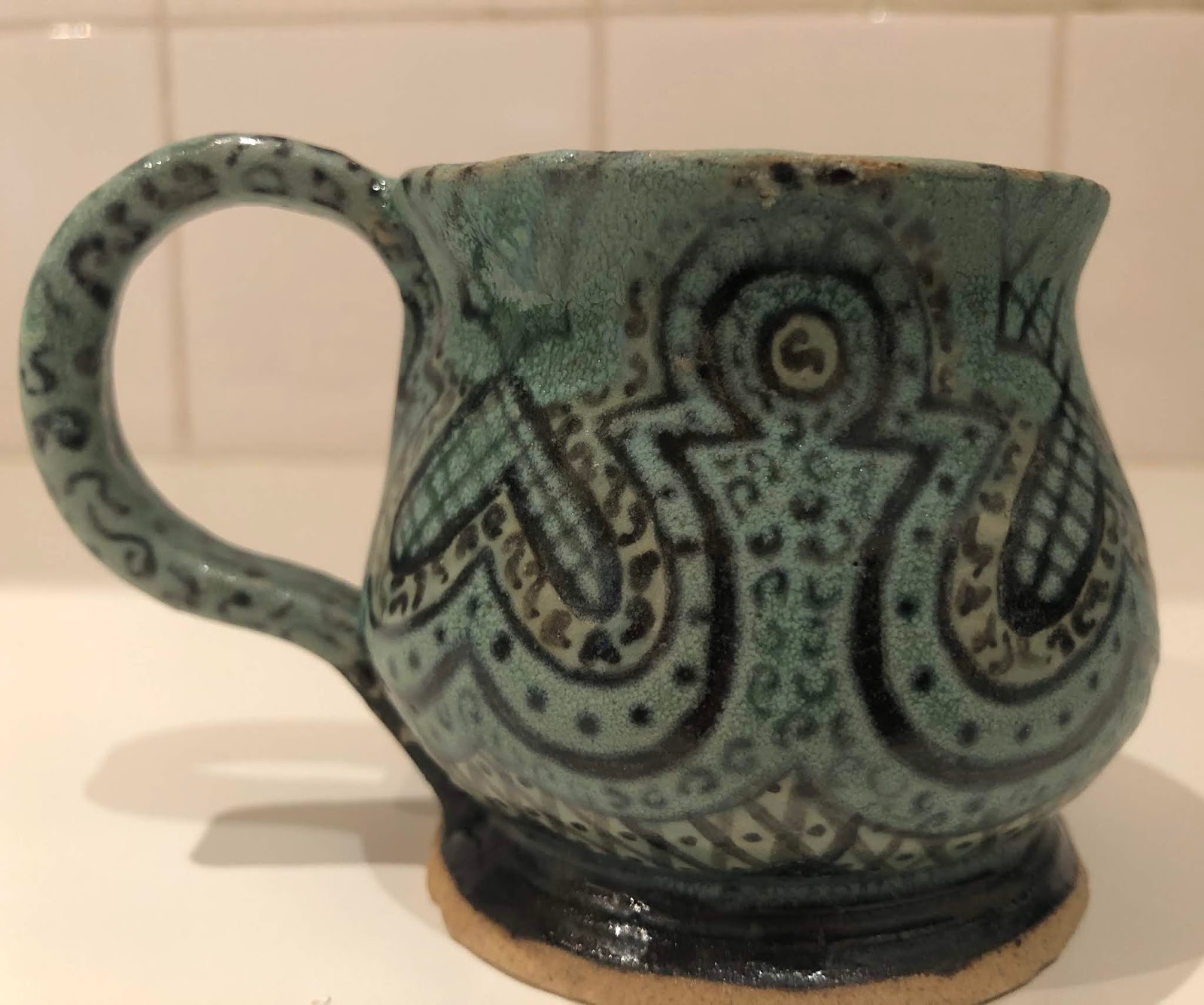
Update: post firing.


Oh wow! I love this piece. The buff area has come out even more green than the jade area. When I was dipping the cup in the two green over glazes I noticed the overglaze didn’t really coat the underglaze. This may be because the bisque pores were full of glaze and couldn’t absorb mire water reducing the ‘stick’.

I can’t decide if the opaque green glaze was too thick here or if there simply hasn’t been sufficient heat. Either way, there are some cloudy areas which needs more investigation. It all seems to be around the rim...

Saturday, 11 January 2020

Buff green Pt 1 - 12th night entry

12th Night Lochac A&S competition Entry

My entry for the Kingdom of Lochac 12th night Arts and Sciences competition in the category of "A container" is a cup based on an extant example from 12th century Iran (Persia). This cup has been hand thrown and hand glazed by myself over the last two months. It is currently unfinished, sitting at stage 6 of 7. This accompanying documentation will discuss the extant item, the creation of the object and my development in the following sections:
  • The extant object - what I've learned about how it was originally made & glazed.
    • construction - stonepaste
    • construction - shape
    • glaze - slip
    • glaze - underglaze
    • reference cup summary
  • Constructing the replica - stages and learning
  • Glazing the replica - stages and learning
  • Reflection
  • References (alphabetical)
  • Table - additional extant items referenced - shape


This project has taught me a lot about ceramics cups, having grown from previously only throwing one moderately successful cup under complete guidance prior to November 2019 to being able to independently form and shape the objects quite close to what I am after. I am rather pleased with the results and plan on exploring period shapes and glazes more going forward. I believe I have achieved the targeted outcome of this project and there is very little I’d change for future implementation.