Monday 19 January 2015

12th century garb part 1

I've been trying to find an image to develop my next set of garb from. Part of the problem of studying 'India' is that in reality I'm studying many different kingdoms and traditions. Finding a generic medieval-indian outfit would be like finding a generic medieval-european outfit. It just isn't a thing. So I've decided that I'll do my best to recreate outfits from specific images or collections based in one time or one location.

I've found my first!

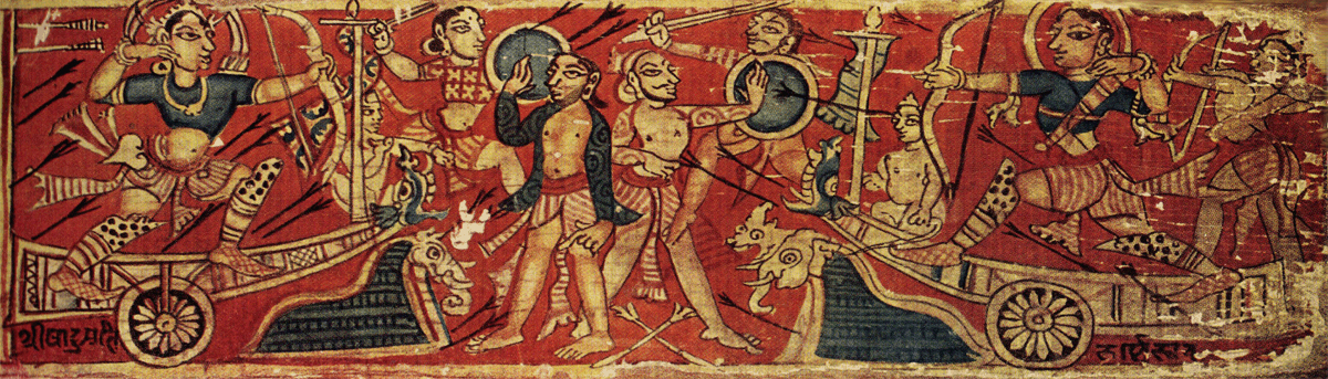
The Battle between Bahubali (Balarama) and Bharat Painted wooden book cover (Patli) Jain School, Western India, 12th ce. (secondary source #1), (better secondary source #2) - Moti Chandra, Jain Miniature Paintings from Western India, Ahmedabad: Sarabhai Manilal Nawab, 1949: Fig. 199.


These ladies are badass. They're in chariots with Mongol-esk recurve bows, shin armour (sort of like the ancient Greeks), shoes (note the lack of toes), a pant drape, mid length choli top with longish sleeves. They're also left and right handed and in the background is an awesome chick weilding a sword and round shield. I don't know how easily this will convert to SCA armour, but I could totally work this for IKAC shoots.

Saturday 17 January 2015

Sari collection


Extant sari (?)  length with hamsa geese print, cotton, Gujarat for the Indonesian Market - 481.3cm long, Met Museum. Accession Number: 2012.445

I wonder about the two spots of damage, is that due to folding and subsequent damage while being stored or displayed? Perhaps those are the sections that were preferentially knotted?

Textile with forested landscape, Gujarat for Indonesian market, 494.5m long, Met Museum, Accession number 2005.407


The saree's that I own:
Cotton brown with black blockprint and dark turquoise detail - 5.20m (5.7 yards)
Cotton red with gold triangle trim - 5.20m
Cotton maroon with straight gold trim and border protection -  5.20m
Cotton cream with brown block print - 6.20m
Cotton/silk blend white with gold spots - 5.20m
Cotton white with gold trim -
Cotton light brown with apricot gold trim -
Cotton purple with orange gold trim -
Cotton maroon with black and gold trim -
Faux silk art silk block print -
?? orange brocade -
Silk wine striped silk -
Cotton ? stiff orange with purple and applique - 

I find the softer and lighter the fabric the better it drapes. As a result, I prefer to wear the cream with brown block print (even though it's really long), the brocade or the wine silk. The art silk I keep around as a demonstration tool and because I love the block print design. It is too slippery to drape well without lots of safety pins but it does fall nicely as it's a light weight fabric.

Monday 5 January 2015

Monthly UFO update

The list so far:

Blue tartan bustle kilt
Red tartan bustle kilt
Blue lace with butterflies tartan kilt
Brown block print sari    (21/12/2014)
Green Ikat saree   (21/12/2014)
Rust and Cream block print saree (29/12/2014)
Red with gold saree  (1/1/2015)
White with red dupatta (4/1/2015)
Cream and gold silky saree (5/1/2015)

Red with Black saree

Apricot saree
White & gold saree
Purple & black saree
Blackwork wall hanging
Fancy Pants blue t-tunic
Snakes and Ladders Quilt
Cream 1860's dress' belt
Goldhaube
Mumluk Dishtowl
Cream woolen dress (28/12/2014)
Layla's tutu (23/12/2014)

Additional items:

Cream & rainbow spot dress
Rust Chemise
Janet's Giraffe
Grey Kilt
Red Kilt
Red and Green Kilt

Thursday 1 January 2015

Generic discussion of my ceramic method

(developed so I can hotlink to this rather than retyping it each time)

General Technique:
In the late middle ages to the renaissance, a number of centers for production of highend earthenware existed across Europe. While each area had their own style, techniques and motifs often travelled along the trade routes. Generally, earthenware plates and bowls would be moulded, fired and then ceramic artists would glaze them typically with tin based glazes. These processes were usually handled by different specialists. (the V&A website has some detailed information related to earthenware production).

For all my work I have used commercially produced bisque. I have then glazed it with commercial (and modern) glazes. To achieve a solid colour, the under-glaze must have three layers painted on. This takes some time, but is important to prevent thick lines or splotchy colours. Where white decoration is required, it is either left blank or the coloured glaze is scratched back with a wooden skewer to reveal the ceramic or a layer of white glaze underneath. This is a period technique as shown by the fine lines on this 16th century Spanish pharmacy jar (1) where the cobalt glaze has applied then carefully scratched off. A clear over-glaze is then applied before firing which I get done at a professional service.

I feel my approach is justified as I don't own the equipment to produce my own bisque and while I have dabbled in glazing, I don't own a kiln either so can't risk ruining other peoples work with my experiments. I'm also aware that many of the lead based glazes use din period may not be appropriate for items people wish to eat from. A side benefit of the professional firing service and commercial glazes is that the items I produce are microwave and dishwasher safe!

Materials: 
The bisque I purchase comes in a limited set of shapes. This restricts the items I can do and how closely I can replicate items due to changes in scale or shape. For each of the items presented here, the design drives the bisque choice when then modifies the design application.
Typically the extant items I replicate are tin-glazed earthenware which is pottery which is coated in a glaze containing tin oxide. This leaves an opaque white base upon which metallic oxides and other glazes are painted. The main difference between my work and that of the workshopss of the middle ages is that I use commercial glazes. These glazes come pre-mixed and are usually a consistent colour. They also contain no toxic substances and due to the over-glazing process result in a product that is dishwasher, microwave and most importantly food safe. Many medieval items utilise a lead based glaze as it can create a higher intensity in colours like red. Needless to say, I doubt my items would be as useful if they weren't functional as well as pretty. The other major difference in the glazing is my lack of lustre. Lustre ceramics involves utilising a glaze containing metallic oxides which leaves behind a shiney lustre once fired. The technique was first developed in Iran before spreading to Egypt and then onto Europe. In the renaissance, Spain was the center of lustre-ware production featuring Moorish designs and pseudo-kulfic inscriptions. The line of commercial glazes I use doesn't contain a lustre products so at this point I cannot replicate this form of ceramic.


Generic references for cupshape

References:
Generic references for the cupshape I preferentally use so I don't have to keep repeating myself to make each post a cohesive document.