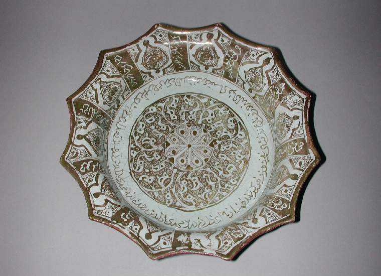
I entered Lady Elizabet's ceramics in the Midwinter Crown-o-nation A&S competition for tableware. The following is the 10 pages of documentation I submitted. I've posted about her plate and cup but picked up the bowl only two hours before I had to get it over the other side of the city so Mistress Genna and Sir Wolfram could deliver it to the event. If you've been following this blog you've probably seen quite a bit of this text.
Tableware – Lochac Midwinter A&S competition
Entry & documentation by Antoinette Travaillie –
the College of St Monica
What:
Lady Elizabet’s ceramic tableware set – plate, cup and bowl (hand glazed
commercial bisque)
Where:
Manises, Spain
When:
15-16th Century
Motivation:
I started this set being inspired by an imaged Lady Alliette linked to facebook
of a 1450’s earthenware plate featuring a cat. As Lady Elizabet has a rather
lovely device (Figure 1) (and has made me some wonderful silk banners) I
decided to recreate the plate for her. Then, obviously, she and Alliette needed
mugs with cats on to make them both smile. When I eventually found out about
the A&S competition, I thought I’d borrow the items back and enter them,
and thank Elizabet for the loan with a matching bowl (also it completes the
set).
Figure 1: Lady Elizabet Hunters device as
interpreted by Countess Constanzia.
General
Technique: Between 15th-16th centuries
there were a number of ceramic centres throughout Italy and Spain (eg. Manesis,
Deruta). Earthenware plates and bowls would be moulded, fired and then ceramic
artists would glaze them typically with tin based glazes. These processes were
usually handled by different specialists. (the V&A website has some
detailed information related to earthenware production).
For these three items,
I have used commercially produced bisque. I have then glazed it with commercial
(and modern) glazes. To achieve a solid colour, the under-glaze must have three
layers painted on. This takes some time, but is important to prevent thick
lines or splotchy colours. Where white decoration is required, it is either
left blank or the coloured glaze is scratched back with a wooden skewer to
reveal the ceramic underneath. A clear over-glaze is then applied before firing
which I get done at a professional service.
Materials:
The bisque I purchase comes in a limited
set of shapes. This restricts the items I can do and how closely I can
replicate items due to changes in scale or shape. For each of the items
presented here, the bisque choice has driven the design selection.
The main difference
between my work and that of the workshops in Manises is that I use commercial
glazes. These glazes come pre-mixed and are usually a consistent colour. They
also contain no toxic substances and due to the over-glazing process result in
a product that is dishwasher, microwave and most importantly food safe. Many
medieval items utilise a lead based glaze as it can create a higher intensity
in colours like red.
The main inspiration
for all of these pieces (Figure 2) features background decoration in
lustre typical of Manesis at this time. I currently do not have the resources
to experiment with lustre and the firing service I use will not accept pieces that
have been glazed in products sourced externally. I have substituted standard
glazes for this instead.
Documentation
(divided by object):
Plate
I was initially
reluctant to paint this design as the cat itself is too pointy for my taste.
Then I realised that the aim of this plate was not to reproduce an extant
sample, but to make something in a medieval style for a modern day SCA use. So
I adapted it a little to best represent Elizabet’s heraldry.
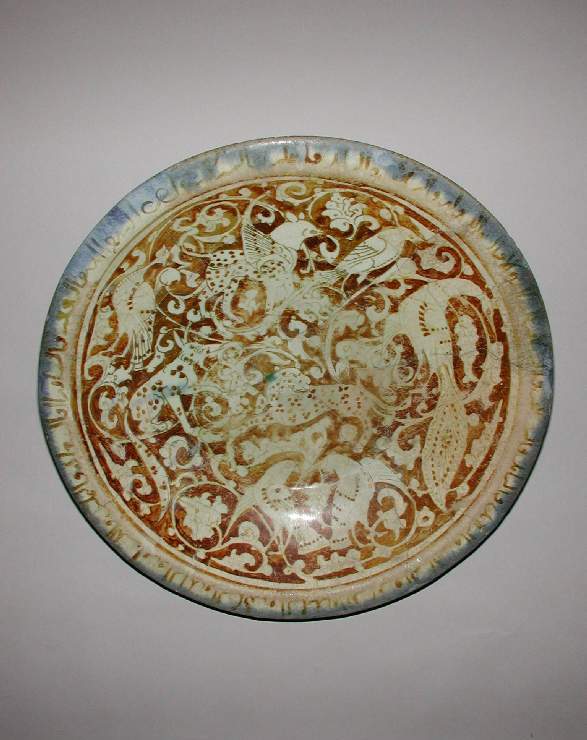
Figure 2: Dish featuring a Cat. 1400-1450, Spanish,
Manises. Tin Glazed Earthernware. 34.6x5.5cm. Accession number 56.171.115,
Metropolitian Museum of Art.
Adaption: In keeping with Elizabets
device, I have flipped the cat to sinister and painted the bottom third of the
plate in red. I have retained the decorative elements (originally in lustre on the
extant piece) and used them to tie the whole plate together. I have also
adapted the cat from the pointy, toothy one above to something closer to the
interpretation of her device that she likes best. I've retained the long legs
but made the cat appear more fluffed up and protective which I think fits
Elizabet better.
Figure 3: The finished plate.
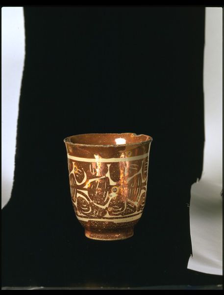
Cup
Shape: Unlike the plate, there is no generic ceramic cup shape for the time
period I was examining. Many people were using glass cups at this time as well.
As I had to utilise what bisque was available to me and I didn’t want to have a
handle, I purchased the only one available and reverse documented it. Figure 4
and 5 show the barrel shape in both glass and earthenware.
Figure
5: 1634 - Barrel shape with handle, tin-glazed earthenware, The British Museum,
item 1887,0210.117
Decoration:
Extant cups were decorated with lustre in a style similar to plates and bowls
of the time. I decided to adapt the pattern used on the plate to the cup and
keep the top of the cup white. This also allowed me to avoid the warped look of
the circular features that would be caused by the slope of the cup sides. I
also changed the style of the cat to match Constanzia’s interpretation better
as it’s more aesthetically pleasing. I added my own touch to the cups to make
Elizabet smile; I painted a sleeping kitten inside the cup that would be
revealed when they had finished her tea.
Figure 6: Cup, Manises, Spain. 1625-1700. Victoria and Albert Museum,
item 447-1903
Figure 7: The sleeping cat is
revealed...
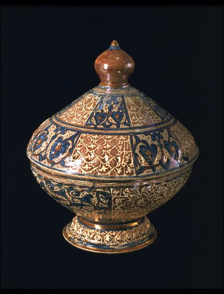
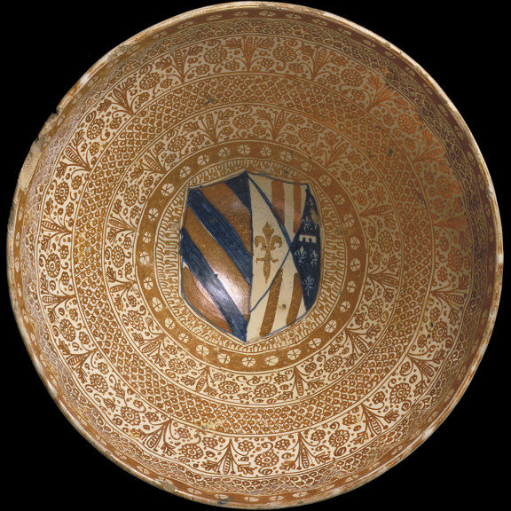
Bowl
Shape:
Again, there is no generic bowl shape for this time period. Shapes range from stumpy
to sloped and footed (Figure 9). My bisque options were flat bowls with wide
rims or more rounded, sloped bowls. I chose the second shape as it was more
like those I’d seen on various museum sites.
Decoration:
The craftsmen of Manises decorated both
the outside and inside of bowls to varying degrees. It appears that the finer
the item, the more intricate the decoration. Figures 10 & 11 show the
inside and outside of a Spanish bowl with arabic inspired design. According to
the listing at V&A for this item “A shipment by a leading Italian exporter
of Spanish pottery, ordered from the Valencian potter Asmet Zuleima in 1407,
lists 199 pieces of lustre ceramics, including ‘three large bowls, their covers
painted out- and in-side’.”. When I was researching these bowls, I was rather
pleased to find the bowl shown in Figure 10 as it helps support my choice of
decorating 1/3 of Elizabet’s plate.
Figure
10: Inside of Lidded bowl, 1440-1460, Manises, Spain. V&A Museum item 7659:1,
2-1862
Figure
11: Outside of Lidded bowl, 1440-1460, Manises, Spain. V&A Museum item 7659:1,
2-1862
As the bowl is the
final item made for this set, I wanted it to tie into the cup and plate but
experiment with another way of displaying Elizabets heraldry. Figure 12 shows a
typical bowl from Manises displaying lustre decoration and a heraldic device.
Rather than paint the full device in the centre of the bowl (difficult with the
curved sides), I decided to paint three cats around the edge. I retained the
red on white decorative elements for the inside of the bowl and painted the
outside with the white on red decoration. This is not entirely true to the use
of elements shown by the Manises glazers however it fits well with the other
items in the set.
Figure
12: Bowl, Manises, Spain, 1500. V&A museum, item 550-1864
Things
learned:
* It is very
difficult to paint the inside of the curved cup. Solution: lack works best as
you can get away with only two coats minimising the chance of errors.
* Black glaze
stains white ceramic and will never cleanly scrape off. Solution: paint a white
undercoat or two underneath any black glaze that may need scraping. This
prevents the black from soaking into the bisque
* Glaze on
the outside of the bowl will come off on your hands (and the table) as you roll
it around while painting. Solution: Paint the inside of the bowl first then
upend it so it rests on it’s unpainted rim while the outside decoration is
completed.
* Three
layers of glaze will thicken even the finest of lines. Solution: The trick to
balancing this is ensure you use lines of different thicknesses to put the ‘thin’
ones in perspective.
Project summary
Motivation: Because I could.
Materials: Bisque
ceramic cups with underglaze decoration
Year: ~1450, Manises, Spain.
How historically accurate is it?
The bisque shapes are
reasonably close to the parameters of extant pieces. The glazing technique is
accurate however the glazes utilised are modern in composition due to safety
reasons and other concerns. The three variations of the decorative elements are
also quite close to medieval extant items.
Hours to complete: ~40
Total cost: $80 in materials
Satisfaction
with finished products: 8/10
Additional
resources:
British Museum - http://www.britishmuseum.org/
Places
to paint ceramics in Australia
Melbourne
Glaze it Studio
328a Glen Eira Rd
Elsternwick
http://www.glazeit.com.au
All FiredUp
568 Hampton Street
Hampton
http://www.afu.com.au/
Brisbane
Tea andBisque-it
Shop 3 Sandgate Arcade
Cnr Brighton Rd & Cliff
St
Sandgate
http://www.teaandbisque-it.com.au/
Sydney
Colour
MeMine
Shop 4, 29 Holtermann Street
Crows Nest
http://www.crowsnest.colourmemine.com/
Adelaide
The PugMill
17a Rose Street,
Mile End
http://www.pugmill.com.au/
(also a good place to buy
home supplies, assuming you have a kiln)
Perth
Fired!Ceramic Cafe
29 Winton Rd,
Joondalup
http://www.firedcafe.com.au/
Make yourmark
8/2 Hulme Ct
Myaree
http://www.makeyourmarkartcafe.com.au/


