Tuesday 31 December 2019

Buff white - basal white with underglaze decoration

Class results continue - 2nd firing, buff clays with a white dip.

When wet, the PB103 and the Buff clay have a noticeable colour difference. The buff clay looks like it resembles the 'earthenware' clays in the museums more. I guess, brownish clay (with some fe-oxide) content seems more natural to me. I've already posted my first experiment with the buff clay effect on glaze colour and noted the curious tendency of the buff to bloom with certain glazes. The items described in this post, were fired in the second batch but decoration commenced while batch one was still in the kiln.

If you've been following my blog, you'll know I started experimenting with underglazing in May / June 2011. I spent many years visiting Glaze It Studio and using their commercial bisque, underglaze and firing. The team there are lovely! Siegel (hope I spelled that right) still welcomes me when I drop in once or twice a year. Many years ago, she gave me glazes to take home so I could work on my items in peace and have been more than generous over the many years. I have, unfortunately, moved so attending their lovely studio is very challenging. I have tried a couple of similar studios in my new home town but the atmosphere is just not the same. The time and dedication it'd take to build a similar relationship with a new company is beyond me because I just want to be able to create my art.

Enter ClayMake Studio! This started as a way to broaden my ceramic skills as I'd been introduced to throwing at Pennsic by Master Simon. Interested in learning more I've signed up for a single session class and a longer 5 week wheel work class. As a result of these classes, I have plentiful bisque to work with and I can indulge in underglazing again. I do need to learn some new parameters as ClayMake fire to stoneware temperatures which, I believe, may be a lot higher than GlazeIt fire at. I'll still be returning to GlazeIt on occasion as I have yet to complete my tile project (ongoing since 2013). There are a few tiles I haven't posted about but I plan on firing the last one and doing a couple of posts about that project. It's been an interesting journey.

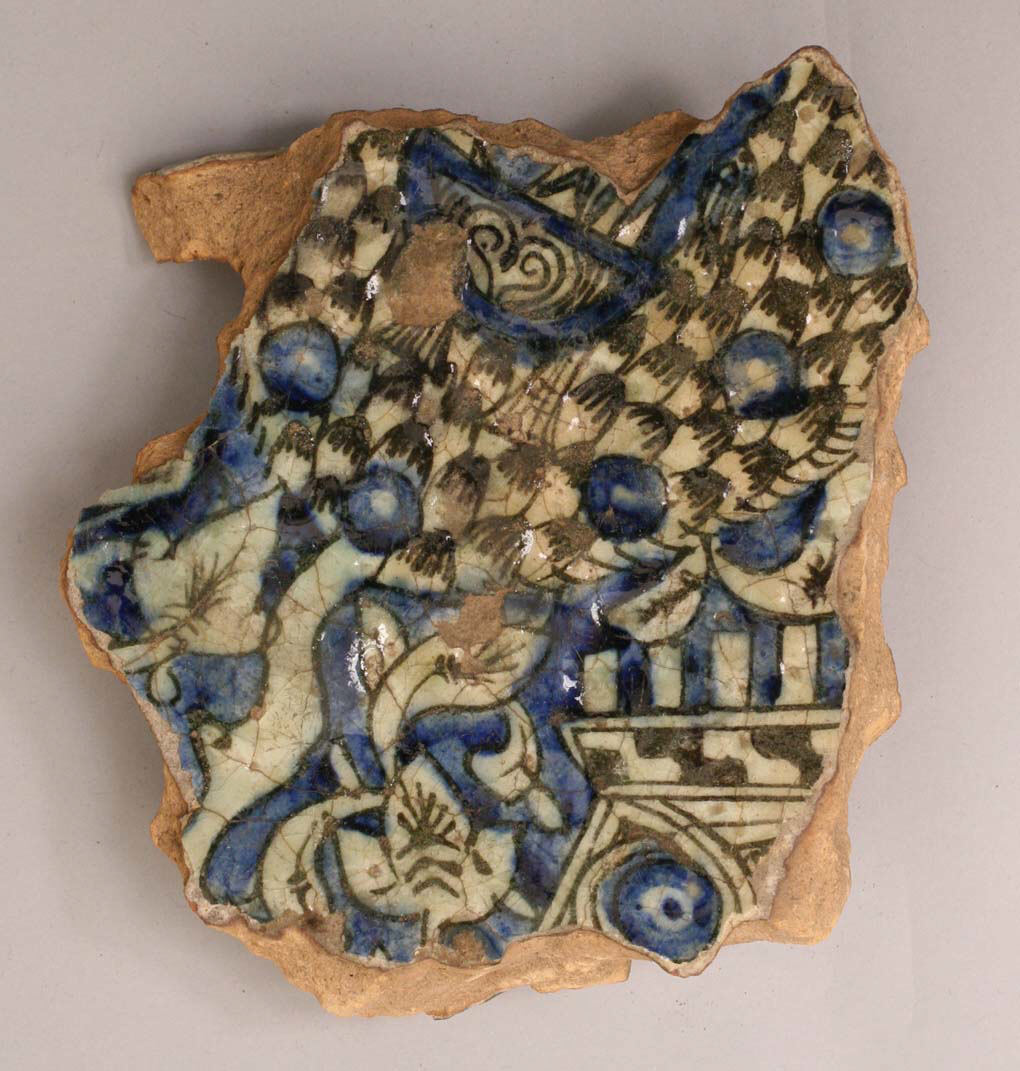
Fragment, 14th–15th century, Egypt, Kus, Stonepaste; underglaze blue and black; transparent, colorless glaze. Met Museum item number: 07.238.19

Anyway, that was an epic background introduction to this new project. I've previously only used / had access to white commercial bisque. This has made creating my designs really easy as many of my medieval references are underglaze on a white lead glaze background. The image above is an excellent example. The brownish nature of the clay can be seen on the edges of the fragment and the white basal colour fragments with curved edges suggesting a silicious nature. (Side note: I've been meaning to develop this fragment into a full design for a couple of years now. I've only just realised the main checkerboard is probably a tree with blue fruit globes and a blue bird while the angular design in the bottom right is a building or fence perhaps.)


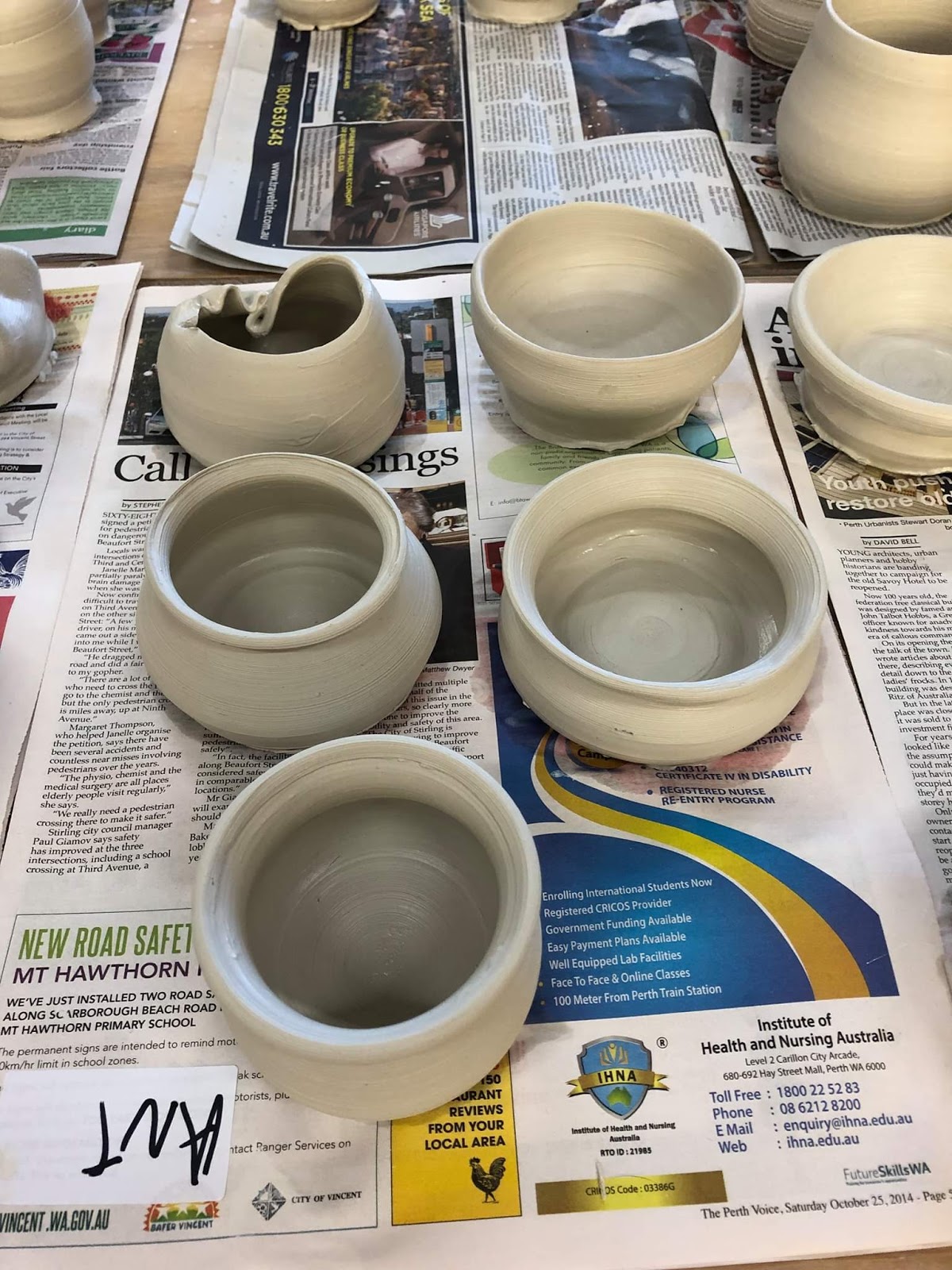
Anyway, I've been able to do away with the background colour and concentrate on the decorative motifs in the past due to the bisque I used. Given the wet colour of the buff clay, I was concerned that if I continued to use buff, it'd change my underglaze colours too much. This experiment was proposed as a solution of the colour of the clay. Similar to some majolica pieces, these cups have been dipped in a white background glaze before the underglaze has been applied. (I don't remember which glaze I used, I may have screwed up and used Titanium white instead of satin white!).

Pre-firing, basal white glaze with Redwood, Citris / Saffron and Turquoise with three layers thick.

The cups were dipped in a white background glaze and then transported to my house for underglazing about a week later. As a result of this delay, all of the moisture has evaporated leaving a very very powdery basal glaze behind. I was able to easily smooth any drips in the basal glaze by rubbing a finger lightly over it. I am a little concerned that the underglaze brushes, if too hard, have lifted some of the basal layer and I may end up with specks in the underglaze colours. The cup on the left has a black outline and detail under the three coats of underglaze colour. I'm curious to see if that comes through or not. I will have to do a proper multi-coat tile experiment with these glazes because the reference tile I've currently got really doesn't show if the colour changes during firing are just due to the thinness of the glaze coat or not.

Test tiles for Buff clay, left = Titanium, right = plain with clear overglaze.
Colours left to right : Row 1. summer blue, electric blue, cobalt blue, turquoise, peacock, jade. Row 2. Redwood, Crimson, Saffron, Citris, Leaf, Brunswick. Row 3. 28A (glazeit colour), Black oxide, Light Jade. Row 4. 28 original (glaze it colour for my bathroom tiles).

I'm in two minds if I should cover everything with a clear overglaze or just hope the basal layer has sufficient silica to make the designs shine. I'm not sure how it'd look if I did dip it in Satin White as I planned on doing. The test tile on the left shows the titanium has sufficient silica to make a pleasing shine to the glaze. The titanium seems to react with the underglazes, modifying their colours and making them more speckled. I chose to use colours that seemed to work on both tiles in the hope they'd stay true. I have a fourth tile and will conduct a test with the clear overglaze with it and leave these as they are.

I used hummingbirds as a motif because if the underglaze does turnout to be titanium white, the speckle would still look good. If the streakiness seen on the previous underglaze experiment was an interaction between the clear overglaze and the underglaze rather than an overglaze application error, the humming bird motif won’t be badly impacted.


Sunday 29 December 2019

PB103 Iznik vase - experimenting with new and old underglazes at high temperatures

Item four in the Christmas firing was a small PB103 Iznik vase. I was experimenting with thin closed forms when I made the vase. It was reasonably pleasing to hold to I kept it and fired it to bisque. Once I purchased a new set of underglazes, it seemed like a good candidate to trial the colours at stoneware temperature. The following are the colours I had available. These are presented on a buff coloured tile so the PB103 expression is likely to be different.

L-R: R1. summer blue, electric blue, cobalt blue, turquoise, peacock, jade. R2. Redwood, Crimson, Saffron, Citris, Leaf, Brunswick. R3. 28A, Black oxide, Light Jade. R4. 28 original.

Not knowing how the colours would turn out, I selected Crimson, Turquoise and Cobalt blue for my design. I know blue is stable at high temperatures (see the Blue on White essays) so I figured those elements would probably remain. The temperature range on the crimson suggested it'd probably burn away so I used it for non-essential items. These were the small swirls at the base of the vase, the flower insides and the dots around the petals.


Close examination of the flowers show a very pale pick remains. I may use crimson in the future if I'm aiming for a pale pink as I'm told pink and purples are difficult to deliberately achieve. If I want a bright red, I think redwood may be the way to go. I'll have to make a PB103 tile and test the glazes on it to see. On the buff clay it seems to be more orange and less deep red than I expected. It will require a test though, because the buff clay contains something that reacts with the glaze, creating blushing near where some specific glazes are applied.

Saturday 28 December 2019

Buff blue - glaze dipping to understand difference from PB103

Glazing attempt 2 - blue!

My first attempt at glazing was a single session to experiment with colour combinations and basic dip glazing techniques as dip glazing was something I'd never tried before. Those experiments were moderately successful with the blues being my favourites followed by the aubergene over green combination. For medieval ceramics through, the purple colour isn't a common one so I thought I should stick with basic colours to see if using buff clay changes much.


The first experiment was conducted on what could be my favourite little cup shape. It unfortunately developed a small crack in the base and one on the handle due to uneven drying. I hoped a solid glaze could plug any potential gaps and strengthen the cup. I had intended to put a clear glass over the matte blue however the cup slipped while I was dipping it so it absorbed too much water from the glaze and was too damp. I didn't want to add more moisture with a second layer of glaze as I was worried it wouldn't be able to be fired. Still happy with the shape as I love the little thumb divoty thing and the handle is a very pleasing size for me.
The glaze appears to have strengthened the cup and this one it nicely watertight and the handle can hold the weight of the cup full of liquid.

Experiment the second. This smallish milk jug was dipped in titanium white in the base and matte blue on the top. The inside was sealed with a transparent gloss glaze. Blue dots of 28B underglaze was added for visual appeal and to see if the older underglaze could withstand the stoneware temperatures (~1200). I am in love with this glaze blend and plan on creating a whole set of house cups for myself in this pattern.

Experiment is a success with the blue withstanding the higher firing temperatures and the buff clay body is not skewing the shades blue significantly.

Interestingly, the buff clay appears to bloom when proximal to certain types of glaze. There doesn't seem to be a significant colour change on the foot of the milk jug however there is bloom on the foot of the blue cup. The bloom is easier to see on the neck of the quatrefoil cup resulting in a pleasing reddish-brown tone. This has to be a result of a slight degassing from certain glazes interacting with the iron in the clay body as the same glazes on the PB103 do not produce this result.

Friday 27 December 2019

PB103 quatrefoil cup - still chasing the grail

My first quest in my recent ceramic class was to make a quatrefoil cup. I threw three but squished two of them because the proportions just didn't look right. My final one still isn't perfect but it was the best of the lot and the shape visually pleases me.

So what is a quatrefoil cup? A quatrefoil cup has a rotund body, which cinches in slightly then flates out. The lip is pinched so as to form four lobes. The lobes take up slightly less than half the cup. There are a number of quatrifoil and cinquifoil extant items available in museums. My favourite is posted at the bottom of this entry because the Swiss National Museum doesn't create independent linkable pages for their items.


Quatrefoil Cup. 9cm tall. 15th century, Cheapside, London.


My first attempt at a quatrefoil cup was my third ever thrown item. I threw it at Pennsic in 2019 and it's details can be found here. My next attempt at a quatrefoil occured during day 1 of a 5 session class. I'm still learning about how to determine the stability of clay and how to intuitively feel when it's been pulled enough. I started using PB103 which is a basic white clay. It's reasonably dense and can sustain a lot of height on reasonably thin walls.


There are three main things wrong with my quatrefoil. First, height: The original is 10cm wide and 9cm tall. My cup is taller than it is wide, resulting in more vase overtones. Second ratio: the original had the quatrefoil lip flaring out from just over a half cup. Mine is about the top third of the item creating a 60 degree angle rather than an 80 degree angle for the lip. Finally glaze: I used a matte green glaze on the base of my cup and a clear internal & over the lip glaze. I should have reversed this, glazing the inside and lip green and then sealing the lot with a clear glaze over everything.

Interestingly, the colour variant in the glaze of my cup is due to the firing process rather than a deliberate attempt. I'm not sure if this a slightly temperature change or a slight oxidisation change both could be caused by the bulbous nature of the cup.


Breiter Henkel mit seitlich eingedrückten Rundflächen; enger Hals. Herstellung: Zürich. 1400 - 1500. Herkunft: Zürich (ZH), Haus zum Johanniter. 23,4 cm. Ton, glasiert. (Broad handle with indented round surfaces; tight neck. Production: Zurich. 1400 - 1500. Origin: Zurich (ZH), Haus zum Johanniter. 23.4 cm. Clay, glazed.) Swiss National Museum. Item no. LM-24622 or possibly DIG-4681


+1 to throwing skills

I believe I've achieved a +1 in pottery skills in the last couple of months. I've just completed a 5 week (three hours a week) course at ClayMake Studio and my skill at making things has come along significantly. Prior to this course, I made a bowl at Pennsic in  2017, a cup and a bowl in 2019 and 5 "bowls" in a oneshot single lesson session in October which I glazed in early November. 
Enthused, and city based for the time being, I signed up for a 5 week throwing course with the aim of being able to throw a satisfactory cup in a deliberate manner. i.e. I want to be able to throw a set of similar looking cups whenever I want. As a side mission, I'd like to understand clay and the strength of the form well enough to be able to throw a properly balance quatrefoil cup.

As this class went for 5 week, 4 throwing, 1 glazing. I spent 1 class throwing items in PB103 which is white clay and then shifted to a buff clay for the next session as it was closer in colour to the earthenware I was trying to replicate. I spent the third and forth sessions trimming pots and learning to make handles and for the fifth session I glazed some of my creations.

I had a lot of pots to glaze! Due to my interest in underglazing, I decided to do some experiments with underglaze rather than just dip all my items like I did for the oneshot class. Below is my experimental colour test tile which was fired with the first 6 items. The first six were experiments to see if the underglaze held up and if my cups would make it through stoneware firing. I only underglazed three of these and accepted they might not come out of the kiln well. I figured I had a pretty good shot with the black oxide and the other colours may or may not work. They were ready for collection on the 27th!

All my items are at various stages of glazed so I'll post about them and update this entry as they develop.


Buff greens - middle-eastern / sultanabad - Part 1, Part 2, Part 3

Handles - why summer is BAD

Wednesday 20 November 2019

Pot throwing results

On the 20th of September, I took a casual class in pot throwing at Claymake. This was my third ever time using a wheel, and my first exposure to an electric wheel. Thanks to the expert tuition of Master Simon at Pennsic, I understood the basics of what I was trying to achieve even if I couldn’t quite get my hands to do it properly. In that three hour class, i made many objects, scrapping most of the asymmetrical ones. I retained 5 olive bowls which were bisque fired.

I then signed up for their monthly guided glazing class so I could glaze my treasures.


I am rather proud of my creations even through one of the rims snapped. I tried a different glaze technique on each one. From left to right: green and yellow englobe with a translucent green dip; Matt blue interior with blue englobe rim /painted on for the scales in a transparent outer glaze; blue englobe belt with blue interior and aubergene exterior glaze; translucent green glaze throughout with aubergene angle dip and finally englobe interior scratched back to create design with transparent clear over.

Notes: the englobe is a coloured clay tweaked to ensure no shrinking occurs during firing. The glazes and englobe are very powdery when dry and make further decorative work challenging. I’d probably add more gum or something to reduce the powder effect if I were to make my own for the painting or scratching applications.

Notes II: it’s likely the underglaze I used for all previous work won’t stand up to the firing temps at Claymake. Well, the blue might because that’s generally a sturdy colour. The others might not. It’s worth an experiment though.

Tuesday 5 November 2019

Mughal flat hat

The Mughal flat hat!

Late 15th Century. Shapur with the daughter of Mihrak, by Qāsim.  British Library MS 5600 - f.399v: Look at the detail on her hat! I love the beaded (pearl?) trim on the edge and the suggestion of gems all over.


Tuesday 29 October 2019

Lets talk about pants

So, in my usual method of garb creation, I've started with a half remembered reference and jumped into my project. I've begun practicing block printing on bigger items and thought I should start with a ~2m bit of fabric because then I could make it into pants. Because, you know, you can never have enough pants.


Anyway, I've now block-printed half the fabric and I couldn't remember if the original reference looked like the diagonal strips both trended the same way or opposite ways. i.e. do I need to change orientation half way through the print to make a V shape or can I get away with //// all over?

Cue many many hours of trolling through manuscripts trying to find diagonal prints!

Here are some findings and comments thus far:

Some Safavid pants to start...
Folio 155r, British Library. MS 6613. Pants appear to have a dark stripe over blue, red and black diamond pattern. The diamond pattern is offset in the right leg which suggests an alternate construction method where the pale fabric is sewn together out of isosceles triangles, allowing the pants to gently increase in size with every rotation. Given I'm not very good at sewing, I think this would only happen if you were short on fabric, otherwise just gather / pattern to taper to the ankles.

Folio 184v, British Library. MS 6613. Pants worn by the Greek Princess. Same manuscript so artistic style is unlikely to change however these appear to have aligned triangles and alternating gold and grey bands. I wondering if the white dots are dyed, pearls, embroidery or spangles?

  
Woman holding a daisy. Herat (Afghanistan) Safavid. 1570-1578m. The Met Museum,   55.121.42. Diagonals again but such detail on the closeup! The fabric is fantastic and does suggest the entire piece is either diagonal stripes or vertical and the pants are cut on the bias. Cutting them on the bias would provide some stretch.

Christian Maiden dies. 1600 Iran. The Met Museum. Folio 22v. Accession no. 63.210.22. Look at that splendid acanthus print!

 Woman nursing a child. Bibliotheque Nationale Paris. folio 23r. Arabe 5847. Glorious colour combination and multiple foliages. It looks like these would fall into horizontal strips should she stand up.

Skipping to the Mughul culture now because when it comes to pants, I'm not picky.
 These are the pants of Princess Jahanara, painted in 1632. British Library, Add Or 3129. Folio 13v. I am really taken with these pants, the strips are fantastic! Unfortunately, the geometry doesn't work well. We see three red stripes at the ankle, which becomes 6-8 at the waist. We see no narrowing of stripes up the leg suggesting all stripes must either be cut off or gather/taper. To achieve this look, the fabric must be cut to ensure excess stripes on the front and back are cut to terminate on the inner thigh. Even then, superior tailoring is required to taper the cut from the hips up to the waist.


Lady with a narcissus. 1631-1633.  British Library, Add Or 3129 folio 34r. Take a moment and admire this spectacular pair of pants. Yellow with blue mangos? outlined in red, with a blue framing pattern. Splendid!


I'll leave this collection there as there are many many pants down this particular rabbit hole. For now, I believe i have sufficient justification for horizontal, vertical and diagonal stripes. There is no supporting evidence, yet, of stripes that originate on the inside ankle with one leg clockwise and the other counter-clockwise so for now, I shall make the stripes all go one direction.

Monday 21 October 2019

Princesses MS6613


I had hoped the Princesses mentioned in this manuscript would all be wearing clothes reminiscent of their culture or at least Safavid interpretations of their garb. Unfortunately, a majority of them appear to be wearing the fashion of the times, that is, Safavid fashions.


The Moorish Princess, F165v The Tartar Princess, F168v
The Russian Princess, F171v The Khvarazm Princess, F178v
The Chineese Princess F180r The Greek Princess F184v

Happily, the Indian Princess and her attendants wear something slightly different.


The Indian Princess. F159v Indian Princess' attendant / dancer


Sunday 13 October 2019

Safavid pants - MS6613


Detail: Folio 155r: Fitnah carrying the ox on her shoulders up steps to Bahrām Gūr. 
Khamsah by Niẓāmī Ganjavī (1665-7) which contains 41 minitures in the Safavid style. This manuscript was written for Tājā Mīrzā Abu al-Ḥasanā. Colophons dated Jumadi II 1075 to 5 Rabi‘ II 1076 (AD 1665). British Library. MS 6613


Pants appear to have a diagonal blue/grey pattern which overprints blue triangles / diamonds outlined in red and black.

Sunday 1 September 2019

Pennsic pottery achievements

I attend Pennsic again this year. I spent a lot of time hanging out at the Tudor House in the market place with Master Simon and all the amazing pottery people. I didn't help make the kiln this year as I was sleeping off a watch shift, but I was there for both firings. The first one didn't hit temperature. Master Simons thinks it might be because the woodbox tunnel roof sort of collapsed so it wasn't drawing properly. The collapsed part was dug out and the second firing went much better. The kiln was very crowded but everything seemed to come out generally fine.

I tried a new experiment this year. I was trying to make a quatrefoil cup because they have a very graceful form. I don't think I got the shape quite right though. It should cinch in under the foils slightly more. Then, not bad for my third ever item!

I did also try something a bit different with the glaze. I asked the blacksmith to crush up some malachite (copper carbonate ore) and some chrysocolla (copper oxide ore). I then mixed this with a clear glaze and applied it to the sides of my cup.


I now have a non-slip cup. It seems the chrysocolla had more gangue material (silica?) so left lumps on the side of the cup. The malachite, being a larger chunk of purer ore, turned into a finer powder so provided colour without texture. Very little copper is needed to achieve a good glaze.

I'm very happy with the outcome of this Pennsic and I'm looking forward to next time!
Left - malachite glaze; right - chrysocolla glaze.

Wednesday 14 August 2019

German embroidery design 1535


Embroidery chart by Christian Egenolff. 1535. Germany. The Met Museum accession number: 33.69(4r)

I really like the zig-zag and sort of trefoils of this pattern. The chart really strongly reminds me of a Mamluk pattern currently residing in the Ashmolean. I'm not sure what I'd use this on though as the best effect would come from repeating the pattern which would create quite a wide band.

Linen embroidered with blue flax. 10th-15th century. Fustat, Egypt. Ashmolean Museum. EA1984.560


Wednesday 15 May 2019

German embroidery pattern 1535

Embroidery chart by Christian Egenolff. 1535. Germany. The Met Museum accession number: 33.69(4r)

I'm not sure where I'd use this design. The width may work for both collar and cuffs for a landsknecht shirt. I'm not overly taken with the design but it does remind me of some of the beautiful mumluk patterns.

Wednesday 13 February 2019

German embroidery chart 1535

Embroidery chart by Christian Egenolff. 1535. Germany. The Met Museum accession number: 33.69(4r)

I love this embroidery chart. It looks like carnations and an iris. It'd be quite simple to loop this around and around a Landsknecht collar or cuffs. The design on the left, I can't decide if it's bells or acorns or some sort of pod on a vine.

Thursday 3 January 2019

Hood idea II

Yesterday I published a picture of a hood I'd like to make as I'm quite taken with the ears. I've now found something equally great! Below is an image of a 1535 German design book by Christian Egenolff. The designs seem to cover a great many applications. Some are clearly embroidery charts, others appear to be engraving or carving where rounded lines are utilised. I found the image below on a page of embroidery designs. Though this image has a few rounded lines, I believe the cubic format is intended for embroidery.

The chart features two fools conversing in a garden surrounded by sun flowers. In front of them a wattle fence keeps them penned in. The alignment of the left most flower and fence post and right most flower and fence post suggests this pattern could be repeated with ease. Now I'm torn, should I embroider this along the base of my hood or as shirt cuffs?

Modelbuch aller Art Nehens vn Stickens by Christian Egenolff. 1535. Germany. The Met Museum. Accession number: 33.69(4v)

Wednesday 2 January 2019

Hood idea

Lets all take a minute to admire this hat:

I do like a hood with ears and this has some beautiful detail around the seams. I also love the slightly floppy ears - like a x-breed kelpy. This hat is a small feature in the Fable of the Mouth of Truth by Lucas Cranach the Elder (1534). The original is in the Germanisches Nationalmuseum but to make it easier on us, they have released a lovely high resolution image to Wikimedia here. The figure himself a an disguised as a 'Fool'. I'd happily be considered foolish and wear this amazing hood around at cold events if I could figure out how to make the ears stay up.

Tuesday 1 January 2019

How to make tables in Blogger


1 - An example of images inserted into a table so Blogger will display them side by side.

If you've been following my blog, you'll notice I like to present some of my data in tables. Blogger doesn't have an 'insert table' function so you have to use a work around. Typically my tables are the form of one or two images side by side with a caption followed by a caption (1). To force Blogger to display two images side by side I do the following:

  • Open Microsoft Excel (Word or anything that you can use to create a table should work)
  • Work out your column and row numbers
  • Insert dummy text
  • Copy entire table and 'CTRL-V' it into the Compose tab of blogger.
  • Replace the dummy text with images using the arrow keys to pan through the boxes in the table.
  • Add a caption as standard text below the table or individual captions using 'Left click -> Add Caption'

This simple system works really well and beats having to play with HTML code. Unfortunately, this won't always work. Blogger will automatically resize your text filled columns to conform with it's presentation style. This can result in endless pages of single spaced letters creating an unreadable blogpost.

There are two ways to address this problem. This first is my new favourite brute force hack method which I use when the second method becomes too fiddly. The hack involves exploiting bloggers auto-resizing system. This can cause problems for people viewing your blog on different screen ratios so utilise carefully. To exploit bloggers auto-resizing system:
  • Arrange your columns as you'd like to see them in the compose view
  • Screen capture the headings of your columns as individual tiles
  • Replace the titles of your columns with the new images
  • Blogger will maintain the columns at the size of the image rather than shrinking to fit the rest of the text.
2 - An example of image column headers. Blogger auto-formats them with a shadow so factor this into your chosen style. Note the faint line near Date - that's the end of the standard Blogger page.

The final alternative is to play with the html tab. Some help blogs will recommend that you create your table in Word, save it as a .html file, open it in Notepad and copy the code across. This is a great quick and dirty method for creating a table however it'll often come with a load of code that relates to formatting that you simply don't need as Blogger ignores it. A note of caution: Blogger will also correct your html, changing some of the designations at times. You can manually correct this if you know where the issue occurs. Flicking between the Compose and HTML tabs helps a lot. You'll also need to know the following:

3 - image of basic HTML required to create and modify your table
Good luck and happy blogging!