Preliminary documentation for potential November Crown A&S entry - an Illuminated letter
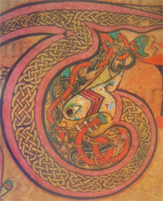
H (12)
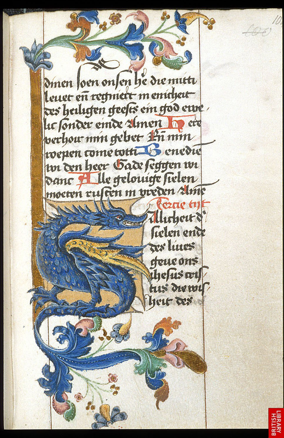
| Title |
Codex Vindobonensis Palatinus 1173 |
|
Description |
Zoomorphic initial H. Dragon.<br>Bible. Old
Testament: Job, Tobias, Judith, Esther, Machabaeorum II, Isaias,
Jeremias, Baruch et Ezechial |
|
Date |
15th century |
|
Source |
17560 |
|
Language |
Latin |
|
Folio |
199 f. |
|
Further Information |
For further information, visit http://www.hmml.org |
|
City |
Wien |
|
Library |
Österreichische Nationalbibliothek |
|
Country |
Austria |
|
Shelfmark |
Codex Vindobonensis Palatinus 1173 |
|
Folio Number |
f.123v |
|
ImgBC |
IM00025587 |
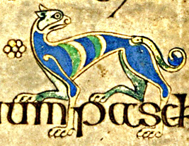
T, R, C, S, Y, M (13)
Secondary source, The art of illuminating as practised in Europe from the earliest times. Illustrated by borders, initila letters and alphabets, selected and chromolithographed by W.R Tymms. With an essay and instructions by MD. Wyatt, archt. Published 1866 by Day in London
Plate detail: 12th Century. Mr Henry Shaw, in his beautiful work on illuminated manuscripts has devoted no less than eight plates, giving an entire alphabet of initial letters, to the illustration of the remarkable MS, which is well known as the Harleian No. 2800 and which has furnished the material for the Plate under notice, as well as for our pl. 28 of the same century. Sir Frederic Madden considers the MS. to be "written in the class of character which came into use at the close of the 12th century, and which formed the link between the round open letter of the preceding century and a half and the square or Gothic letter of later period.
(caption for plate 28 reads: the alphabets have been selected form the Harleian MSS No 2,800 which contains in three large folio volumes a series of lives of Saints for the whole year. The voluyme formerly belonged to the Monastery of St Mary and St Nicholas at Arnstein in the diocese of Treves. The initial letters throughout are for the most part executed in red, with the grounds of the scroll-work, of which they are composted, filled in with light blue and green, after the usual German manner of the 12th century. The drawing of the altogether conventional foliage is good throughout the whole work, which is ascribed by Sir Frederic Madden to "about the year 1190".
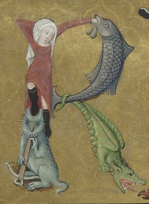
R (14)
Bibliothèque nationale de France, Latin 1173, two initials from f. 52r. Horae ad usum Parisiensem. France, 1475-1500.
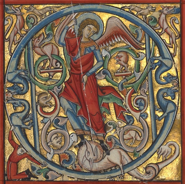
O or Q (15)
Saint Michael and the Dragon in an initial Q by an Unknown master German, Würzburg, about 1240 - 50 Getty Museum


