Showing posts with label Ceramic. Show all posts

Wednesday, 13 May 2020

Green globe attempt 7

There is no extant item to go with this globe cup as I designed it myself. I'm quite happy with the light/dark balance though I wish I'd learned the 'do not underglaze the rim' lesson before I completed this one.


All fired. The image is a little blurry but some of that is due to the glaze running slightly. Still, I'm quite happy with how this turned out.


Sunday, 10 May 2020

Green globe attempt 6


I fell in love with this pattern. I cannot find this extant bowl anywhere though. I can't even find it in any of my Pinterest collections which baffles me. I know I had this saved as a post-to-be on this blog but I can't even find that now. Even Google image search has failed me. If you know any of the details of the image to the right please comment!
On the left is my copy of the motifs. I really like the balance between the thin lines and the thick ones here.

Overglazed in sea green then transparent green and fired to stoneware. This came out lovely, I'm so happy with this cup!

Sunday, 26 April 2020

2 level hydro-abrasion

I got impatient while waiting for the previous attempt at hydro-abrasion to be fired. So I started on the next project. The aim of this one is to create some depth in the design by applying the shellac, removing the clay, then repeating.

Step 1: design. I used a medallion motif from a broken plate. I don’t like the central design on the plate but I thought the medallions were charming. The leaves are a common motif of the time.


1200s, Seljuk. Iran or Syria. Cleveland Art Museum 1915.590.

This is the design after the first layer of shellac. I love the golden tone!

I used a scalpel to trim away unwanted shellac before abraiding. It is really important to angle the blade away from the shellac so it isn’t under cut. I found some of the thicker areas tore if I wasn’t careful. This is probably because this isn’t a new knife blade and may be a little dull.

This is the cup after the second layer has been applied and a raised. As you can see, I shadowed the outer loop with a second layer and added a small arrow leaf in the middle / top. For comparison the two medallions on the bottom haven’t been a raised yet.

With 8 design elements to raise, I found was really important to stop and let the cup dry after every 2-3 items. Otherwise the rim was absorbing a lot of the water and getting squishy.

This dark blue glaze was very thick and it took forever to dry. As you can see it's reasonably runny so it pools nicely in little pockets. I do need to be aware of it along the foot though as it threatens to spill over and cement my piece to the kiln shelf. I'm really happy with how this came out even though I wanted the second, lower level to hold more glaze.

Saturday, 4 April 2020

Kashan fish cup


I don’t really care how the overglaze on this one turns out. I’m already very happy with how this design has turned out.


I copied this design from the bowl above. I’ve found two images of it but other details are slim. It is captioned ‘ Bowl with fish (late 13th to mid-14th century), Iran, probably Kashan. Stonepaste; black decoration under transparent turquoise glaze. The Hossein Afshar Collection’. I’ve found a similar bowl at the Art Gallery of South Australia here but it doesn’t have quite the same fishy swirl.


This is going to look amazing once it is green!

Wednesday, 25 March 2020

1st gallery attempt


I’ve been watching a number of ‘how to’ videos on Youtube recently. I started tonight’s clay session with the express aim of making some Viking cylinder cups. The clay was too squishy and my heavy hands simply couldn’t make the cups work. Instead, as my final piece of the night, I thought I’d try creating a gallery in a jar. A gallery is the little shelf that a lid can sit on. The videos made it sound pretty simple, have a thick rim, run the wooden knife tool through the middle and slowly flatten inward. Well, I did it and it seems to have worked!

Next step & the next first - a snugly fitting life with knob.


Monday, 16 March 2020

Mystery bisque #1


I was given a beautiful bisque jar with lid many years ago. Without the direct means to fire it, it languished upon my desk. That is, until I read about ollas as a means to water your garden. Any bisque jar seems to work. Buried in the garden, the jar slowly seeps water into the surrounding soil. In theory, plant roots can surround the jar and increase water movement too. Once I learned of this, I promptly planted the jar next to one of my struggle plants. I’ve three in a row and two in a terracotta pot. The ones in the pot have done really well and spread everywhere. This may be better soil or better water retention. This experiment should show me what impact better access to water has!


The problem with mystery bisque is you don’t know if it’ll stand up to stoneware firing. This one didn’t. It started as a flat circle with stem and has dropped somewhat. No matter, I had a sacrificial dish under it and it’ll still work a treat as an olla lid. The colours are Chrysanthos turquoise ug153, probably ug161 electric blue and ug201 crimson and black. I’m pretty happy with the design but it has emphasised that the black does require at least two coats for good coverage.


Monday, 9 March 2020

Iranian globe cup decoration


Full discussion and analysis once they have been fired. For now, an under-glaze update. I’m in love with the fish and kelp? I thought I’d also create my own motif with the octopie for a proper nautical theme.

Tuesday, 25 February 2020

PB103 Mustard


Back of extant jar. 


Front. A Venice Maiolica albarello, indistinctly dated 156(?), workshop of Maestro Domenego da Venezia. Sotheby’s
”of tall cylindrical form, slightly waisted with a flared rim and foot, the front with a label inscribed 'Mostarda.', flanked by leafy branches and putti heads, the reverse painted with a horse, a swan, trophies of war and instruments reserved on a blue Sgraffito ground, the underside with incised AB monogram,
approximately 37.6cm., 14 3/4 in. high“


I didn’t copy all of this design. I focused on the front as I wasn’t too keen on the armour, horse and musical instruments. This is a preliminary test for The Mostarda project (tm). Pretty happy with the colours but I’m wary of large scale glaze application in the next one.

Not 100% happy with the ‘redgum’ colour along the rim but I am glad the colour stuck. Further experiments are required to find the right red. I avoided the greens because I don’t think I have quite the right green at the moment. I thought I’d try autumn colours instead. The primary contrast worked well I think as did the yellow+watered down black shading on the scroll.

Due to the lighting the background looks black but it is actually a rather pleasing dark blue. Highly likely that I’ll use this on the final piece.

Friday, 27 December 2019

+1 to throwing skills

I believe I've achieved a +1 in pottery skills in the last couple of months. I've just completed a 5 week (three hours a week) course at ClayMake Studio and my skill at making things has come along significantly. Prior to this course, I made a bowl at Pennsic in  2017, a cup and a bowl in 2019 and 5 "bowls" in a oneshot single lesson session in October which I glazed in early November. 
Enthused, and city based for the time being, I signed up for a 5 week throwing course with the aim of being able to throw a satisfactory cup in a deliberate manner. i.e. I want to be able to throw a set of similar looking cups whenever I want. As a side mission, I'd like to understand clay and the strength of the form well enough to be able to throw a properly balance quatrefoil cup.

As this class went for 5 week, 4 throwing, 1 glazing. I spent 1 class throwing items in PB103 which is white clay and then shifted to a buff clay for the next session as it was closer in colour to the earthenware I was trying to replicate. I spent the third and forth sessions trimming pots and learning to make handles and for the fifth session I glazed some of my creations.

I had a lot of pots to glaze! Due to my interest in underglazing, I decided to do some experiments with underglaze rather than just dip all my items like I did for the oneshot class. Below is my experimental colour test tile which was fired with the first 6 items. The first six were experiments to see if the underglaze held up and if my cups would make it through stoneware firing. I only underglazed three of these and accepted they might not come out of the kiln well. I figured I had a pretty good shot with the black oxide and the other colours may or may not work. They were ready for collection on the 27th!

All my items are at various stages of glazed so I'll post about them and update this entry as they develop.


Buff greens - middle-eastern / sultanabad - Part 1, Part 2, Part 3

Handles - why summer is BAD

Wednesday, 20 November 2019

Pot throwing results

On the 20th of September, I took a casual class in pot throwing at Claymake. This was my third ever time using a wheel, and my first exposure to an electric wheel. Thanks to the expert tuition of Master Simon at Pennsic, I understood the basics of what I was trying to achieve even if I couldn’t quite get my hands to do it properly. In that three hour class, i made many objects, scrapping most of the asymmetrical ones. I retained 5 olive bowls which were bisque fired.

I then signed up for their monthly guided glazing class so I could glaze my treasures.


I am rather proud of my creations even through one of the rims snapped. I tried a different glaze technique on each one. From left to right: green and yellow englobe with a translucent green dip; Matt blue interior with blue englobe rim /painted on for the scales in a transparent outer glaze; blue englobe belt with blue interior and aubergene exterior glaze; translucent green glaze throughout with aubergene angle dip and finally englobe interior scratched back to create design with transparent clear over.

Notes: the englobe is a coloured clay tweaked to ensure no shrinking occurs during firing. The glazes and englobe are very powdery when dry and make further decorative work challenging. I’d probably add more gum or something to reduce the powder effect if I were to make my own for the painting or scratching applications.

Notes II: it’s likely the underglaze I used for all previous work won’t stand up to the firing temps at Claymake. Well, the blue might because that’s generally a sturdy colour. The others might not. It’s worth an experiment though.

Sunday, 1 September 2019

Pennsic pottery achievements

I attend Pennsic again this year. I spent a lot of time hanging out at the Tudor House in the market place with Master Simon and all the amazing pottery people. I didn't help make the kiln this year as I was sleeping off a watch shift, but I was there for both firings. The first one didn't hit temperature. Master Simons thinks it might be because the woodbox tunnel roof sort of collapsed so it wasn't drawing properly. The collapsed part was dug out and the second firing went much better. The kiln was very crowded but everything seemed to come out generally fine.

I tried a new experiment this year. I was trying to make a quatrefoil cup because they have a very graceful form. I don't think I got the shape quite right though. It should cinch in under the foils slightly more. Then, not bad for my third ever item!

I did also try something a bit different with the glaze. I asked the blacksmith to crush up some malachite (copper carbonate ore) and some chrysocolla (copper oxide ore). I then mixed this with a clear glaze and applied it to the sides of my cup.


I now have a non-slip cup. It seems the chrysocolla had more gangue material (silica?) so left lumps on the side of the cup. The malachite, being a larger chunk of purer ore, turned into a finer powder so provided colour without texture. Very little copper is needed to achieve a good glaze.

I'm very happy with the outcome of this Pennsic and I'm looking forward to next time!
Left - malachite glaze; right - chrysocolla glaze.

Thursday, 15 November 2018

Heraldic cups - blowme of Saint Cloud

My new heraldic device is azure (blue), mistral contourney over an  mountain agent (white). I've been playing with the motifs because it's about time I made myself a ceramic cup. My finished ceramics are piling up and waiting for a trip to Victoria to be fired. I really need to complete my bisque stockpile and find a way of indulging in my hobby without the need to fly to Victoria! I took a few liberties with the design and I really hope this improves with firing.

Front, unfired. Back, unfired.

Sunday, 20 August 2017

First time using a pottery wheel

At Pennsic, I made a thing!!

Under the expert direction of Master Simon I made a howl. I threw it using a foot powered wheel and then it was fired onsite at Pennsic. I tried to decorate it like a 14th Spanish example but the glaze was not really cooperating. So proud of myself. It did develop a crack because the base was a little too thick and it dried slower than the rest of the pot.

Bottom right - Post throwing; top right - post glazing; left - post firing.


This is the half built woodfired kiln which is constructed onsite from Pennsic clay to fire all the things. :)


Tuesday, 13 June 2017

Squwark plate

I made a plate for my friend Phillipa. She's pretty awesome and loves her chickens so when I found the following image I couldn't help but modify it. I believe the original is supposed to be peacocks, but their little bug eyes and beaks made me think of chickens. So they became chickens.

Bowl. Iran, Nishapur 10th century. Earthenware, buff slip, underglaze slip-painted,. LACMA M.73.5.289. (No direct link is possible, check out items 30 and 52 of 99)

The LACMA have two bowls in this style. The other one (M.73.5.266) has a lot more intricate detail but a similar peacock shape. The buffware with this figerative style is specific to Nishapur, Iran. The Meteropolitian Museum of Art conducted a number of digs in the city in the early 20th century and recovered numerous artifacts (1). The style is closely linked to sgraffito but lacks the incised decorations (2). A good example of sgraffito ware can be found here for those curious as to it's styling.


The finished plate complete with a variety of personalized chickens.
I've been doing a number of yellow and green items recently. I quite like the colour combination, but I'm also aware there a much more experienced artist who produces sgraffito in my Kingdom, Alex the Potter. Since I don't make my own bisque yet, I'll be steering clear of sgraffito and limiting my emulation of buff ware.

I'm really happy with how this turned out. The green/yellow/white/black contrast looks great and is appealing to modern tastes as well. I only hope Phillipa likes it as much as I do.

1) The Met at Nishapur. http://www.metmuseum.org/toah/hd/nish/hd_nish.htm
2) Sgraffito from Nishapur. http://www.metmuseum.org/blogs/ruminations/2015/production-history-of-sgraffito-ware-from-nishapur

3) The extant plate - http://islamic-arts.org/2011/ceramic-vessel-collection-at-lacma/

Saturday, 13 May 2017

Festival cups

In theory, the cups have all gone to their new owners so I can post the posse of my latest experiments. Three different eras, three different styles and three different colour sets! I'm very please with how these turned out. I was a little unsure if the new glazes would have the right tones and if the shading would work well but I seemed to have nailed the contrast I needed.

Cup 1 reference:
I've been sitting on this reference image for a while. If you've visited my Pinterest collections you'll know I mostly have blue and white ceramics however I am fascinated by other extant artifacts as well. This plate features a black horse with a cheetah on it's back. The original is reportedly in the Asian Art Museum of San Francisco however I haven't been able to find a formal online reference for it. At the moment the only two bits of information come from flicker and trip advisor. Not the best resources. That said, I have managed to find a piece in a similar style, depicting the same subject matter in the Cleveland Museum of Art (here, and info here). The Cleveland one apparently dates to the 900's so it's fair to assume the my one is from around the same time and place.
Horse with Cheetah, 800-1200.Nishapur, Iran. Asian Art Museum, San Francisco. 
Cup 2 reference:
This one turned up when I was trolling The Met for references for a different research project. I stored it away on my Pinterest and when I wanted to make a prize for the Fighter Auction Tourney I thought this would be perfect. I really liked the style of the griffin but wasn't too keen on the rest of the bowl. It didn't translate into a cup as well as the horse did because the griffin is too long compared to it's height. I should have shrunk it down more and put two on the cup with a vine border at the top but i didn't know what the vines would look like until I was done. Ah well, I can always do a reprise if the mood strikes me.
Bowl with Griffin. 11th Century, Egypt. The Met Museum. Item no. 1970.23
Cup 3 reference:
I didn't find this reference. It was passed onto me as a suggestion for a different project. I modified the design at the request of it's new owner to suit her heraldry. This cup is based on a typical Albrello (Drug Jar) which features three sets of wings. When I find the original (I suspect The Met due to the background), I'll post it here.
Albrello (drug jar), Italy. Museum and date unknown.

Pre firing:

Finding myself not so sure about the layout and I modified the nose into a beak
.
Blue and gold, light yellow and green, gold and red.


Monday, 23 January 2017

Ceramic 53 - Montjoye jug

I acquired a bisque jug a while back and have been stuck for an appropriate design to place upon it. I trolled the internet for reference images of extant items that had the right shape. Originally I was thinking of converting the central image on the jug (Figure 1) into a household of fighting badgers but in every trial sketch they ended up looking like teddy bears.

Figure 1: Jug, Montelupo, 1480, Tin glazed earthenware painted with metal based colours. V&A, no. 1568-1855

Inspiration:
So I decided to go looking for more inspiration. I found it. A friend of mine, Montjoye, who I admire quite a bit, posted a flurry of things on her blog. One post caught my eye because it was regarding the recent acquisition of some blue and white ceramic item for her kitchen. Given my enjoyment of blue and white, I decided to make her a blue and white jug because she brews some very tasty stuff.

So, many museum collections later I amassed a number of pinterest images I found inspiring, nothing was a 100% match for the jug shape that I had, but there were quite a few jugs, drug jars and miscellaneous items that were in the ball park. I also had a time frame restriction as Montjoye camps with a group that try to be mid-medieval in every way.

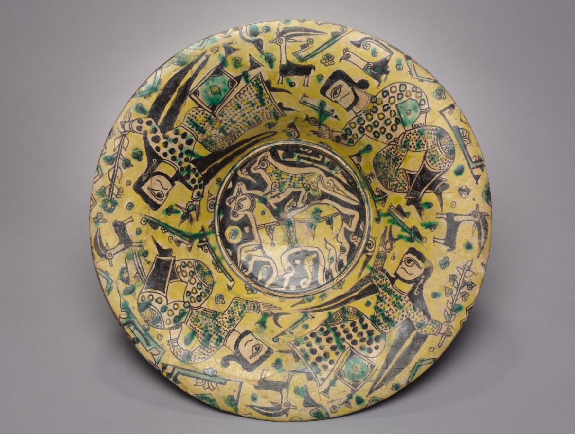
There are a number of drug bottles, jugs and vases that do feature blue and white, but the designs just didn't appeal to me. The key inspiration (figure 2) was chosen due to it's simple 2 colour motif which would convert well to blue, black and white.
Figure 2: Drug bottle, Italy, Tin glazed earthenware, date unknown. V&A no. 629-1902

Timeframe:
The inspiration jug has no date, but appears to date between late 14th century and early 16th century. That is a rather large time frame but I believe it's closer to the 14th century for the following reasons: The late 14th century examples have a similar pallet of colours and a similar consistancy for application (layers can be seen in the green leaves above). The early 16th century example, is much more ornate in it's design with multiple shades of blue, yellows and oranges (i really like the wyvyrn in this one). It also features a neat little twisted spout holder which gives it a cute flare. One final reason I believe it's closer to the 14th century than the 16th is shown in Figure 3. This jug has the right shape however it seems to be one of the earlier examples of the high firing colour pallet. The yellow, blue, green and manganese brown/purple suggest  this jug is the mid point between the early 16th century highly crafted majolica and the reference jug. So I give the jug in Figure 2 a date range of 1400-1450 ish.
Figure 3: Drug jar, Italy. Tin glazed earthenware with high-firing oxides. 1450. V&A no. 1222-1901

Motif:
Many of jugs I examined feature writing around them. The text usually designates what the contents of the drug jar is, for example - SYo DI PAPAVARI = syrup of poppies, SYo DE FARFARE = syrup of coltsfoot (tussilago). I considered translating alcoholic beverage, or spirit of grain or some such into Italian but that would sort of lock down the use of the jar. This was the intention of the original jars as a measure to prevent residue of one drug mixed with another but not required for this project. I could have removed the text, but that would have done away with the key feature of the jar. Instead, I decided upon labeling the jug with her name, Montjoye, as she does with her alcohol bottles..

The next challenge was getting the characters in the text right. I downloaded image after image and copied all the writing forms as Master Piers taught me years ago. I wasn't able to amass an entire alphabet and there was a huge variation in character forms between the jugs I was able to find. So I could either use a mishmash alphabet which spanned about 100 years (badbad), pick one and try and fit the missing letters in, find an extant alphabet from the right time and use that, or come up with something else.
I decided to copy the text form that Montjoye uses on her bottles (and had on her website at the time). I was able to download a copy of a picture of one of her successful brews and figure out the lettering from the computer screen. I'm pretty happy with how the kerning turned out.

I also placed three trefoils on the jug, as they are a key feature of her device. I think the motif came out less crowded than the Italian-ware and strikes me as more of a spanish take on an Italian jug.

All in all, I'm happy with this project and I hope Montjoye gets much use out of it as a jug or a vase or whatever. The best thing about gifting ceramics is if the recipient doesn't like it, they can accidentally smash it and I'd be none the wiser. My general dislike of repetition means they're unlikely to get an exact replacement anyway and I'm always open to suggestions!

Sunday, 17 January 2016

Plate - 14th century Sultanabad

I've been rather quiet these last three months as I've been moving across the country and am still finding my feet in this new city. I have now found a place to rent and my furniture gets delivered in three days! I am enjoying finding all sorts of new things but last weekend I thought I'd try something new and old at the same time. I had passed through a homewares and overpriced duct collectors shop and found the sales lady painting white plates with some sort of commercial poly-paint. I've seen this stuff before, you paint it on, put the item in the oven and ta da - customized item. Unfortunately, the paint doesn't really stand up to wear and tear, the Stormhold Baronial plates haven't really withstood knives, forks and hand washing by people not told about their special needs. This is why I prefer to glaze my plates rather than buy the ceramic paint from spotlight. True, this restricts me in size, shape and I need people to fire it for me but the end product is much more durable. I've decided that finishing the A&S 50 challenge was enjolyable but I'm not done with the ceramic painting yet. So, I need to find someone in my new city who can supply the bisque and fire the finished products for me. Or make arrangements to get the my bisque to Melbourne for firing and collection by a friend.

So last weekend, off I went to All Fired Up in Joondalup. I've mentioned this place on my 'where to make your own ceramics' list for a while now so I thought it was the perfect first candidate for a replacement ceramics facilitator (i only have two candidates). So I saved a number of reference images from the Met Museum on my iPhone and off I rode (image 1). I arrived at noon, spent half an hour browsing their limited stock of bisque before settling down to another project. When I went I had no real plan in mind as I wasn't sure what sort of bisque range they'd have (small). I was there until closing (5pm) and finished the front of a plate and made an attempt at the back.

The blackwork outlines complete. I was tempted to finish here because the grey and white looked so lovely and balanced just by themselves but I knew it'd fire to black and throw the look off.

The blue is complete. Note the solid look of the blue over the black. The original used transparent glazes in blue and turquoise of the Saltanabad style. This is really hard to replicate using opaque glazes so I aimed for a wash and hoped the fired results would be satisfactory.
Finished! Well balanced and really happy with the front.

 The center of the design - surprisingly balanced for a free hand experiment.


Replicate or create original designs?
This is always a question I ask myself when creating something new. Should I replicate an original extant item I'm really taken with, or should I use design elements from a specific time/place and design my own items? I think every SCA artisan asks themselves this same question and I believe the answer comes down to, will the item be fit for purpose? SCA items seem to fit into two categories, 1) cheap make do items for a single or short term use or 2) expensive or hand made items design to hopefully last an SCA lifetime. The items in the second group are not used on a daily basis and are often expected to last for years beyond their more often used modern counterparts. For many people in the SCA, a ceramic item that is fit for use must look medieval. For some people this means old, worn or clearly handmade (see previous rants), others want ceramic items that fit their game, either referencing their personas storyline or featuring their heraldry. The final group of SCA users want items that completely replicate medieval items.

I feel that I make items that generally fit into five categories.
a) appropriation, the grotesques are an example of this. I copied images from manuscripts into a new medium. They are the least medieval ceramic thing I've made (let's not count the escher plate).
b) adaption, I count my early household plates in this category. The elements came from a number of related sources but the combination was created to meet a specific need.
c) insertion, Into this category I fit the Gabs & Stanzi plates. The design and a majority of the plate were period replicas with small elements of heraldric symbols to craft something appropriate for the leaders of my other household.
d) replication, I have replicated the designs on many of my A&S items straight from the originals adapting them only slightly so they'd fit on the bisque available. This Sultanabad item is one such item.
e) creation, the items I'm often most proud of, the Dr Suess bowl and plate fit into this category. These items are inspired by their medieval counterpart but the design is very much original.

Extant reference - Bowl, Il-Khanid, Iran, Sultanabad. 14th century. Freer Slacker, S1997.129.