Showing posts with label AandS. Show all posts

Monday, 18 May 2020

Let there be Light?

My first oil lamp - essentially a thick bottomed bowl with the sides pinched in and sealed. Glazed in a yellow outer with a clear semi-gloss coat to seal the interior. A simple triangle pattern was carved into the greenware prior to bisque firing along the foot.

A bamboo torch wick and citronella oil for firing, both purchased from Bunnings. Due to the kink in the neck the wick was a little tricky to insert but this does prevent the oil from sloshing out the front.

The lamp was pretty easy to fill and the wick adsorbed the oil very quickly. I cannot completely fill the reservoir as the wick lip is around the same height as the rest of the bowl so oil will seep into the open and pool under the wick.

This lamp produces a rather large flame when lit. This could be related to the loose wide weave of the wick (too large), the protrusion of the wick (too long) and partly, the strong wind. I'm going to modify what I can when it's less windy and see if I can get this to be sufficiently manageable that I'd risk having it inside.

I may have to carve a dragon into one of these.

Friday, 24 April 2020

Basic hydro-abrasion

Recently I encountered a fellow potter at Claymake. She had the most lovely relief patterns on a cup. When I inquired how she'd achieved such fine lines she told me she was experimenting with shellac resist then removing the clay body with water. She couldn't tell me much more about the process so I decided to google it. I couldn't find any videos on Youtube but there are a number of ceramic boards which make some interesting reading. One board suggested using shellac as a resist as it's a naturally derived product that will burn off in the bisque firing. The following is my initial experiment and thoughts.
The only brand and smallest bottle of shellac available in the store. It would have been cheaper to purchase shellac flakes and make my own but there were no solvents available so I couldn't.

A slightly skewed cup. I picked it up when it was too damp and it tilted. Still usable and if not for this experiment it wouldn't have been fired.

Step 1:
Use a paintbrush to apply shellac to dry greenware. The greenware will adsorb all of the alcohol and the shellac will dry really fast. If you want finer lines, leave a small amount of shellac out in the sun to thicken for half an hour or so.

Thoughts - the shellac applies well but when it is the thickness of water you either need to only have a small amount on your brush and keep dipping and wiping or use a thicker consistency. If you don't, drips of shellac will spread making thicker lines and blotches. I like the golden shine and can see why this is used on furniture.
It occurs to me that stencils could be used with technique if the shellac were slightly thicker.
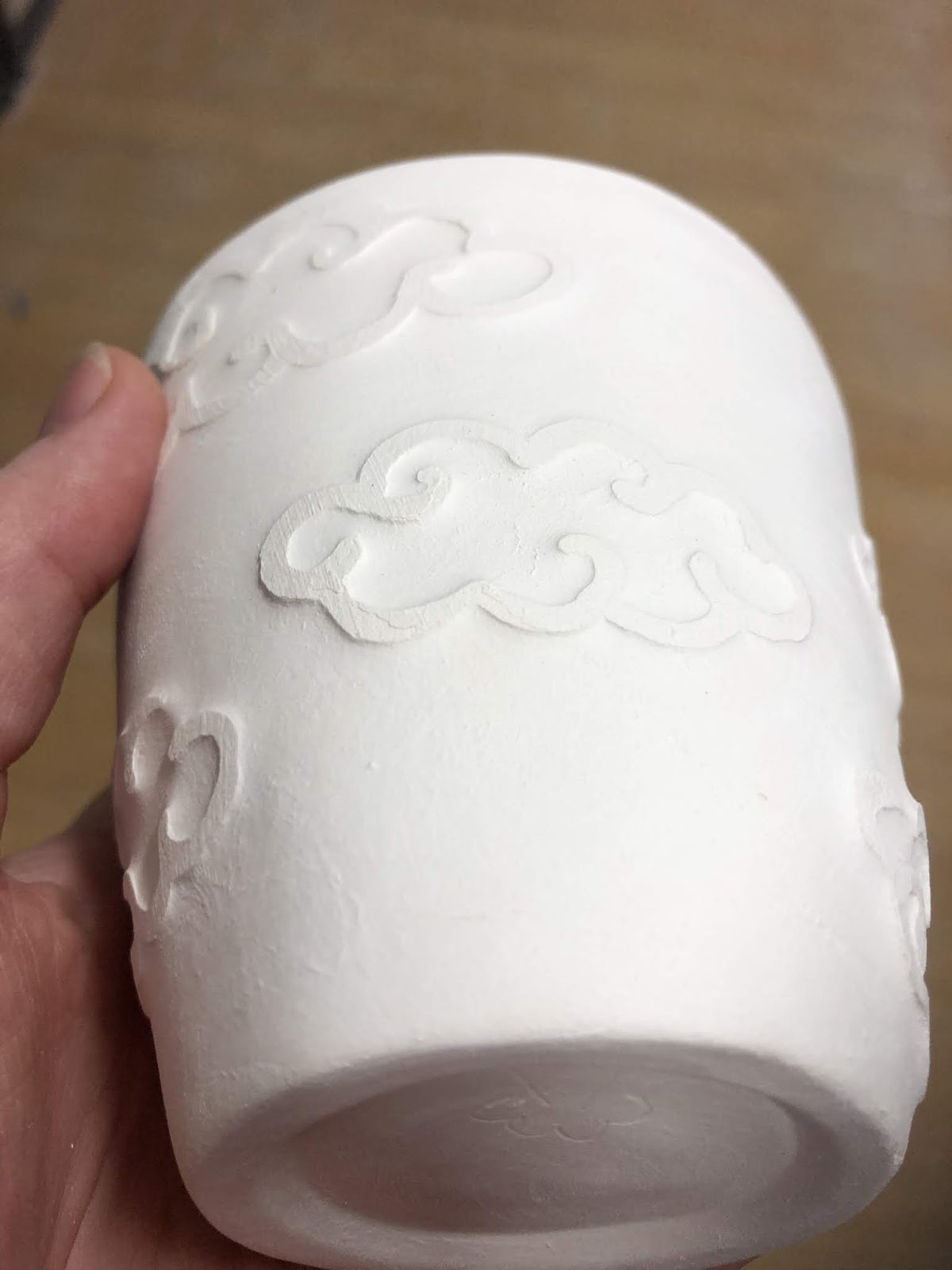

Step 2:
Use a wet sponge to wipe away clay from around your design. This is called hydro-abrasion even though typically that term is applied when using pressurized water. Circular motion of the sponge seems to prevent one side of the line from getting too much lower than the other. When the clay turns to a slurry, use the other, sopping, side of your sponge to wipe the clay away. Work on one area then move to another.

I used a brand new dish sponge. Under the sponge is a bit I've already done, the other three clouds still need attention. It's reasonably easy but I did get clay water everywhere.

Thoughts - This may work better as a staged step. I found that the water had undermined the strength of the cup. As I posed and held the cup my thumb has created a small divot in one side while between my fingers a small crack has formed. I think I managed to fix both but I believe that I need to reduce the amount of free water and probably do one side, wait for it to dry then do the other side. In the image above you can see a small area on the bottom cloud where I've accidentally wiped away the shellac. I believe this was because it was rather thin in that area. The thicker shellac, the more golden areas, seems to have held up fine.

Step 3:
Bisque fire it.

Thoughts - It came out well. I'm really happy with how the relief works. I think it'll show off a glaze nicely. I also think this could be a substitute to create once off tiles patterned off molded items.


Step 4:
Glaze & stoneware fire it. I chose midnight blue glaze with a clear overcoat.

Thoughts - Love this look. Next time I'll use a thicker cup and try a two layer design. I think this may work really well for some heraldic displays similar to those carved in marble. I may also try a colour resist. After the first wash, I'll place some englobe or underglaze on the cup and then apply a second coat of Shellac.

#not-so-pro tip: hydro-abrasion works best if the sponge is run parallel to design. Right angles creates more of a sloped edge and it is harder to achieve a clear difference in clay body level.

Sunday, 12 April 2020

Glaze pallets

I made some glaze pallets so I could see how well the various colours worked on stoneware and the difference between the local buff clay and pb103. I’ve done this in the past, creating two test tiles with and without a titanium white base glaze.

It was important to make some new tiles because I’ve purchased some new colours and I needed to see what the impact of multiple layers was. These will be critical to making the colour choices for an upcoming collaboration.


Left- PB103, right - buff. Each divot is top third 1 layer, middle 2 and base 3 layers. The top 20 colours are the Chrysanthos glazes. The bottom glazes are five selections from the Glazeit pallet which I suspect are Duncan underglaze. Black is Cesco ebony brush on underglaze.

Thursday, 9 April 2020

Practices makes perfect


I found a lovely cup on a viking related blog (Bjornthisway) and thought it was the perfect thing to aim for to continue developing my skills. This cup resides in the Sydvstjyske Museum in Ribe. The main features of this item are straight sides with even walls, a lip and probably, a tight square internal corner.


I'm getting there.


Saturday, 4 April 2020

Kashan fish cup


I don’t really care how the overglaze on this one turns out. I’m already very happy with how this design has turned out.


I copied this design from the bowl above. I’ve found two images of it but other details are slim. It is captioned ‘ Bowl with fish (late 13th to mid-14th century), Iran, probably Kashan. Stonepaste; black decoration under transparent turquoise glaze. The Hossein Afshar Collection’. I’ve found a similar bowl at the Art Gallery of South Australia here but it doesn’t have quite the same fishy swirl.


This is going to look amazing once it is green!

Tuesday, 31 March 2020

Blue hats of MS 6613

Hats of MS 6613 - a safavid manuscript with many lovely illuminated pages

These images were gleaned off multiple pages and there are a few similarities across the board:


  • Bright sky blue hats with white dots - These may or may not be spangles as they  occasionally appear to raise off the edge of the hat.
  • Black decoration around brim - this looks like lace or fur floof
  • Brim - the brim is at least half the hat tall
  • Point - the point is slightly rounded may be floppy given the multiple directions it moves.


Thursday, 26 March 2020

Lids!


I made two lids for my first jar. As I haven't done this before I followed vague memories of Youtube videos from the night before and produced the above items.

The lid on the left started as a straight sided bowl. I then squeezed the top in until I had a sort of squished hollow globe shape with a point on the end. The divot around the point was unintentional and a result of pushing down while trying to close the point. I then used a wire while the bowl was turning to cut it free. There was minor deformation while I lifted it off onto the board but I was able to recover from that during the trimming stage with some gentle squishing. I'm not very good at hollow shapes so this lid was quite thick and needed a lot of internal trimming. It's a perfect fit though and I really like it.
This lid will be bisque fired on the jar so hopefully they shrink at the same rate.

The lid on the right was thrown as a bowl so I could create a slight gallery and internal lip to lock with the one in the jar. The base of the bowl was quite thick so I could trim a knob into it later. It required a lot of clay removal. The remaining clay was still very maliable so as I formed the knob I was able to create another lid divot which should help give fingers space to grab the knob. I'm not as happy with this shape as it's more conic than the other. It is slightly smaller so this is a back up plan if the first lid doesn't shrink enough during firing.

Thoughts:  Not sure which approach I like the best. The first one makes it easier to have straight edges on the lid which is good if it's an insert lid. The second one allows fancier knobs but next time I'll use a heat gun to dry it a little during the trimming process. These are now both drying out and will be submitted for bisque next week assuming Claymake is permitted to operate the firing services.


Update: I killed the jar by breaking the rim while it was still greenware. These two lids are in the queue for bisque firing but will then wait until an appropriate replacement jar is made. I’ve got a lot to learn about shrinkage rates now.

Wednesday, 25 March 2020

1st gallery attempt


I’ve been watching a number of ‘how to’ videos on Youtube recently. I started tonight’s clay session with the express aim of making some Viking cylinder cups. The clay was too squishy and my heavy hands simply couldn’t make the cups work. Instead, as my final piece of the night, I thought I’d try creating a gallery in a jar. A gallery is the little shelf that a lid can sit on. The videos made it sound pretty simple, have a thick rim, run the wooden knife tool through the middle and slowly flatten inward. Well, I did it and it seems to have worked!

Next step & the next first - a snugly fitting life with knob.


Monday, 23 March 2020

Bowl shapes black underglaze - Iran

I've been working on cups for a couple of months now but many of my favourite references are bowls or dishes. Before trying to make some bisque to decorate I thought I should review some shapes before I get throwing. To narrow it down a little, I'll focus on Iranian objects preferentially black underglaze.
Bowl - 1180-1220 Kashan Iran. V&A, CIRC 53-1938
Small flare above foot then reasonably conicle. Likely incised foot / foot ring but no images of the base is available. Similar shape at The Met.

Bowl. 13th century. Kashan, Iran. The Met. Accession No. 20.120.32.
Incised foot with a flared edge.

Bowl, early 13th century. Iran. Brooklyn Museum. Accession no. 37.147.
Conicle with bulb 2/3rd of the way up. Slight lip.

Bowl. 1038-1194. Iran. Saint Louis Art Museum. Object 281:1951.
Conicle with an inclised foot ring. A slight bulb  4/5th of the way up with an overhanging lip. Similar bowl in Sotheby's


Sunday, 22 March 2020

Iranian globe cup II

The design:
This is the black under-glaze design. I used a single sized paint brush and a single coat for all of the items except the blackband at the top. I rather like the swirl in the foliage of this design.


The extant reference:
Extant jug from LACMA. (M.73.5.258). Kashan, Iran, early 13th century.

The reeds / kelp design and the fish are a common motif  (1, 2, 3, 4) appearing on cups, jugs and most commonly, in bowls. Given my cup is squatter than the extant piece I decided to do away with the top layer of fish. I also decided to continue the vine down the handle rather than blackening it out as it has been on the original. This was because the handle makes a greater % of the overall object and would have dominated the design. I am actually really pleased how well the fish came out. Their sinuous form is lovely, it's just a pity they are too low on the cup to be seen properly.


The glaze:
Both cups (+octopi cup previously posted) came through the kiln fine. What was most interesting about both of these cups is the difference between them and my 12th night A&S entry. Exactly the same glaze combination was used but these came out lighter with some interesting crystal patterns forming.

The result:
Front Back

Friday, 20 March 2020

Black underglaze and light blue

This is my favourite piece of bisque from the class I took in November. I’ve been hoarding it because I had no idea what I wanted to decorate it with and I really didn’t want to ruin this mug.

After the epically long time I spent with a tiny brush completing all the fine glaze detail on the mystery bisque albarello, I needed a better solution. While I was down at Potters Market I happened upon some squeeze bottles with variously sized needle bits. This is the result. The thick lines are multiple applications of the size 3 needle and the thin lines are the size 2. I think the underglaze is too runny for the size 4 needle and not runny enough for the size 1. I also suspect size 1 wouldn’t permit sufficient pigment to be applied. It may be good for fine dots though.

Generally I feel the squeeze bottle is a good idea however inconsistency in the bisque surface results in lumps and bumps in the glaze lines. I could scratch a lot back but I’m hoping a the over glaze will reduce the impact of the imperfections.

Extant jug. Sotheby’s. 

I glazed this in light blue with a clear overglaze. I twisted a finger when placing the cup on the drying rack so there are some inconsistencies along the rim where I’ve tried to repair the glaze coverage. I gotta say, I am not happy with the result.


As you can see, the fine brushwork has essentially been swamped by the glaze. Most of the detail is gone and everything has become streaky. I believe this was, in part, due to the clear cover glaze. The top rim was double dipped because of my clumsy finger damage to the original coat. This area seems to suffer most from the streaky effect.


Examination of the internal rim suggests that the light blue contributes. Note the lovely internal band where the light blue stops? It seems it already has a colour change where there is a thickness or boundary change. While I wouldn’t want to use this combination on another underglaze work, I’d love to see how this does with topographic detail. The colour somewhat reminds me of the pale Egyptian blues.

So, I don’t like this result but I’ve learned a few things. Pity I had to do my learning on a ‘good’ bisque but I guess practice will increase the number of things I consider ‘good’.


Thursday, 19 March 2020

Albarello collab

I’ve been posting this project at some of its stages already. It has now been fired so I thought it was about time I did a write up.
Fired!

Background:
Many years ago I participated in the laurel prize tourney. I don’t recall what I was displaying, I think I was in the middle of the A& S challenge so neck deep in my decorative glazing obsession. The laurel prize tourney helps participants engage with a variety of laurels to receive useful feedback and advice. It’s also open to non-laurels to review so you can inspire and engage with the rest of the Sca as well. Individual laurels will often give various participants small tokens. In this year in particular, Master Alex the Potter presented me with two handthrown bisque fired albarello. At the time I had no way of firing them myself and I wasn’t confident that I could do this limited resource justice.

Now, years later, I’m throwing my own pots. I haven’t yet created an albarello I like but I’m close enough. I can also get anything I like commercially fired to stoneware. Time and beyond to do something with the bisque I’ve had since before I moved to this state (at least 5 years ago). I’ll admit, I was really worried this mystery bisque wouldn’t hold up to the high firing temperature. Especially after the slumping seen in the Olla lid mystery bisque.


The original choice which was closer in shape to the bisque Extant arbarello from the Louve ref. OA 4091.


On inspiration:
On the right is the original choice. Unfortunately when I sketched it onto the bisque the symbols just didn’t balance right. So I switched to something else. The left is my final choice. I’ve had this image pinned to my ceramic inspiration page for a while. I’ve loved the simplicity of the component elements and the complexity of the background work for sometime. This style really has been a favourite of mine for a while and this seemed like the perfect time to execute it. Part of my decision lay in the colour fastness if black oxide and cobalt blue. Both can withstand high temperature firing with pretty good colour consistency. I couldn’t be sure how other colours, like the super fickle purple, would do so very late period Italian designs are out for now.

Of the two design choices, the second one was more balanced once sketched onto the bisque using 6B pencil.

On execution:
Glazing this took a fair while. I worked the main body in sections with the main design free handed and then double glazed to ensure colour integrity. The background super detailed swirls were a single stroke with a 5zero paint brush trimmed down to have shorter bristles and increase its stiffness. I’m pretty happy with the colour consistency achieved there. I was a little worried they’d end up streaky it grey.

The blue is ‘Cobalt Blue’ from Chrysanthos. It was painted on as a single layer as it was important to me that the black detail come through the blue. I added more blue than was on the original design because I had more foot space and thought the colour balance worked better. I’m not a huge fan of the free blue leaves at the top, I much prefer the blue outlined in black.

I designed the foot pattern myself utilising elements from the extant item. I considered a detailed swirl pattern in the background but decided that it would reduce the impact of the main panels. I really needed more light space to balance the overall look. I think it is important to understand not only the design context but the impact of the piece as a whole. I took for inspiration the bold black line features seen in many items of the time. I’m really pleased with how this came together. Using the lines also let me tie them into the shoulder pattern. Again, I could have overlooked this geometrical change and continued the extant pattern down but it wouldn’t have worked with the shape of the bisque. I did consider a vine design but decided the area would be to thin and the vines would look weird as a result. Plain black bars helps divide the d ensign
Elements without detracting from them.

On the future:
Overall, I’m very pleased with how this piece came out and I’m super relieved it didn’t deform in the kiln! I probably wouldn’t change the rim decoration even though it doesn’t overly appeal to me because it is a direct copy of the extant item. I will be using the other bisque item to trial an Italian or Spanish polychrome design next now I’m more confident in the integrity of the bisque in the high firing temperature.


Sunday, 15 March 2020

Part the forth ... necks please

Beyond happy. The underglaze is done. All that remains is a coat of clear to seal it and the bisque of unknown properties to survive a stoneware firing. I can’t wait to see this fired!

Saturday, 14 March 2020

Part the third ... blue

Added a smidge more blue than the original because I felt it had better balance when viewed with the tapered base and neck. It’s coming together!

Friday, 13 March 2020

Iranian nautical globe cups


The nautical glove cups are out of the kiln and I am so very pleased with the geeen glaze. It isn’t as smooth and transparent as the last cup but the bubble texture to the glaze is so much more fitting for the nautical theme.

I wanted to share the octopie cup while I take some time to write up a reflection for the kelp one.

Base: I wax resisted while glaze dipping. As a result of a deeper pool of wax than anticipated some of the black underglaze stripes didn’t receive any overglaze. Makes for an interesting contrast.

Thursday, 12 March 2020

Part the second.... vines

Finished the crazy central detail and made something up for the base in fitting with the extant examples design motifs.

Monday, 9 March 2020

Iranian globe cup decoration


Full discussion and analysis once they have been fired. For now, an under-glaze update. I’m in love with the fish and kelp? I thought I’d also create my own motif with the octopie for a proper nautical theme.