Tuesday 31 March 2020

Blue hats of MS 6613

Hats of MS 6613 - a safavid manuscript with many lovely illuminated pages

These images were gleaned off multiple pages and there are a few similarities across the board:


  • Bright sky blue hats with white dots - These may or may not be spangles as they  occasionally appear to raise off the edge of the hat.
  • Black decoration around brim - this looks like lace or fur floof
  • Brim - the brim is at least half the hat tall
  • Point - the point is slightly rounded may be floppy given the multiple directions it moves.


Thursday 26 March 2020

Lids!


I made two lids for my first jar. As I haven't done this before I followed vague memories of Youtube videos from the night before and produced the above items.

The lid on the left started as a straight sided bowl. I then squeezed the top in until I had a sort of squished hollow globe shape with a point on the end. The divot around the point was unintentional and a result of pushing down while trying to close the point. I then used a wire while the bowl was turning to cut it free. There was minor deformation while I lifted it off onto the board but I was able to recover from that during the trimming stage with some gentle squishing. I'm not very good at hollow shapes so this lid was quite thick and needed a lot of internal trimming. It's a perfect fit though and I really like it.
This lid will be bisque fired on the jar so hopefully they shrink at the same rate.

The lid on the right was thrown as a bowl so I could create a slight gallery and internal lip to lock with the one in the jar. The base of the bowl was quite thick so I could trim a knob into it later. It required a lot of clay removal. The remaining clay was still very maliable so as I formed the knob I was able to create another lid divot which should help give fingers space to grab the knob. I'm not as happy with this shape as it's more conic than the other. It is slightly smaller so this is a back up plan if the first lid doesn't shrink enough during firing.

Thoughts:  Not sure which approach I like the best. The first one makes it easier to have straight edges on the lid which is good if it's an insert lid. The second one allows fancier knobs but next time I'll use a heat gun to dry it a little during the trimming process. These are now both drying out and will be submitted for bisque next week assuming Claymake is permitted to operate the firing services.


Update: I killed the jar by breaking the rim while it was still greenware. These two lids are in the queue for bisque firing but will then wait until an appropriate replacement jar is made. I’ve got a lot to learn about shrinkage rates now.

Wednesday 25 March 2020

1st gallery attempt


I’ve been watching a number of ‘how to’ videos on Youtube recently. I started tonight’s clay session with the express aim of making some Viking cylinder cups. The clay was too squishy and my heavy hands simply couldn’t make the cups work. Instead, as my final piece of the night, I thought I’d try creating a gallery in a jar. A gallery is the little shelf that a lid can sit on. The videos made it sound pretty simple, have a thick rim, run the wooden knife tool through the middle and slowly flatten inward. Well, I did it and it seems to have worked!

Next step & the next first - a snugly fitting life with knob.


Monday 23 March 2020

Bowl shapes black underglaze - Iran

I've been working on cups for a couple of months now but many of my favourite references are bowls or dishes. Before trying to make some bisque to decorate I thought I should review some shapes before I get throwing. To narrow it down a little, I'll focus on Iranian objects preferentially black underglaze.
Bowl - 1180-1220 Kashan Iran. V&A, CIRC 53-1938
Small flare above foot then reasonably conicle. Likely incised foot / foot ring but no images of the base is available. Similar shape at The Met.

Bowl. 13th century. Kashan, Iran. The Met. Accession No. 20.120.32.
Incised foot with a flared edge.

Bowl, early 13th century. Iran. Brooklyn Museum. Accession no. 37.147.
Conicle with bulb 2/3rd of the way up. Slight lip.

Bowl. 1038-1194. Iran. Saint Louis Art Museum. Object 281:1951.
Conicle with an inclised foot ring. A slight bulb  4/5th of the way up with an overhanging lip. Similar bowl in Sotheby's


Sunday 22 March 2020

Iranian globe cup II

The design:
This is the black under-glaze design. I used a single sized paint brush and a single coat for all of the items except the blackband at the top. I rather like the swirl in the foliage of this design.


The extant reference:
Extant jug from LACMA. (M.73.5.258). Kashan, Iran, early 13th century.

The reeds / kelp design and the fish are a common motif  (1, 2, 3, 4) appearing on cups, jugs and most commonly, in bowls. Given my cup is squatter than the extant piece I decided to do away with the top layer of fish. I also decided to continue the vine down the handle rather than blackening it out as it has been on the original. This was because the handle makes a greater % of the overall object and would have dominated the design. I am actually really pleased how well the fish came out. Their sinuous form is lovely, it's just a pity they are too low on the cup to be seen properly.


The glaze:
Both cups (+octopi cup previously posted) came through the kiln fine. What was most interesting about both of these cups is the difference between them and my 12th night A&S entry. Exactly the same glaze combination was used but these came out lighter with some interesting crystal patterns forming.

The result:
Front Back

Friday 20 March 2020

Black underglaze and light blue

This is my favourite piece of bisque from the class I took in November. I’ve been hoarding it because I had no idea what I wanted to decorate it with and I really didn’t want to ruin this mug.

After the epically long time I spent with a tiny brush completing all the fine glaze detail on the mystery bisque albarello, I needed a better solution. While I was down at Potters Market I happened upon some squeeze bottles with variously sized needle bits. This is the result. The thick lines are multiple applications of the size 3 needle and the thin lines are the size 2. I think the underglaze is too runny for the size 4 needle and not runny enough for the size 1. I also suspect size 1 wouldn’t permit sufficient pigment to be applied. It may be good for fine dots though.

Generally I feel the squeeze bottle is a good idea however inconsistency in the bisque surface results in lumps and bumps in the glaze lines. I could scratch a lot back but I’m hoping a the over glaze will reduce the impact of the imperfections.

Extant jug. Sotheby’s. 

I glazed this in light blue with a clear overglaze. I twisted a finger when placing the cup on the drying rack so there are some inconsistencies along the rim where I’ve tried to repair the glaze coverage. I gotta say, I am not happy with the result.


As you can see, the fine brushwork has essentially been swamped by the glaze. Most of the detail is gone and everything has become streaky. I believe this was, in part, due to the clear cover glaze. The top rim was double dipped because of my clumsy finger damage to the original coat. This area seems to suffer most from the streaky effect.


Examination of the internal rim suggests that the light blue contributes. Note the lovely internal band where the light blue stops? It seems it already has a colour change where there is a thickness or boundary change. While I wouldn’t want to use this combination on another underglaze work, I’d love to see how this does with topographic detail. The colour somewhat reminds me of the pale Egyptian blues.

So, I don’t like this result but I’ve learned a few things. Pity I had to do my learning on a ‘good’ bisque but I guess practice will increase the number of things I consider ‘good’.


Thursday 19 March 2020

Albarello collab

I’ve been posting this project at some of its stages already. It has now been fired so I thought it was about time I did a write up.
Fired!

Background:
Many years ago I participated in the laurel prize tourney. I don’t recall what I was displaying, I think I was in the middle of the A& S challenge so neck deep in my decorative glazing obsession. The laurel prize tourney helps participants engage with a variety of laurels to receive useful feedback and advice. It’s also open to non-laurels to review so you can inspire and engage with the rest of the Sca as well. Individual laurels will often give various participants small tokens. In this year in particular, Master Alex the Potter presented me with two handthrown bisque fired albarello. At the time I had no way of firing them myself and I wasn’t confident that I could do this limited resource justice.

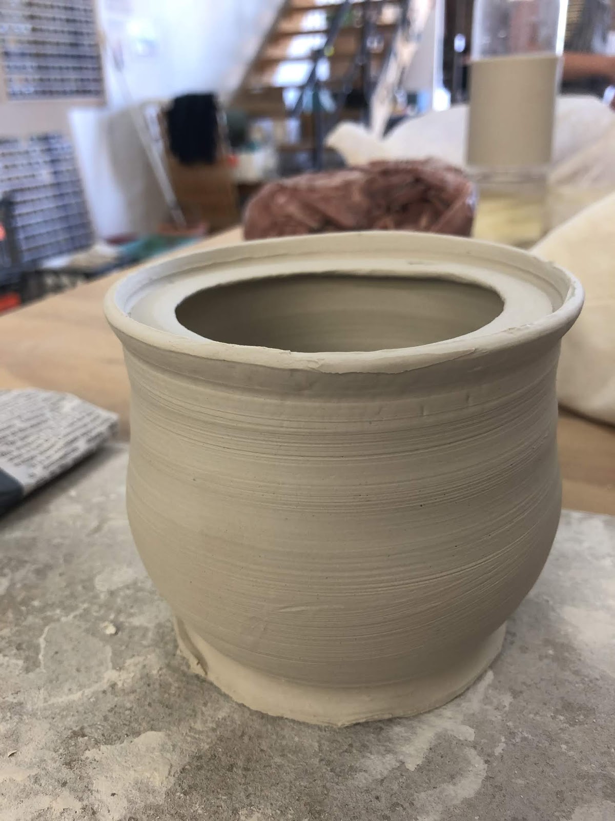
Now, years later, I’m throwing my own pots. I haven’t yet created an albarello I like but I’m close enough. I can also get anything I like commercially fired to stoneware. Time and beyond to do something with the bisque I’ve had since before I moved to this state (at least 5 years ago). I’ll admit, I was really worried this mystery bisque wouldn’t hold up to the high firing temperature. Especially after the slumping seen in the Olla lid mystery bisque.


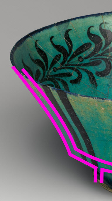
The original choice which was closer in shape to the bisque Extant arbarello from the Louve ref. OA 4091.


On inspiration:
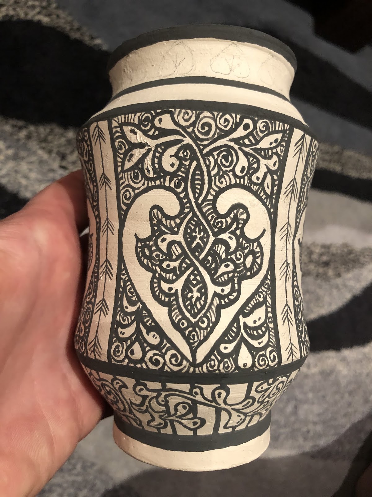
On the right is the original choice. Unfortunately when I sketched it onto the bisque the symbols just didn’t balance right. So I switched to something else. The left is my final choice. I’ve had this image pinned to my ceramic inspiration page for a while. I’ve loved the simplicity of the component elements and the complexity of the background work for sometime. This style really has been a favourite of mine for a while and this seemed like the perfect time to execute it. Part of my decision lay in the colour fastness if black oxide and cobalt blue. Both can withstand high temperature firing with pretty good colour consistency. I couldn’t be sure how other colours, like the super fickle purple, would do so very late period Italian designs are out for now.

Of the two design choices, the second one was more balanced once sketched onto the bisque using 6B pencil.

On execution:
Glazing this took a fair while. I worked the main body in sections with the main design free handed and then double glazed to ensure colour integrity. The background super detailed swirls were a single stroke with a 5zero paint brush trimmed down to have shorter bristles and increase its stiffness. I’m pretty happy with the colour consistency achieved there. I was a little worried they’d end up streaky it grey.

The blue is ‘Cobalt Blue’ from Chrysanthos. It was painted on as a single layer as it was important to me that the black detail come through the blue. I added more blue than was on the original design because I had more foot space and thought the colour balance worked better. I’m not a huge fan of the free blue leaves at the top, I much prefer the blue outlined in black.

I designed the foot pattern myself utilising elements from the extant item. I considered a detailed swirl pattern in the background but decided that it would reduce the impact of the main panels. I really needed more light space to balance the overall look. I think it is important to understand not only the design context but the impact of the piece as a whole. I took for inspiration the bold black line features seen in many items of the time. I’m really pleased with how this came together. Using the lines also let me tie them into the shoulder pattern. Again, I could have overlooked this geometrical change and continued the extant pattern down but it wouldn’t have worked with the shape of the bisque. I did consider a vine design but decided the area would be to thin and the vines would look weird as a result. Plain black bars helps divide the d ensign
Elements without detracting from them.

On the future:
Overall, I’m very pleased with how this piece came out and I’m super relieved it didn’t deform in the kiln! I probably wouldn’t change the rim decoration even though it doesn’t overly appeal to me because it is a direct copy of the extant item. I will be using the other bisque item to trial an Italian or Spanish polychrome design next now I’m more confident in the integrity of the bisque in the high firing temperature.


Monday 16 March 2020

Mystery bisque #1


I was given a beautiful bisque jar with lid many years ago. Without the direct means to fire it, it languished upon my desk. That is, until I read about ollas as a means to water your garden. Any bisque jar seems to work. Buried in the garden, the jar slowly seeps water into the surrounding soil. In theory, plant roots can surround the jar and increase water movement too. Once I learned of this, I promptly planted the jar next to one of my struggle plants. I’ve three in a row and two in a terracotta pot. The ones in the pot have done really well and spread everywhere. This may be better soil or better water retention. This experiment should show me what impact better access to water has!


The problem with mystery bisque is you don’t know if it’ll stand up to stoneware firing. This one didn’t. It started as a flat circle with stem and has dropped somewhat. No matter, I had a sacrificial dish under it and it’ll still work a treat as an olla lid. The colours are Chrysanthos turquoise ug153, probably ug161 electric blue and ug201 crimson and black. I’m pretty happy with the design but it has emphasised that the black does require at least two coats for good coverage.


Sunday 15 March 2020

Part the forth ... necks please

Beyond happy. The underglaze is done. All that remains is a coat of clear to seal it and the bisque of unknown properties to survive a stoneware firing. I can’t wait to see this fired!

Saturday 14 March 2020

Part the third ... blue

Added a smidge more blue than the original because I felt it had better balance when viewed with the tapered base and neck. It’s coming together!

Friday 13 March 2020

Iranian nautical globe cups


The nautical glove cups are out of the kiln and I am so very pleased with the geeen glaze. It isn’t as smooth and transparent as the last cup but the bubble texture to the glaze is so much more fitting for the nautical theme.

I wanted to share the octopie cup while I take some time to write up a reflection for the kelp one.

Base: I wax resisted while glaze dipping. As a result of a deeper pool of wax than anticipated some of the black underglaze stripes didn’t receive any overglaze. Makes for an interesting contrast.

Thursday 12 March 2020

Part the second.... vines

Finished the crazy central detail and made something up for the base in fitting with the extant examples design motifs.

Monday 9 March 2020

Iranian globe cup decoration


Full discussion and analysis once they have been fired. For now, an under-glaze update. I’m in love with the fish and kelp? I thought I’d also create my own motif with the octopie for a proper nautical theme.

Sunday 8 March 2020

Islamic illumination reference helper

If you do not know about this you should!

Are you trying to find miniatures?
Are you getting frustrated by the need to troll though an entire manuscript just in case there's an image you can use?

I found the Islamic Printed Page. http://www.islamicpaintedpage.com/

Its a meta-reference which will tell you where in each illuminated folio the images you are and what they are of. It really speeds up the search times and makes visual research so much easier!

Friday 6 March 2020

It is on its way!

Not my bisque but I’m loving working on this pattern!