I made Mirriams plate mid-last year. It was created as a prize for the table competition at one of the Winterfeasts I ran. I picked it up just before and event and delivered it that day. As a result I didn't get a picture, I haven't even seen the finished product!
It took me over a year to complete it because it was a large plate than I was accustom to (serving plate) and I had to make sure the design and colours suited her requirements (green). The design she chose was simple enough, a rampant lion but she also wanted a personalised motto - Agite primo recte. I will happily admit I have no idea what is written on the extant plate (hints anyone?).
So for this plate, I broke each word into two sections - Ag ite pri mo rec te. I then spent hours researching medieval hands (specific scripts and ways of writing) from both the time period and place. I couldn't for the life of me find something that looked like the very decorative script on the original. Then after a conversation with Waldo regarding woodgrain and the obvious impact on viking text I realised my mistake. The scripts I was researching were created with a quill. The shape of the quill, the viscosity of the ink and the absorbancy of the parchment would directly impact on the style of the script. The ceramic artist who painted the plate was using a brush with glaze, an entirely different medium. So, I stopped looking for scripts and tried to imitate the decorative nature of the text on the plate itself. I made up the script for the letters that I didn't have on the original and I joined a number of letters together to make sure they looked right. I then decorated the background in light green as I still haven't a working kiln for lustre experiments. I think it turned out quite well considering I didn't chose the subject matter. Mirriam seems happy with it so it's a successful project!
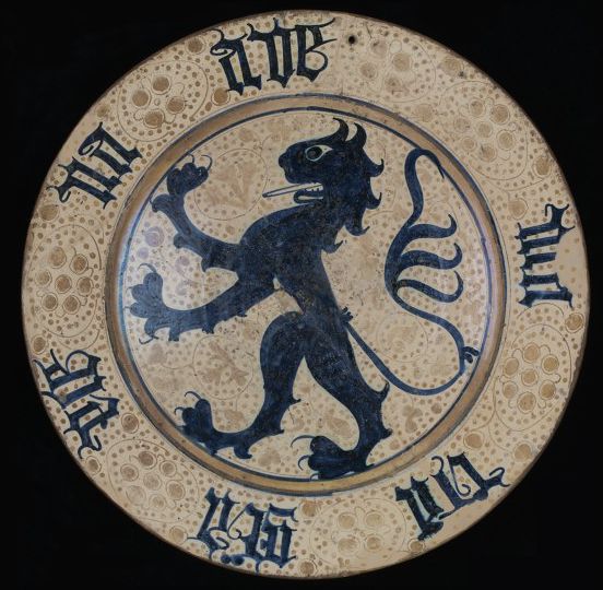
Also, I remember how much I dislike commissions, I hate feeling like I have to produce for a timetable.

Mirriam's finished plate - I think it's turned out quite well and is nicely balanced. The text isn't as florid as the original but that's important so the joined letters can be read.
No comments:
Post a Comment