Friday, 22 January 2016

Remaking the blue dress - Step 1 & 2

 Plotting at Great Northern War (2013?)

I've had my blue linen dress for a couple of years. I made it last minute for a tourney and feast in Atlantia. One thing I've always disliked about the dress is the hem was tacked up and contains at least 30cm of additional fabric. While this helps the drape quite a bit, it makes the skirt quite weighty. I also used hooks and eyes as fastenings, which are reasonably unobtrusive against a white chemise but they're not period. They're the good hooks and eyes with the little kink which means they don't pop open but still. Also, the fit isn't quite right. It doesn't hurt my back like my last blue linen dress but the arm holes are slightly too tight and my bust has changed since creation. Lace around a chamise should not be a requirement of wearing a dress.

I considered remaking this dress for Krae Glas's Ehrentag 2015 event but I gave up on the idea because I ran out of time as per usual. Instead of rushing through the remake, I'm going to take my time and hopefully end up with a late period dress I can be happy with. My first task is to fix the hem that's been bothering me for so long.


Task two, find a period reference as inspiration.

Domenico Ghirlandao, Birth of St John the Baptist 1486-90 Cappella Tornabuoni, Santa Maria Novella, Florence

I started the remake by finding something similar in some extant art (above). The reference had to fit the basic features of the current dress - circular neckline, cartridge pleated skirt which starts at the natural waistline and no/detachable sleeves. Thus the new dress will be patterned on late 15th century Italian fashions.

The dress in 15th century Italian, is called a gamurra. There is a nice collection of similar images on a blog called Sophie Stitches. It looks like the come in a range of colours, with or without sleeves which may or may not match the main colour. The dress appears to lace up the front or at the sides. Removing the hooks and eyes and replacing them with a more period approach will be my next step.

Sunday, 17 January 2016

Plate - 14th century Sultanabad

I've been rather quiet these last three months as I've been moving across the country and am still finding my feet in this new city. I have now found a place to rent and my furniture gets delivered in three days! I am enjoying finding all sorts of new things but last weekend I thought I'd try something new and old at the same time. I had passed through a homewares and overpriced duct collectors shop and found the sales lady painting white plates with some sort of commercial poly-paint. I've seen this stuff before, you paint it on, put the item in the oven and ta da - customized item. Unfortunately, the paint doesn't really stand up to wear and tear, the Stormhold Baronial plates haven't really withstood knives, forks and hand washing by people not told about their special needs. This is why I prefer to glaze my plates rather than buy the ceramic paint from spotlight. True, this restricts me in size, shape and I need people to fire it for me but the end product is much more durable. I've decided that finishing the A&S 50 challenge was enjolyable but I'm not done with the ceramic painting yet. So, I need to find someone in my new city who can supply the bisque and fire the finished products for me. Or make arrangements to get the my bisque to Melbourne for firing and collection by a friend.

So last weekend, off I went to All Fired Up in Joondalup. I've mentioned this place on my 'where to make your own ceramics' list for a while now so I thought it was the perfect first candidate for a replacement ceramics facilitator (i only have two candidates). So I saved a number of reference images from the Met Museum on my iPhone and off I rode (image 1). I arrived at noon, spent half an hour browsing their limited stock of bisque before settling down to another project. When I went I had no real plan in mind as I wasn't sure what sort of bisque range they'd have (small). I was there until closing (5pm) and finished the front of a plate and made an attempt at the back.

The blackwork outlines complete. I was tempted to finish here because the grey and white looked so lovely and balanced just by themselves but I knew it'd fire to black and throw the look off.

The blue is complete. Note the solid look of the blue over the black. The original used transparent glazes in blue and turquoise of the Saltanabad style. This is really hard to replicate using opaque glazes so I aimed for a wash and hoped the fired results would be satisfactory.
Finished! Well balanced and really happy with the front.

 The center of the design - surprisingly balanced for a free hand experiment.


Replicate or create original designs?
This is always a question I ask myself when creating something new. Should I replicate an original extant item I'm really taken with, or should I use design elements from a specific time/place and design my own items? I think every SCA artisan asks themselves this same question and I believe the answer comes down to, will the item be fit for purpose? SCA items seem to fit into two categories, 1) cheap make do items for a single or short term use or 2) expensive or hand made items design to hopefully last an SCA lifetime. The items in the second group are not used on a daily basis and are often expected to last for years beyond their more often used modern counterparts. For many people in the SCA, a ceramic item that is fit for use must look medieval. For some people this means old, worn or clearly handmade (see previous rants), others want ceramic items that fit their game, either referencing their personas storyline or featuring their heraldry. The final group of SCA users want items that completely replicate medieval items.

I feel that I make items that generally fit into five categories.
a) appropriation, the grotesques are an example of this. I copied images from manuscripts into a new medium. They are the least medieval ceramic thing I've made (let's not count the escher plate).
b) adaption, I count my early household plates in this category. The elements came from a number of related sources but the combination was created to meet a specific need.
c) insertion, Into this category I fit the Gabs & Stanzi plates. The design and a majority of the plate were period replicas with small elements of heraldric symbols to craft something appropriate for the leaders of my other household.
d) replication, I have replicated the designs on many of my A&S items straight from the originals adapting them only slightly so they'd fit on the bisque available. This Sultanabad item is one such item.
e) creation, the items I'm often most proud of, the Dr Suess bowl and plate fit into this category. These items are inspired by their medieval counterpart but the design is very much original.

Extant reference - Bowl, Il-Khanid, Iran, Sultanabad. 14th century. Freer Slacker, S1997.129.

Friday, 15 January 2016

Venitian dresses in India?

Anne de Wilde's elevation dress.

A friend of mine has been making an elevation dress for Canterbury Faire this year and has been sharing the construction on facebook. It is a lovely Venitian dress inspired by this image, a lady from the 1600's. When she posted the finished dress I was interested by the fact the main body of the dress ends below the breasts which are covered by a plain or decorated partlet. There is a whole section of images of these dresses here. Apart from being a beautiful dress which has taken her hours to construct, it also reminded me of an interesting image I'd found when browsing the collection in the Met Museum. The image below featured in one of my classes on indian choli tops. I was fascinated by the contrast in garb between the central figure and the ladies on the left looking on. I was quite taken with the European garb combined with the indian veils etc. I had thought the European garb was Elizabethian garb depicted in such a way that still displayed the ladies breasts for some sort of symbolic reason. Now I'm not so sure.

The ladies could quite well be wearing complete Venetian dresses. Even better, if you examine the center lady in pink, there appears to be some pinkish gathers coming from her neck and the lady in purple on the far left also seems to be sporting a neckline of some sort. Is it possible that this manuscript also shows light weight, solid colour fabrics as transparent? This would fit with other images I've seen of more traditionally dressed indian ladies wearing light fabrics depicted as a wash over the womens body or a halo behind it so the breasts and upper body can still be seen.

17th century manuscript depicting Amir Khusrau Dihlavi (1253–1325). 

Given my other research interests at the moment my next step will  be to examine the bottle in the central figures hand as well as any other time frame indicators in this and associate images and see if I can nail down the reason for the dresses. Are they contempory to the time of painting (was there a Ventian influence?) or are they from a period before the manuscript was painted?

Thursday, 31 December 2015

A&S 50 wrap up, tables and factoids - oh joy!

A&S 50 has come (by far) and I have completed my challenge. There are still a few items in the queue for firing, and some individual items for 33 are still waiting completion but on the whole I believe I have successfully met this challenge. I have taught myself how to paint ceramics. I have learned a variety of techniques and tools. I have also reached a great many individual items and cultures. I entered two Fields of Gold A&S competitions and one Kingdom competition, placing first in one FoG and one Kingdom competition. I have given away the vast majority of items or donated them as fighter auction prizes. I have learned a significant amount about blue on white ceramic objects and have applied this knowledge not only to my ceramics work but also to deducing time periods depicted in medieval art. I still have at least three more essays on BoW items to go with Uzbekistan, Italy and China still in draft form.

Below I have summarised my projects in a handy dandy table but for those who don't like tables as much as I do, some reflections.
  • I'm still in love with Sultanabad, mostly because of the blue and turquoise colours.
  • I love Kashan tiles but this project is probably too big for me.
  • I've made a lot of Italian and I believe this is because the opaque palette I have to work with fits the maiolica style best
  • Pretty much everything is after the 1300's because this is when ways to fire polychrome items in a stable manner were invented.


Plate Item Style Culture Age
1 My household plate Lusterware Spanish 15th C
2 Gabriel's Plate Tin Glazed earthenware Spanish, Seville or Valencia 1525-1550
3 Constanzia's Plate Tin Glazed earthenware Spanish, Seville or Valencia 1550-1600
4 Relief experiment Lusterware Spanish, Reus 1575-1600
5 Ibis plate Luserware Spanish, Manises 1525-1575
6 Drollery plate 1 Illumination N/A  N/A
7 Drollery plate 1 Illumination N/A  N/A
8 Peacock plate Stonepaste with under-glaze decoration Syrian 12th C
9 Dove plate Earthenware Iran 14th C
10 Rohans household plate Lusterware Spanish 15th C
11 Hare and artichoke bowl Tin Glazed earthenware Italy, Florence 1450
12 Mirriams serving plate Tin Glazed earthenware Spanish, Manises 1400-1450
13 Tile 1 Stonepaste with lustre over white underglaze Kashan, Iran 1263
14 Tile 2 Stonepaste with lustre over white underglaze Kashan, Iran 14th C
15 Tile 3 Stonepaste with lustre over white underglaze Kashan, Iran 1260-1270
16 Tile 4 Stonepaste with lustre over white underglaze Kashan Iran 13th C
17 Tile 5 Stonepaste with lustre over white underglaze Kashan, Iran 14th C
18 Tile 6 Stonepaste with lustre over white underglaze Kashan, Iran 13th C
19 Tile 7 Stonepaste with lustre over white underglaze Iran 13th C
20 Pheasant Plate Stonepaste with overglaze lustre Kashan, Iran 12th C
21 Escher Plate Geometrical line drawing with  pigment Modern Modern-ish
22 Tile 8 Stonepaste with lustre over white underglaze Iran 13th C
23 Fox Plate Wooden plate with gesso and varnish Egypt 13-14th C
24 Tile 9 Stonepaste with lustre over white underglaze Iran 13th C
25 Tile 10 Stonepaste with lustre over white underglaze Iran 1262
26 Iznik Plate Polychrome underglaze Iznik 1575
27 Janet's Plate Lustreware Manises, Spain 1400-1450
28 Cat Cup 1 Lustreware Manises, Spain 1400-1450
29 Cat Cup 2 Lustreware Manises, Spain 1400-1450
30 Stromhold Fidchel board Carved wood Isle of Man 10th C
31 Peacock cup Polychrome underglaze Italy, Florence 1515
32 Janets Bowl Lustreware Manises, Spain 1400-1450
33 cups* Polychrome underglaze N/A N/A
34 Krae Glas Baronial platter Polychrome underglaze Italy 1525
35 Aneala cups Polychrome underglaze N/A N/A
36 Aneala plates Polychrome underglaze Italy 1525-1530
37 Dr Suess bowl and Plate Cobalt underglaze Italy 15th C
38 BoW Iranian cup Cobalt underglaze Iran 1450-1500
39 BoW Turkey cup Cobalt underglaze Iznik, Turkey 1550's
40 BoW Spanish cup Cobalt underglaze Spain 1550's
41 BoW Italian cup Cobalt underglaze Tuscany, Italy 1575-1625
42 Bowl for Tamar Polychrome underglaze  Italy  16th C
43 Plate for Tamar Polychrome underglaze  Italy  16th C
44 V's cup Cobalt underglaze Valencia, Italy 15th C
45 Foxy bowl Lustreware Sultanabad, Iran 13th C
46 Plate of love Polychrome underglaze Italy 1550's
47 Tile 11* Stonepaste with lustre over white underglaze Kashan, Iran 13th - 14th C
48 Tile 12* Stonepaste with lustre over white underglaze Kashan, Iran 13th - 14th C
49 Tile 13* Stonepaste with lustre over white underglaze Kashan, Iran 13th - 14th C
50 Starwars maiolica Polychrome underglaze Deruta, Italy 1525
         
* Items 47, 48 and 49 still to be fired
* Collection of items for 33 half way completed & delivered

Saturday, 28 November 2015

Indian armour for SCA persona

The defeat of Hemu by Kankar. From an Akbar-nama manuscript 1590's. National gallery of Victoria As24-1876

At the moment when heavy and light (archery) fighting in the SCA I wear a mishmash of Viking (helm and bazubands), crusades (tabard) and15th century (shield sometimes) and everything else is covered with cloth so is unremarkable. I've been meaning to create a cohesive set of armour for a number of years now but I've never had the funds or the skillset to do this. I think I've finally found the look I'm going to try and go with. I know I posted something similar back in Janurary but the female archers lack of body armour made it impossible to copy well. The image above depicts a battle between warriors wielding spears, maces, bows, swords and machete type swords. There is also a guy in there with a billhook looking thing. They typically have round conicle highly decorated shields as well. There are also a couple of flag bearers and some of the guys have tiny flags out the top of their helmets. The ones I spotted were yellow or red and may have been a signal of allegiance?

Maceman detail from image above.

The important details for my future armour are:
knee high leather boots (sensible when riding)
pointed helm
chainmail aventail (or just back drape)
bazubands  or forearm guards
decorateive knee cops with upper leg protection
articulated upper arm protection (could be quilted fabric instead)
decorative chest protection
pretty tunic over the top


There are few unbearded / non-mustache faces in the crowd of warriors. Most of the people depicted have delicate eyes and noses but I do wonder if women were getting in among it,

Wednesday, 28 October 2015

Ceramic 42 & 43 - Birthday presents for Tamar

Detail from the Hastings Hours.

I completed ceramic 42/43 ages ago but I've been terribly slow in delivery. I created a plate and shallow bowl set for Lady Iglesia Delamere because I think she's wonderful and deserves pretty things. This project was born from her request to Lady Elizabet Hunter for a silk veil. I believe Iglesia received the veil as a Great Northen War prize which Elizabet kindly donated a voucher for. You can check out some of Elizabet's projects on her pinterest page here.

Corner of hand painted silk veil by Lady Elizabet Hunter made for Lady Iglesia Delamere. Photo by J.Coath.

A slightly blurry picture of the inspiration page from the Hastings Hours.

Together Elizabet and I conspired to make these projects match. We examined a number of sources of medieval illumination and settled on the Hastings Hours as it contains a large variety of floral borders. The challenge was finding something that would work well as both a silk painted and ceramic painted item. We ended up choosing the design above together. Because she is MUCH more organised than I am, Elizabet finished her project before I'd even started mine so I ended up copying the style of her border rather than directly from the book of hours. Below is a project montage followed by some thoughts on authenticity.

Roughing out the layout with a 6B pencil. An owl has been used above the device due to my fond memories of hanging out at Great Northern War with Iglesia. Also, wisdom, or some such.

 Plate painted in but no shading with black on vegetation yet. Light green sections have been shaded with dark green glaze.

Bowl painted and shaded

The bowl post firing - success!

Plate post firing, mostly success. I decided prior to firing that the plate would look better if the vegetation was purple/red and greens. I scratched off some of the purple/red acanthus leaves and replaced them but only noticed I missed part of one after firing. Damn!

Angry owl is angry.

Some thoughts on authenticity:

Is this 100% authentic?
No. The plate and bowl shapes can be documented (see previous projects) however my use of white bisque and modern ceramic glazes are not 100% authentic.

Is the design authentic?
In part yes. The floral design elements are documented in the Hastings Hours. Acanthus leaves and flowers feature on a number of Italian Maiolica items (1, 2, 3, 4). It seems rare to have them placed on a white background but it does occur. Plates will often feature a small central rondel which occasionally contains a heraldic device (5, 6, 7).

Would I change anything to make this more authentic?
Not for this project. The recipient is happy and I'm rather pleased with how this came out! The set is microwave and dishwasher safe and uses non-toxic glazes. It was produced by someone (me) who has no skill in the area of pottery and prefers just to apply glazes.


Tuesday, 15 September 2015

Blue on white - Spain, extant objects

These are the items referenced in my previous post regarding blue on white ceramics of Spain. Yes, it was posted months ago! Images have been downloaded from the relevant sites and uploaded as a reference list for those that wish to see them while reading my mini-essay. As I have done in previous posts, I've put the images behind a jump cut so as not to spam my blog. Each image has a museum number which is linked to the original item if you want additional views or wish to know more...

Friday, 28 August 2015

Calamity ware - wow!

Many months ago I started down the winding rabbit hole that is blue on white ceramics. I have yet to complete many countries worth of documentation (Turkey up next!) and I am still collecting reference images. I'm close to 400 right now with very few repeats. One of my bosses showed me a kickstarter that I just HAD to get involved in (here). I'm not earning much at the moment, but I couldn't resist pledging for this project. THIS IS SO AWESOME!


Don Moyer, the genius behind calamityware, has recreated the 'traditional' blue willow print with a twist (or two). Previous incarnations have featured things like pirate ships or giant robots within the more traditional setting. The plate I have pledged for involves what appears to be a kraken feasting on innocent locals. To date he has crowd funded 6 plates with another in process and an 8th planned for October. They are as follows:

SERIES 1: On-Glaze Plates
Calamityware Plate 1: Flying Monkeys
Calamityware Plate 2: Giant Robot
Calamityware Plate 3: Voracious Sea Monster
Calamityware Plate 4: UFO Invasion
SERIES 2: In-Glaze Plates
Calamityware Plate 5: Pirates in the Neighborhood
Calamityware Plate 6: Rambunctious Volcano
Calamityware Plate 7: Tentacles! (Funding on Kickstarter until September 10)
Calamityware Plate 8: Vortex of Doom (Coming in October 2015)

So cool, so awesome. I think I need to find something medieval to do this to!!

Sunday, 23 August 2015

Ceramic 50 - Star Wars Maiolica for Dangerboy


For my final AS50 project I decided I'd finally finish a project that I thought about 4 years ago when I met Dangerboy for the first time. DB is the son of Lucas' knight. He seemed to be a rather shy boy but came out of his shell when Lucas was around. He was really into Star Wars at the time and I felt bad about taking his friend away from Atlantia. (His parents and whole campsite were also pretty wonderful to me). At the time I really didn't have the skills to make the item I wanted to but I kept the idea in the back of my head for ages. Though I was hesitant, I thought it was the perfect project to push my skills that little bit harder and decided to make it my 50th project. (Feel like you've missed a few? That's okay, I haven't posted them yet because they are gifts and still pending delivery!).

Inspiration plates:


Dish 1: 1525, Deruta, V&A Museum, C.2191-1910 Dish 2: 1500, Deruta, V&A Museum 6666-1860

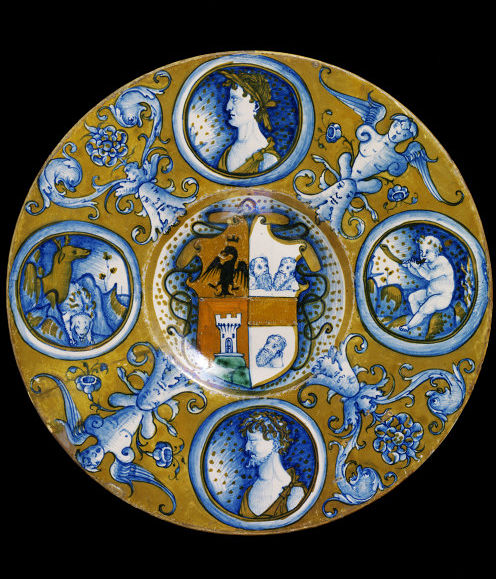
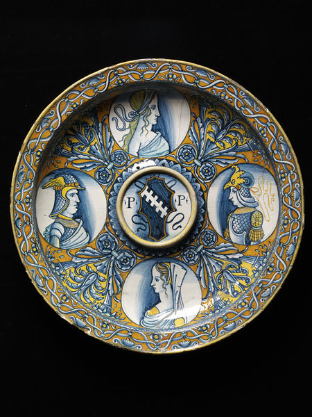
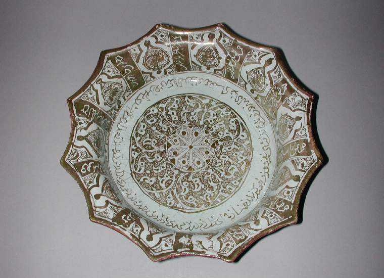
Dish 1 was the main inspiration for this piece. I found it's simplistic colour pallet quite appealing and I quite like the grotesques between the medallions. The shape is also closer to the bisque I had available. Dish 2 requires a thin rim and the proportions of the items I have aren't quite right. I like the dark shading around the portraits in Dish 2 as it highlights the faces better. I also liked the central roundel as it looked a bit like Sir Cuan's heraldry.

I started by roughtly sketching my ideas to get an idea of how everything would sit. I then realised that it'd be impossible for me to freehand characters that I know nothing about so I had to do a lot of Star Wars research. Dangerboy is part of the new generation so a plate featuring Leia probably wouldn't be appropriate. I tried to pick strong characters one of which might be his favourite (there was no way I'd put Jar Jar Binks on this plate!). I ended up settling on R2D2 (as the character in every film), Yoda (because), Vadar and the Bounty Hunter. I then trolled the internet to find appropriate images of each of them. I collected a folder worth then resized them so they'd all be the same height. I opened them in photoshop, turned them greyscale and reduced the number of tones. Adjusting them from 3 tones to 15 helped emphasise the areas which needed shading and the direction it should fade. The final images I chose are below.


Bounty Hunter Darth Vader

R2D2 Yoda

Once I'd selected the images and worked out the best way of shading them, I 100% cheated and traced them off the screen of my computer. I ended up drawing them each three or four times before making an attempt at transfering the outline to the plate using the old-fashioned pencil rubbed back of paper method. I mastered this trick making cups (which I'll post about later) Once I had the outlines, I painted the majority of the plate in the background colour, yellow. I also drew in Yabba the Hut's head as the grotesque and added sort of dolphins and a thistle (Dangerboy's mothers device) because all the Star Wars worm type characters didn't look right or sit well. I then outlined the four medallions and painted in the strong solid lines on each of the characters.

I thought long and hard about the thistle things. I felt they were rather plain compared to the detail in the medallions. I decided to be a little tricky and put Star Wars symbols in each one. Fans will know what they are but off the top of my head, the rebel alliance and the sith are in there. Finally I finished the outlines, the thistles and dolphin things (they should have been Atlantian seahorses now I'm thinking about it a month later, ah well). It was time to do the shading!

To shade the figures, I diluted the blue glaze with water in a 1 to 4 ratio as shown to be most effective in my Krae Glas Baronial Platter experiments last year. I then used a sponge to dab water onto the target area to dampen it without smudging the existing glaze. The Angel and Matt plate showed that damp surfaces allow the brush and glaze to spread further and smoother leaving a better shadow.


It seems to have mostly worked out that the light source of the characters is the top right side (ish). This wasn't something that I considered until after the fact, it just turned out that way from the photos I selected. If I do this again I'll have to think about these small details to ensure cohesiveness of the design.
The next step was the small details, I shaded the back of the medallions in with yellow to replicate the shading I liked in Dish 2. I know cartoonists often use the angle of background colour to emphasise a message or symbol. I just shaded in the left side. I should have tied the yellow shading to the angle of the light (next time). I also added a minute amount of red to the design. Yoda and Darth Vadar are nicely mono-chromatic however R2D2 needed a red light (?) and the bounty hunter has a red patch on his armour. I thought this would tie in nicely to the red I'd need to use to make Cuan and Padreign's devices.
I outlined the central roundel and the shield. I sketched in half of each device and added a chief that symbolises 'Oldest Son'. I had to make a call on Padreign's device. It's supposed to be half black with gold thistles. As I wasn't and wouldn't be using black anywhere else I went with a pastel blue instead of having a big black blob in the middle of the plate. This is when I made my big mistake on this one. I forgot to fill in the crown around the dogs next on Cuan's device. As a result, this ended up being white instead of red. I was kicking myself when I noticed after it'd been fired!


I learned many things to make this project happen; how to evenly paint three layers without leaving thin or thick patches, how to clean up lumpy lines, how to vary the thickness of lines to balance out design elements, how to transfer images, how to find the right medieval inspiration for a project, how to shade with glaze, how to use Photoshop to emphasize shaded areas and how to apply glaze without having thin white lines between colours. While I am not a master of this art yet, I am happy to say that for my 50th project I have produced something I will always be proud of and it has inspired me to continue making things like this.


Saturday, 15 August 2015

Ceramic 46 - Amor vincit Omnia

 Dish featuring Man in Armour, Louvre Museum

This project was started for two reasons. First, I wanted to give a gift to my friends Angel and Matt to celebrate their first wedding anniversary (I wasn't able to attend the wedding). The secondary reason is I'm building up to Project 50 and I needed some practice with shading and human features. So I thought I'd achieve two goals with one serving platter and make them a 16th century style mailoica dish.

I started this project by trying to find plates that featured a couple. There are many plates from Deruta which feature a single female surrounded by a thick decorative border (1). For the most part the central image is circular but there are a few square ones as well (2). Some plates don't have a border, instead they generally depict complicated allegorical scenes (3). I did find one that appeared to have a couple making out and I decided it wasn't the right vibe for this project (4). Couples tend to appear on ewers (5) and drug jars more often than plates. This may be because the circular nature of the plate restricts the layout and can result in strange foreshortening.

Colours

Plates created in the early 16th century tend to feature blue and yellow colours. Dark reds and turquoises were introduced in the mid to late 16th century. Portraits tend to be monotone with a secondary colour added to the garments or head wear. Given my habitual use of blue recently, I decided to use a dark red and a dark gold similar to those created in the mid-16th century (6).

Decoration

For decoration I was mostly inspired by the plate pictured at the top of this post. I have it in my Italian Ceramics Pinterest collection but haven't been able to find out the museum number. I like it's monotone portrait and blank scroll pattern. I used the acanthus leaf from the Man in Armour dish, and then replicated a common geometric fill pattern that appears on a number of dishes (7).


I spent a long time trolling facebook trying to find a good picture of the two of them as a couple however every single picture had odd shade or head angle on one of them. I decided to combine two pictures instead.


As you can see in the above image, I've tried to use shading where appropriate. There is more shading than can be seen here. It will be revealed when this gets fired. I'm not sure if the faint shading will work and I really hope Angels lips become more realistic once fired! 


Success! I'm really glad much of the shading came out well and I love the arch pattern fill.

Thursday, 6 August 2015

Ceramic 45 - Foxy drinking bowl for Brooke


Dish, OC.157-1946, Fitz Museum.  

I had a small palm sized bowl that I had bought to experiment with and it's been sitting on my craft desk for a while. Inspiration struck when I was pondering Pennsic and all the people I enjoy hanging out with and I realised I hadn't indulged in the tim-tam port slam recently. The tiny bowl will make the perfect port bowl and who better to make it for than Brooke? It's a pity I didn't have it ready for Great Northern War because she put a lot of work into that event. Ah well, I'll take it to Pennsic and we shall drink and make merry.

Bowl, C.53-1998, Fitz Museum.
I decided to use red again as it'll go with her other bowl. This time I did find a fox on a plate but it's on there with a mess of other animals and that would just be too busy in such a tiny bowl. I decided to make the bowl sort of Saltanabad-ish and copied the motifs on the spiky bowl below. I then painted a small Kitsune style fox in the base of the bowl for her to find once she finishes the port.


Saturday, 11 July 2015

Ceramic 44 - V's cup


I found this bowl while researching Spanish Blue on White items. It struck me as being perfect for one of the local SCA ladies. Vee is pretty awesome so I thought I'd celebrate the completing of the initial Spanish post by making a Spanish cup to add to the BoW examples. I've asked Beth to pass it onto Vee at Krae Glas' Carnival this weekend. I hope she likes it.


Thursday, 2 July 2015

Blue and White ceramics - Spain

Blue on White ceramics: the reciprocal influence of Chinese porcelain on European and Middle Eastern ceramics -Spain

Other essays on the history of BoW in Iraq, Egypt, early Iran, late Iran, Japan, China, Turkey, The Netherlands, Italy and England. 


Item 11: 16th century pharmacy jar, cobalt on earthenware.
 

Spain

In the 14th century, Spanish potters were producing polychrome items in greens & browns with lovely brushwork (1). These items are reminiscent of the Sancai ware of China.. Items would often feature incised lines which would help prevent the glazes from running (2). Similar items were produced in many countries and though the artistry is lovely, the Spanish doesn't seem to have had a strong international market for these items.

The late 15th century saw the naval might of the Spanish Empire bloom resulting in the eventual settlement of the Americas. This time of growth was beneficial to all trades especially luxury goods which were traded across the empire. The Spanish potters of the 15th and 16th centuries were known for their beautiful luster work. It is thought that the method of the luster glaze had come to Spain from various conquests and trade routes from Africa. It is possible there was a direct knowledge transfer from the luster artists of Egypt (3).

Spanish potters would decorate items with a metallic luster glaze, typically both front and back (4). Motifs varied depending on the market and the region. Design elements were heavily influenced by Moorish artists with many items showing pseudo-islamic glyphs (5, 6, 7).

BoW items were produced in parallel with lusterware. In early examples the BoW earthenware features wider brush strokes and cruder patterns than the lusterware. Where luster and BoW were combined, the cobalt is used simply and is generally rougher than the luster items created at the same time (8, 9, 10). Ceramicists would eventually develop techniques that resulted in cobalt items that were as refined as the luster items.

All earthenware items were processed in wood fired kilns. One of the major challenges for potters was to ensure the temperature was consistent creating a glaze that would shine but not run. Often the temperature within the kiln would vary resulting in a well fired pharmacy jar (11) and one fired at too high a temperature (12, 13, 14). The temperature challenge could come down to the difference in degrees within 5 centimeters resulting in pharmacy jars where the glaze runs on only the top section of the jar leaving the rest of the design intact (15, 16). I had supposed that the pharmacy jars primarily suffer from running due to their height which would effect placement in the kiln and thus airflow around them however I have found smaller objects like tiles that seem to suffer from dripping as well (17).

Like pharmacy jars and other common household objects, tiles were often mass produced. One indication of this is the way their patterns are designed so the corners link together to create seamless designs (18). Some tiles seem to display an Iznik influence (19) such as half palmette (20) and other designs.  Others have a distinctly Islamic flavour and feature geometrical patterns (21, 22), Interestingly, the central fill is often clearly Spanish in design.

Item 23 is worth noting as it highlights the diversity of resources the Spanish potters drew their inspiration from. The pitcher / ewer could almost be a replicate of the Kashan (23a) vases in shape. The stripes appear to have been applied with a single stroke from a brush with six bundles of bristles.

Item 23: Spanish vase with Kashan influences

Toledo

Possibly inspired by early Tang-ware (24), the artists of Toledo produced what I call splash-ware (25, 26, 27). It's possible that splash-ware was deliberately created to ensure that even if the glaze runs, the end product can be sold convincingly. This style doesn't seem to have been adopted by any of the other production centers.

Sevillia

Sevillia seems to distinguish themselves in the Blue on White market producing some lovely BoW items (28). They also integrated some black into their designs (29, 30). The items from Sevillia often feature horror vacui, i.e. the filling of all available space with decoration (31).

Manises

In the early 15th century, Manises produced lovely luster work as well as a combination of luster and cobalt. Plates would often feature heraldic animals (32, 33), the most prominent being the Spanish Lion of the Kingdom of Leon (34, 35). My favorite group of items from Manises features a cobalt design highlighted in luster (36, 37). These items seem to have an Islamic influence with their symmetrical geometric designs. Manises also utilized cobalt to augment the pattern fill seen in item 38. Later in the 15th century, these patterns became larger and more of a design feature rather than a fill pattern (39, 40, 41, 42)


Item 37: Deep dish from Manises, Spain with lustre and cobalt.

Barcelona

Item 43, a pharmacy jar, is interesting as it appears the cobalt glaze was applied then carefully scratched off. Given that the scratching never punches through the white tin glaze, it's possible the item was fired white then fired again with the blue. Barcelona seems to have concentrated on providing items for the local market such as pharmacy jars (44). Many heraldic tiles were also produced and all  seem to be designed to fit together to create a continuous design (45, 46, 47). By the end of the 16th century, the local potters had mastered the art of fine luster-ware with blue highlights (48). The 17th century saw the develop of lovely BoW shaded work similar to the portraits featured on Italian majolica work (49).

Dish 49: Shaded portrait similar to early Italian majolica work