Wednesday, 22 August 2012

Flowered headwear acquisition - Yay!


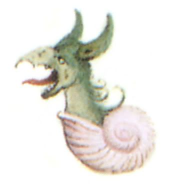
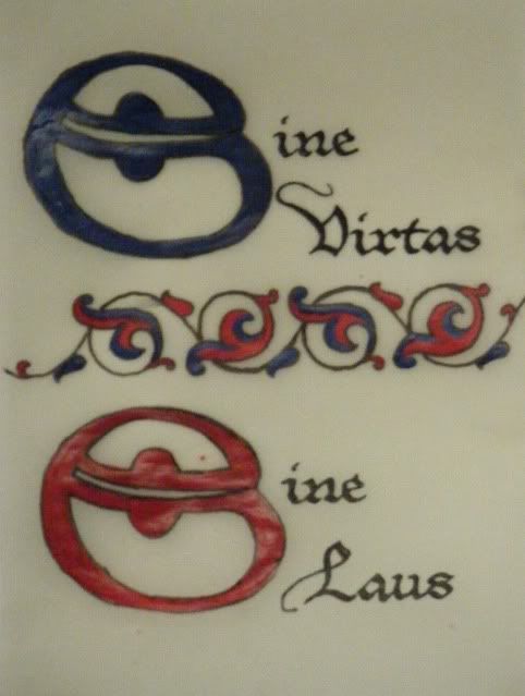
Last weekend while wandering the city blocks the boy and I stumbled upon some sort of Indian cultural festival. By stumbled upon,  I mean: we heard the Bollywood music from blocks away and I dragged the poor man all the way there. I happily acquired three new items for my Indian personal. The first (above) is a matched set made out of ribbon to represent strings of marigolds and carnations. The central loop is intended to go around a bun pinned into place through the white circles. The other loop can be strung around the head or through the plait.

Some similar garlands can be found below, though I suspect most of these are composed of actual flowers.

(Figure 1 - left) Aishwarya Rai's wedding hair. Totally my most favorite actress.  (Figure 2 - right) A modern Australian bride with beautiful jasmine in her hair and simple yet elegant decorations for her Hindu wedding.


Figure 3 - Other methods of using flowers to decorate hair - wrap enough jasmine flowers around the head to create an aura of flowers. Use jeweled pins to pin the braid together (something like this is on the things to do list)

Figure 4 - Strings of jasmine buds can dangle from the head and will provide a light, refreshing scent throughout the day. Don't have long hair? Wrap the entire 'braid' in flowers and no one will know!

These days the best flowers-in-hair images come from Indian weddings where hours are spent getting the bride's hair perfect. However, simpler arrangements can be use for day to day wear. I suspect wearing a jasmine garland all day will provide perfume through out the day.
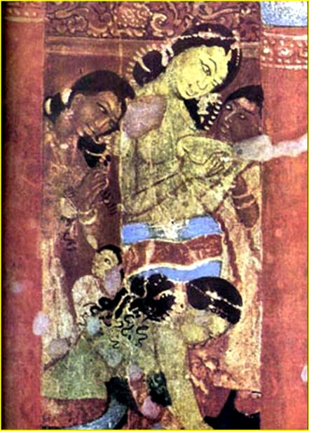

Figure 5- Common women at household chores - Ajanta Caves - Cave 1?. The central figure seems to sport the jasmine flower aura seen in Figure 2.
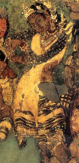
Figure 6 - Dancer sporting intricate hair decorations as well as a fitted dress. Ajanta Cave 1 - 6th-7th CE

.

I also bought a string of fake jasmine buds. These have been created out of cotton, and the tips dyed green. They actually look alot like actual buds (right). I might try making some out of cotton wool buds and PVA. This is also designed to wrap around a bun, but this one ties with black wool string. I will have to strengthen it and make it easier to attach if I plan on using it at Pennsic.


I do wonder if I can get away with something like the arrangement shown in this portrait by De Vinci. Incrust the net at the back with flowers. Secure with a jeweled band to the forehead and bind and decorate the braid and hair extension as shown.


Monday, 20 August 2012

Viking Designs - review

 
ISBN 13: 9780486404691 ISBN 10: 0486404692

Like most design books published by Dover, Viking Designs by A.G. Smith contains pages upon pages of black and white viking clip art. The publisher has also included an additional note which gives a enough of a background so as to furnish the lay reader with appropriate terminology to research later. "Borre-style pieces often show creatures with bulging eyes, triangular forward facing heads and large ears whereas Jellinge-style pieces the heads are slender, shown in profile and nearly always sport pigtails."
The book has 44 pages of images which range from interpretations of carved stone and wooden implements such as bedposts to tapestry and sword hilts. The clipart is clear and well drawn but due to their nature they cannot communicate placement and use of stones or enamel. Captions are frustratingly brief. Some objects are titled such as the Sutton Hoo items, however there is no list of extant sources. I would LOVE to see this book reprinted with the interpretation side by side with the original artificat. The scientist in me also wants these diagrams to come with a scale.
A good book for those wanting inspiration for Viking themed craft-work or someone just starting to research the Viking period. A mediocre book for someone wanting a good reference book for historical research.

3/5

Saturday, 18 August 2012

Dash's birthday Daisy


It was Dash's 30th birthday this Sunday so we took a stroll through the city. I couldn't resist snapping some photo's of these daisies near the Ripponlea train station. I think they'd look amazing in ultraviolet light. I suspect they'll be popular with the local bees because of this.

Monday, 13 August 2012

Sprouting III


The sprouted carrots have been planted. This pot holds four purple carrots. The sweet potato is planted next to the pot and the parsnip is about half a meter away. I don't think the parsnip will succeed as the shoots are very small. Carrots are beginning to look very leafy and will hopefully produce alot of seeds for the coming year.

Sunday, 12 August 2012

Hardenbergia violacea


A beautiful Hardenbergia violacea.which Dash acquired in trade at the market this weekend. It's a native Australian pea plant. It has purple flowers throughout winter and should become a nice compact climbing vine. We've planted it near the front of the house so it'll get enough light and hopfully cover up some of the ugly.

Thursday, 9 August 2012

Traditional Jewellery of India - Review

ISBN 13: 9780500287491 ISBN 10: 050028749X

This is a very well researched and interesting book, as you would expect from Oppi Untracht. The main focus is on tribal jewellery, with specific notes on the construction, meaning and evolution. There are many pictures throughout, both black/white and colour as well as schematic drawings. Perhaps could have dated some of the images better as it isn't clear if the 'traditional' items shown are just from the last two centuries or are older.

For anyone with an interest in tribal jewellery this book is a must. If you are interested in medieval jewellery from the Indian sub-continent this book provides great information on construction and tradition but has comparatively few images prior to 1600 CE.
4/5

Monday, 6 August 2012

Jar of Strawberries

Sharing more Femo fun! Jar is 3cm tall. Once I've filled it I'll lash the neck and turn it into a pendant.

My sister has used a similar bottle and created brain in a bottle! She constructed the brain out of Femo (massivly impressed by the detail she managed), she used sunflower oil instead of formaldehyde, she sealed the cork with PVA and we glued it in with Tarzans grip.


Sprouting II

Purple carrots have started sprouting. The sweet potato is trundling along. I've added some more purple carrots and some parsnips. Interestingly, the carrots where I left an inch of frond seem to have produced the largest fronds, where those that were cut to the quick (?) have sprouted in three or four places.
I do wonder if I'll get viable vegetables from these plants. I suspect they'll be somewhat mutated looking and probably best as seeding plants.

Saturday, 4 August 2012

Femo strawberry pendant


I got this idea from PiTop who provides a nice simple construction tutorial.

Having made a couple now (because you can't go wrong with strawberry jewellery) I've got some extra hints and tips.

1. If you are using non-brand name ploymer clay and it tends to be a little crumbly (the red based colours tend to do this) mix it with a little of the white or some white Femo to make it softer and easier to handle. Use a variety of products to get a consistency you like.

2. If you don't have the metallic iron on studs suggested by PiTop, press holes into your strawberry and use a fine brush and your gold acrylic paint. I used JoSonja's Rich Gold paint. I love JoSonja's as it's a good medium price range paint widely available throughout Victoria.

3. You can insert the eyescrews before baking however the Femo is soft enough that you can use a 1mm drillbit and screw the eyescrew in after cooking. I bought 1mm and 1.2mm eyescrews in gold and silver tone from the screw isle (painting / hanging screws) in Bunnings.

4. Getting finger prints and fine tool marks in your femo? Use a slightly wettened finger to smooth out the marks. You can also sand femo after it's baked to remove any marks.

5. Clay tools are wonderful if you can get them, but if you're making miniature objects, most tools can be made from wire or plastic lying around the house.

6. I baked my Femo at 180 degrees Celsius for ten minutes. I've also accidentally left a project in for 25 minutes at 180, it didn't seem to affect it. There are alot of advice on how to bake your Femo. I've found this site lists temperatures for a range of products.

7. My most awesome sister bakes her Femo on a tray of aluminium foil which is then enclosed in foil. A great idea to reduce potentially toxic fumes (jury is out on this) AND an excellent idea to avoid contaminating your oven / artwork - especially if you live in a share house where who knows what has been cooked in that oven!

I love crafting randomness!


Thursday, 2 August 2012

Some sort of native lily?

Random Australian ? native on the path to Uni.
Flowers are >1cm across. Leaves remind me of kangaroo paw. Flowers can have four, five or six petals, typically five. Quite pretty.

Friday, 27 July 2012

Wattle-ling along


It's wattle season again. These trees are always so bright and cheery at the end of a grey winter. This year they remind me that it's Pennsic season and I'm missing out. Ah well, perhaps next year.

Thursday, 19 July 2012

Cream and purple t-tunic

I've been trying to make some garb for Dash as he is woefully under-garmented. I figure if I start now he'll have enough garb for a week long camping event in April. I've already make him a long black woolen t-tunic (crusader?) and a white linen under tunic. I've also made him a couple of pairs of trews including an awesome green and black houndstooth pair.We've bought linen for a number of gab projects for him but I find I'm having the usual issue of not being able to cut the fabric because I know I'll screw it up. So I decided to use a cream woolen blanket I bought for a cloak making demonstration at the College of St Monicas. Not only is it cheap fabric, it's also wool so he'll be snug and warm during freezing Rowany evenings.

The Plan: Cream body, dark purple trim around the cuffs, the hem and the neckline.


Since he wants this to be a little fancy and I don't have any purple trim in stock I'm going to decorate the edges with embroidery. I've tested five designs that I like. The colours in the final product will be reversed, with dark purple linen and light purple thread. The linen used in a sampler was some left overs I got from Lady Nadia because I'm not sure I have enough dark purple for the garment AND a sampler.
Next time I do a sampler I'll sew down the fabric first. I had a little trouble with the linen wandering over the wool and bunching under the threads.

 Butterfly chain stitch - I like this one the best but Dash thinks it looks like a bunch of *
 Variations upon blanket stitch. We agreed that we liked the one on the right the best.
 A combination of double feather stitch and chain stitch to create little leaves every third branch.
 Half blind cross stitch. I like this one too. It'll be good for seam treatments.
Herringbone stitch - this was hard to get even as the linen kept migrating across the wool.

The verdict: I'll be using one of the blanket stitch varieties. Probably the second from the left, but using purple embroidery thread on the cream wool and cream thread on the purple linen.

Wednesday, 18 July 2012

Sprouting

During last weeks trip to the supermarket I found Dutch purple carrots! Anecdotaly (i.e. I can't find a reference and haven't tried all that much) the first orange carrots are said to come from the Netherlands in the 17th century. I was aware it was possible to buy purple carrots in the heirloom mix from the Diggers club (http://www.diggers.com.au/) but to have these things common enough to enter the supermarket?
The carrots are a rich purple on the outside and a creamy yellow on the inside. They're not as sweet as orange carrots and will make a nice turnip replacement I think.
Of interest is the purple stain the juice leaves on my fingers. I may juice a bunch and see if I can use them to dye thread.


So, having used them for some delicious soup, I'm attempting to sprout the carrots. I didn't do this as a child so I'm not sure I'm doing it right... They don't appear to be shrivling and the sweet potato next to them is sprouting so with luck I'll have purple carrot and sweet potato casserole in a few months.


Wednesday, 29 February 2012

Plate 07 - Drollery II

Plate 7 is another experiment in shading using a drollery image. This one is from Les Heures de Croy (the Croy Hours) currently in the collection of the Österreichische Nationalbibliothek in Vienna. I found a wonderful art blog which had posted a number of drollery images from the Croy hours (http://www.spamula.net/blog/2004/08/drolleries.html). The blog author had scanned the drollery’s from a book, Codices Illustres. As I have been having trouble to properly trace the previous drollery back to its manuscript I thought I’d try one of these instead (Figure 2). I picked this one for two simple reasons: I wanted to use blue (needing to take home the glaze for a different project) and I wanted to use some of the remaining yellow/brown from the previous drollery. This little guy seemed perfect.


Figure 1: The vines used as inspiration. (San Marino, Huntington Library, HM 1100, f. 13, John on Patmos)

As the intent of this piece is to practice shading in different colours with the glazes I coloured in the back of the image with a 6B greylead and then traced the image onto the plate. Happily, the greylead burns off in the kiln. This meant I could maintain the proportions of the original image rather than having to freehand it like the last drollery. Having completed the drollery I decided the plate needed spiffing up a little. Though I sort of consider plate 6 and 7 to be a set, I didn’t want to do the same vines as I’d get board very quickly. So I cruised some images of illumination and found the perfect thing (Figure 1) and freehanded in onto the plate. In the before firing shot you can see the mess of greylead I left behind trying to get it right. At a loss for how to complete it, I took an idea from one of the Deruta plates and repeated the face of the drollery at the top of the page.
Figure 2: The Croy drollery
Figure 3: My attempt
Figure 4: The plate – pre firing. The greylead is visible
Figure 5: After firing. The colours become stronger and shading more evident.

Saturday, 18 February 2012

Plate 06 - Drollery I


I’ve been ogling plates made in Deruta for sometime now (above - Deruta 1520-1525). There are some very pretty ones in the Victoria and Albert Museum however the ones I like the most require an artistic talent I’m not sure I possess, namely the ability to shade things well. As I’ve previously posted, I’ve tried some simple illumination experiments. I know mixing light is completely different from mixing pigment and I suspect mixing glaze is different again as the chemical compounds may interact unexpectedly in the kiln.

So, having attempted shading with pigment, I have used the same image from Drollery (22nd Jan) on a medium sized plate. I completely forgot to take a ‘before firing’ shot. The shading looked good when I handed it over. A nice yellow/brown skin colour, and brown/orange spikes. I’m not entirely sure the legs will work with the blue shading but I guess that remains to be seen. I added a simple vine work around the edges of the plate in the same green used on the wings because the plate looked a little empty without it. As a final experiment I added a lighter green shading layer over the dark green.

...

 It seems to have worked, mostly.

Figure 1: The completed plate. Light green on the dark vines doesn’t appear to have been successful

Figure 2: Zoom in of the drollery. Light blue legs overshaded to darkblue – success!

Thursday, 16 February 2012

Cranach gown brustflect construction - an analysis

I'm still trying to work out how to construct a Cranach gown 'properly'. I've found some higher resolution images of some of the Cranach women which is helping in my task.


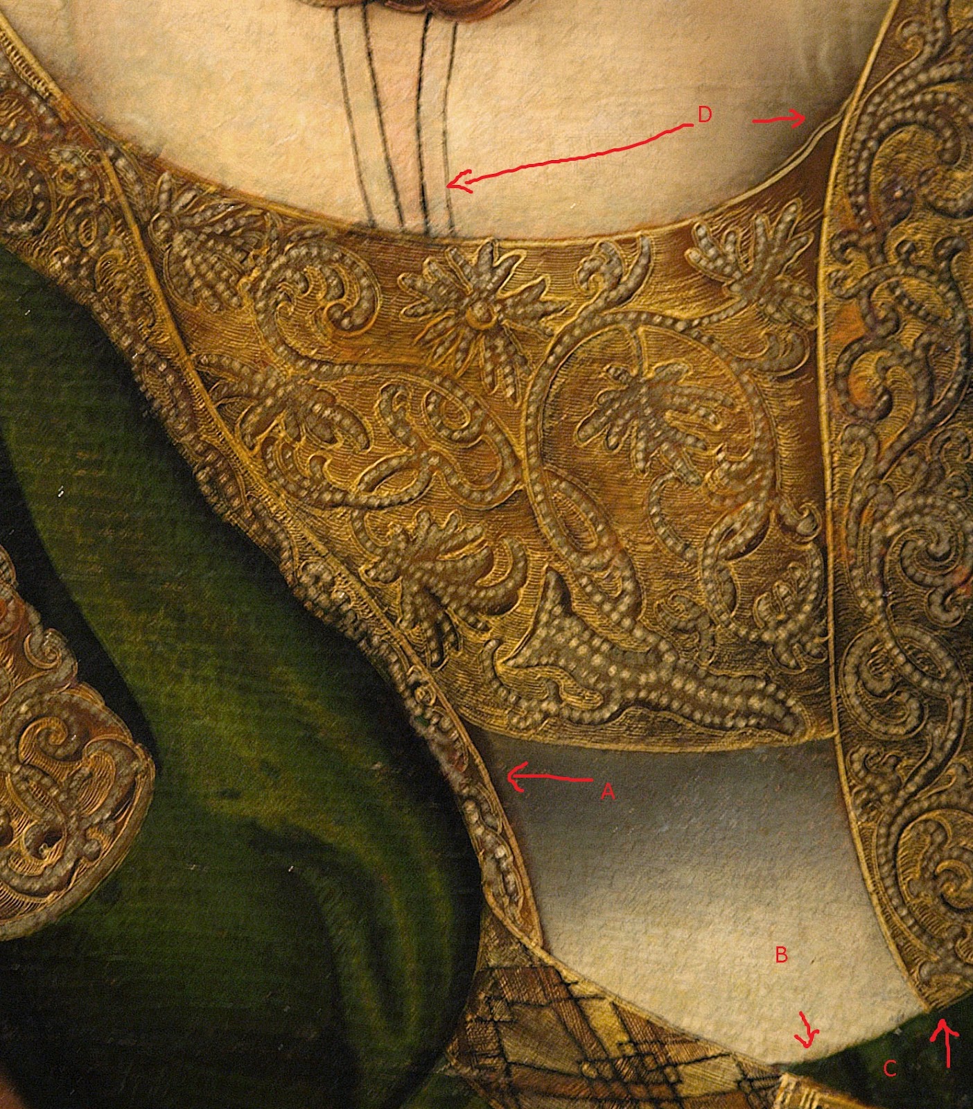
The Brustflect

1 - Jesus with Mary & saints Catherine & Barbara & 2 cherubs – Detail

Highlighted here in green, the brustflect seems to join the right of the bodice snugly (A) while on the left the shading may suggest that the bodice overlaps the brustflect (B). The embroidery also seems to stop at the right but continue under the bodice at the left.
At the bottom of the brustflect (C), shading indicates the guards on the dress overlie the opaque white fabric.

2 - The suicide of Lucretia.
In this image the brustflect has been folded down however the folding at A suggests the opaque fabric continues around her body but it seems to run under the guard. At B we can see the decorative part of the brustflect is attached directly to the opaque white fabric and would continue down to meet the skirt (C). The Brustflect and opaque white marterial seem to be a single unit and run under the guards of the dress.

3 - Lucretia (1512).
In this image we can see the Brustflect (A) has been folded down to bare her breasts. This brustflect is golden on the back rather than white (maybe because Cranach wanted to highlight then opened dress rather than have the panel blend into the excessive levels of white). There are strong black ties which would be the waist chinching ties seen on many Cranach gowns. I first thought these were tying the brustflect on and the pearled trim was the brustflects decorative trim. Closer examination shows the pearled trim is part of the dress guard as it runs straight from her shoulder. It is also possible to see lighter ties (C) that appear to come from the brustflect. These ties are too thick to be part of the fur and run against the grain in some locations.
These images somewhat contradict each other, it may be that one side of the brustflect is pinned or sewn in place while the other is pinned or tied.

Chemise / underdress

1- Jesus with Mary & saints Catherine & Barbara & 2 cherubs – Detail

Here we clearly see two different fabrics, the translucent chemise (D) and the opaque white fabric below the brustflect.
The skirt seems to join the bodice at C and shadows at A suggests the bodice overlies the opaque white (chemise?). It is not clear at B if the white is separate to the skirt, an underdress, or joined as a stomacher.


2- The suicide of Lucretia (1529).
In this image the brustflect has been folded down however the folding at A suggests the opaque fabric continues around her body but it seems to run under the guard. At B we can see the decorative part of the brustflect is attached directly to the opaque white fabric and would continue down to meet the skirt (C).

3 - Judith with the Head of Holofernes (1537 – 1540)

Here we see the white opaque material has been trimmed with tiny pearls and pleated in a ruffle on the top of the brustflect.

On the basis of these images, I would propose the brustflect is most likely attached to the opaque fabric and the combination is used as a supporting garment under the main gown. I would suggest that it is attached on either side with pins much like the tudor gown outlined in Patterns of Fashion by Janet Arnold.

Chemise Neckline?

1- Mary Magdalene, 1525.
A number of the Cranach women have been painted with sloping black lines over their breast. It has been suggested that this is the neckline of a translucent chemise however in many of the images (like the one opposite) there is no discernable change in skin tone nor is the

2 - Jesus with Mary & saints Catherine & Barbara & 2 cherubs – Detail
The Chamise:
In this image two parallel lines curve over Catherine’s chest (A). Her skin tone between these lines (B) is pink suggesting this is the collar of a translucent chemise (there are also wrinkles near her armpits where it tucks into the brustflect).
It’s unlikely that the fabric would change at the bust line from translucent to opaque as the translucent fabric doesn’t seem structural enough to support the opaque fabric.

3 - Saint Dorothea, 1530.
Here Dorothea has a simple black ribbon looped around her neck. This is clearly not the edge of a chemise as it loops around itself multiple times. John Thrupp in “The Anglo-Saxon Home: A History of the Domestic Institutions and Customs of England” proposes that ribbons embroidered with prayers would be worn around the neck. While his book covers a period earlier than the Cranach dresses and of a different culture, it strikes me that a majority of the women wearing the ribbons wear simpler dresses. I’ve also noticed that when I wear a longer chain it does tend to get wedged in the top of my breasts and the chain forms an arc similar to that seen in the top image. Some of the Cranach women, i.e. Duchess Katharina von Mecklenburg are painted wearing a chain that drapes over their breasts a lot like the ribbon seen in 1.

Sunday, 22 January 2012

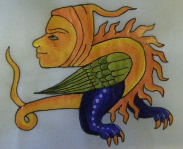
Drollery

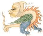
Original drollery image (Google researched). Chosen as shading practice before I commit to a whole plate.
I think it turned out reasonably well. The eye isn't as nice as I wanted but the colours on the legs and feet I'm happy with.

Thursday, 19 January 2012

Illumination experiments continued

Continuing the theme of my last post I have increased my attempts at learning medieval style shading and illumination.

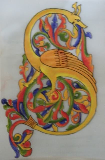
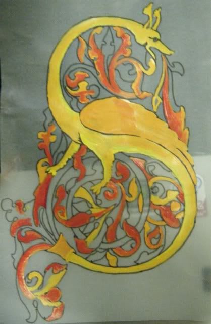
Below is an as-yet unfinished attempted at an illuminated S. I have completed all of the reds and much of the yellows and just need to finish up the greens and blues. I rather like how this one is looking (apart from the smudge fingerprint on the left). Maybe I should find someone willing to do all the calligraphy so I can make an attempt at a scroll. Maybe I should have a chat to Stanzi or Katherine Alicia of Sarum as I've seen them produce some lovely work.

Monday, 16 January 2012

Illumination experiments

I have been pondering my next plate (after the two household ones currently in the works). There's alot of very nice 15thc plates from Deruta however many of them require shading rather than solid lines and textures. I'm not confident enough in my abilities yet to commit to a large plate so I've been trying to find ideas in which I can practice on before doing a full plate.

One idea is practicing with some drolleries on smaller plates. Something like the one above which came from the Croy Hours (date unknown because I google image searched rather than re-searched).

During my wanderings around Spotlight a couple of months ago I found some sheets of vellum which are about A6 in size. So I've tried my hand at illumination as a shading experiment. Once I'm happy with an illumination project I'll go back to the plates and the added complication of blending (or not) glazes.

Experiments so far:


Attempt 1: No guts, no glory.
I was thinking of my man when chosing this motto. I'll admit the calligraphy isn't mine (as this is a skill I've attempted in the past and don't have enough time/interest in perfecting). I actually found a collection of medieval fonts on line developed from period resources by Pia Frauss (http://www.pia-frauss.de) and I fell in lust with some of them. This one,  EtBoemieRex is based on a charter issued in 1359 by the German/Roman emperor Charles IV, granting a market privilege to the city of Hambourg. I printed then traced the words I wanted as the calligraphy is just bulk for the illumination to surround.
Attempt 2: Knowledge is power.
Same deal with the font here as in attempt 1 however where I traced the font with a ink pen for attempt 1, here i traced it with paint, it's thicker and uglier I think. I created the little Dolphin scrollie things inspired by a 'medieval designs' book I own and the fact that Krae Glas' animal seems to be a dolphin,
The white work within the S was done using a whiteout pen as I thought that using a brush would be too difficult as I'd have to go over it multiple times. Since taking this image I have painted over the white and redone it much finer and neater with white paint and a paintbrush. Sometimes short cuts aren't short cuts at all.
I really like how the fish things turned out.